WebsiteBRK Telecom2025
Every button on the site already knows where the interest came from. The sales rep starts the conversation with the right product, without asking again.
- Client

- Role
- Product builder: strategy, design and AI-assisted development
- Timeline
- About 7 weeks
- Disciplines
- Information architecture, UX/UI, Lead generation, AI-assisted development
- Live
- Visit the site
The context
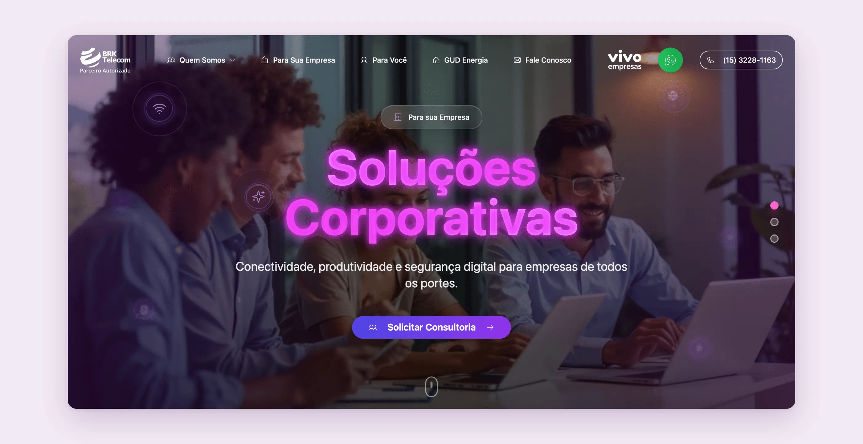
BRK Telecom, based in Sorocaba (São Paulo state), is an authorized reseller for Vivo, one of Brazil’s largest carriers, and sells the carrier’s portfolio to two very different audiences: businesses (dedicated internet, PBX phone systems, corporate mobile plans, productivity licenses, cloud servers) and consumers (home fiber, mobile plans, TV and streaming). On top of that, it resells a third product from a different field: moving companies to the free energy market, with GUD Energia.
People who buy from a reseller want to talk to a person. The sale happens in a conversation with a sales rep, almost always on WhatsApp. The website doesn’t close deals. Its job is to open that conversation.
The pain
A generic telecom corporate site has a predictable problem: everything funnels into a single “contact us”. The rep gets a name and a phone number and has to figure out, in the first message, whether it’s a business looking for a dedicated link or a family wanting to switch their mobile plan. Every contact starts from zero.
And there was a tension to resolve in the channel. Customers prefer WhatsApp, but a click that opens WhatsApp directly leaves no trace: if the conversation doesn’t take off, BRK never even knows that interest existed.
The research
The architecture came from separating three questions visitors answer, even without noticing:
- Who are you? A business or a consumer. That’s the first fork in the menu (“For Your Business”, “For You”) and also in the tabs of the homepage showcase.
- What are you interested in? Each product or service became a card with its own “Request a Quote” button. The product is the subject of the conversation, not a detail of it.
- How do you prefer to be served? WhatsApp or email, decided at the end, with the details already filled in.
GUD Energia got its own page in the menu, outside the Vivo portfolio. It’s a different product with a different sales logic (savings on the power bill, switching at no cost) and its own FAQ. Mixing it with internet plans would only confuse both.
The solution
One form, many contexts
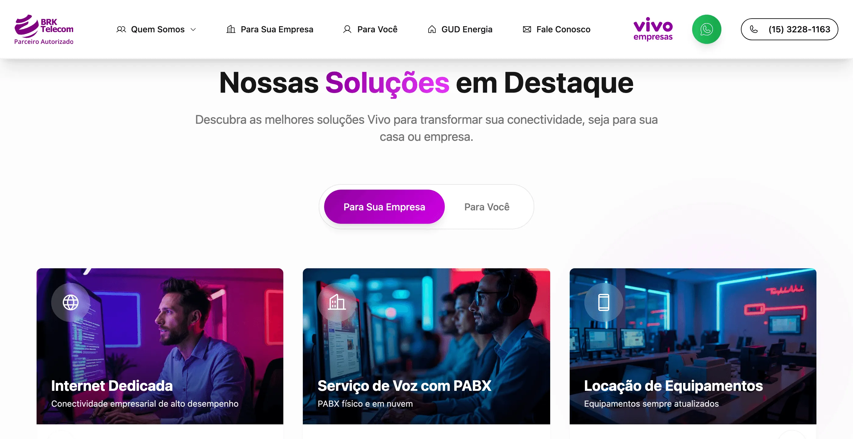
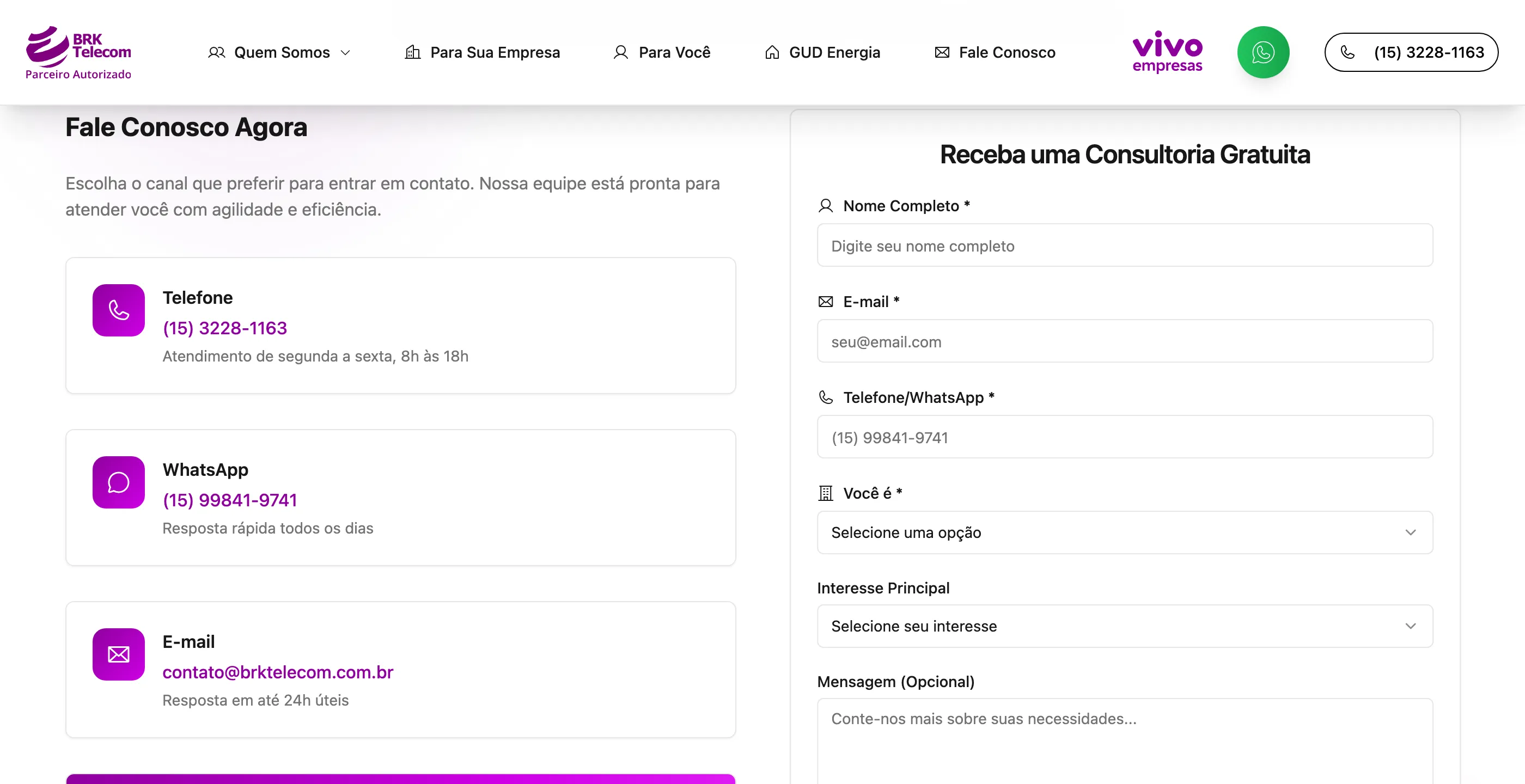
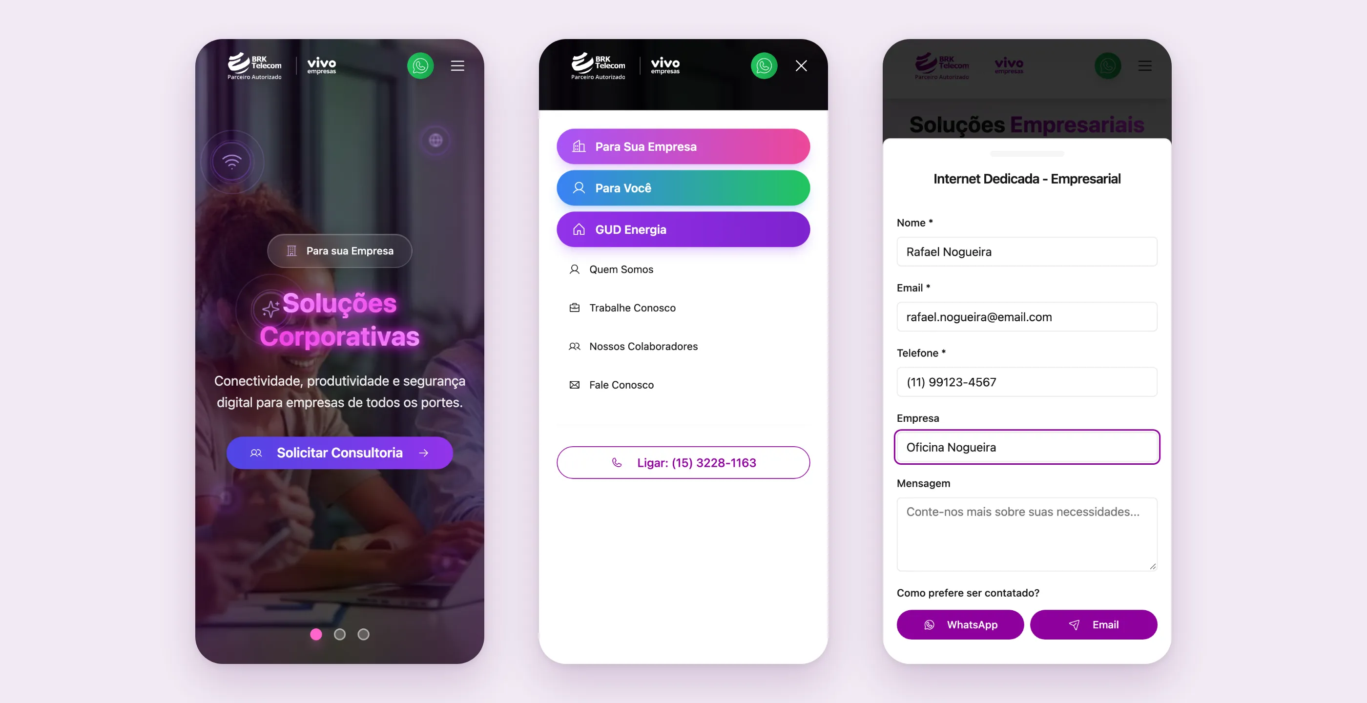
Instead of one form per page, the site has a single contact form that any button can open. What changes is the context the button hands over: where the click came from, which product or service, on which page, and whether it’s a business or a consumer. The form’s title already shows it (“Dedicated Internet - Business”), and the “Company” field only appears when the context is business.
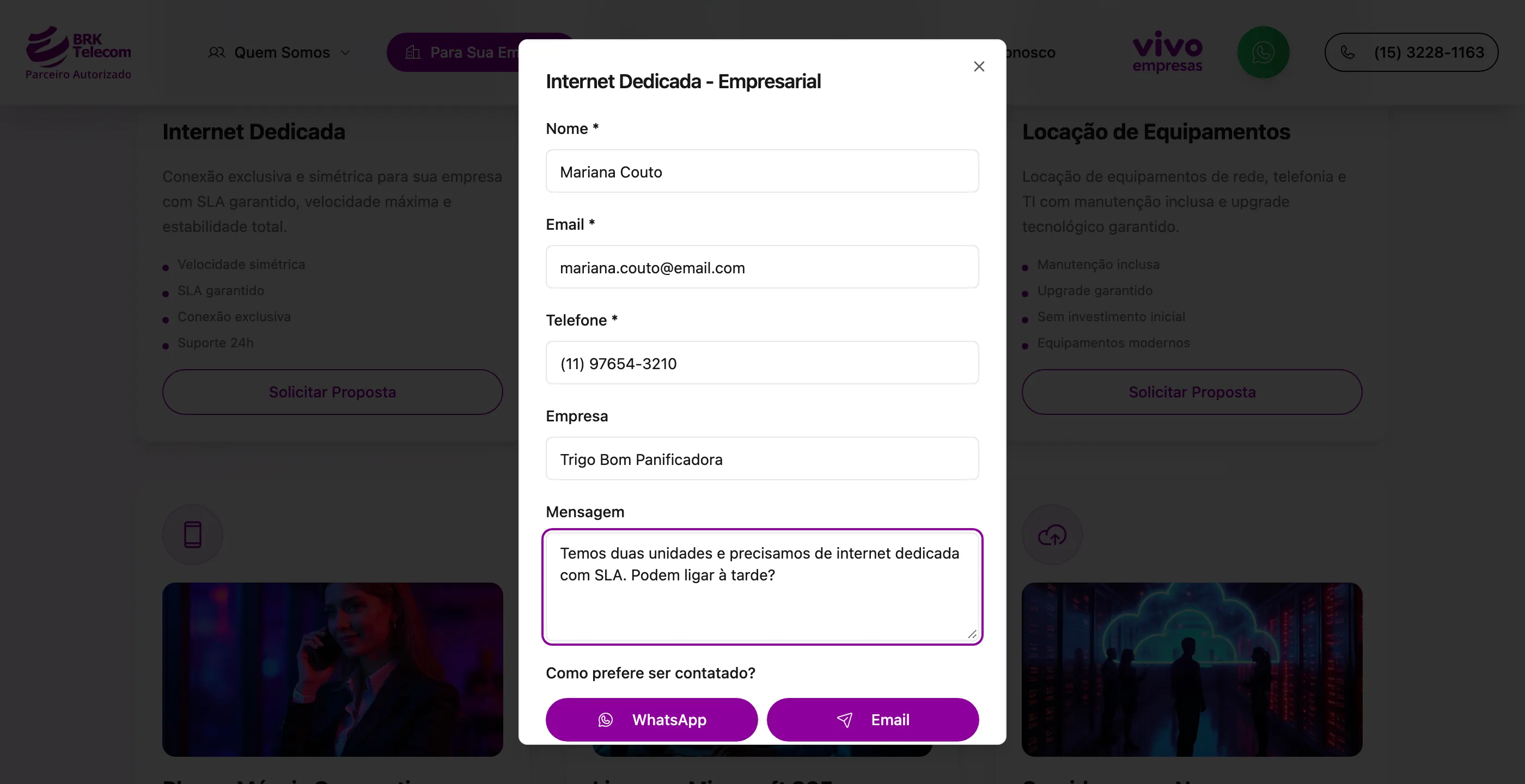
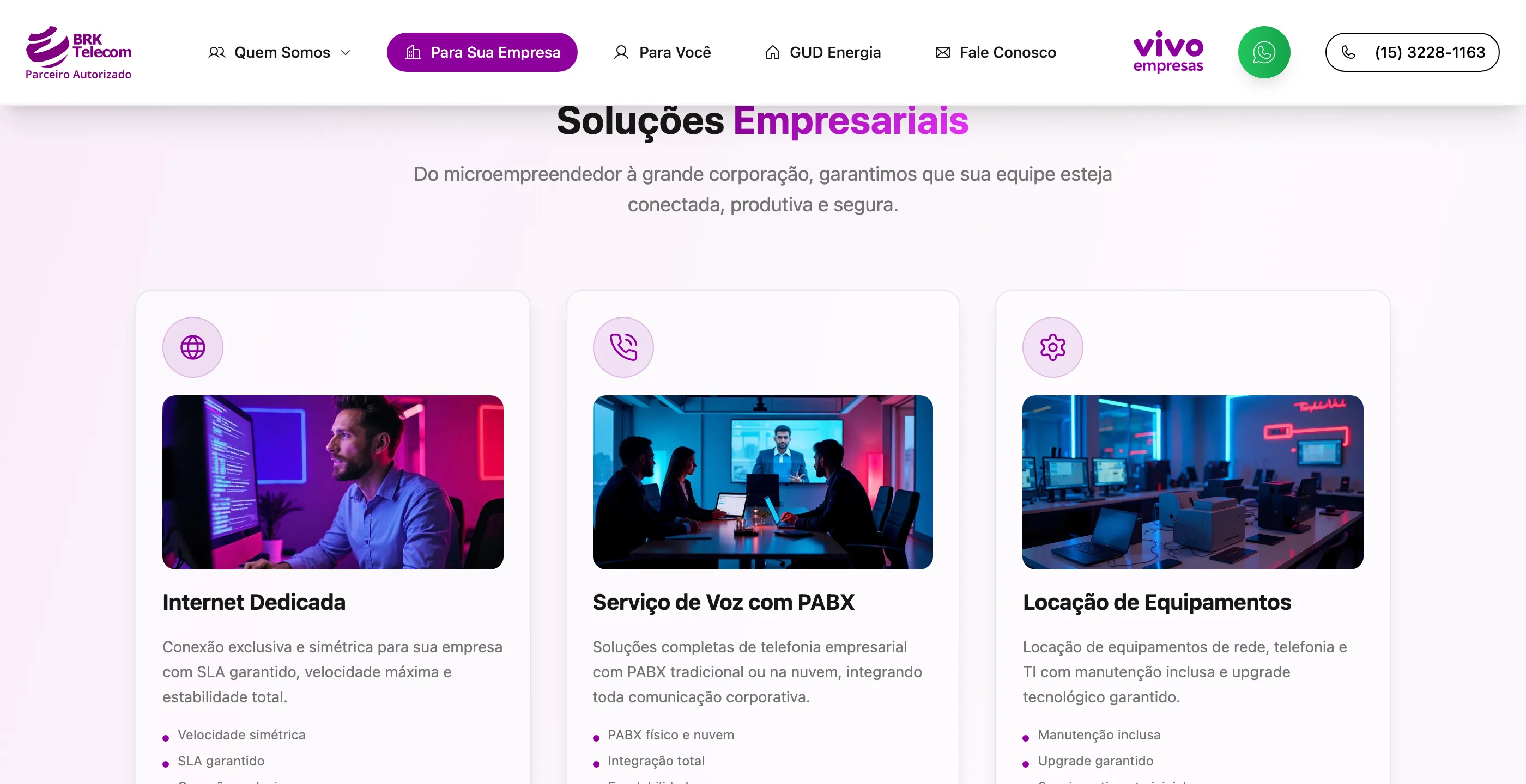
On the business page, the six main services sit in cards with an image, a description and three or four key strengths. Below them come the add-on services (corporate Wi-Fi, attack protection, IoT, toll-free numbers) and the advantages of buying through BRK.
Energy as a cross-sell
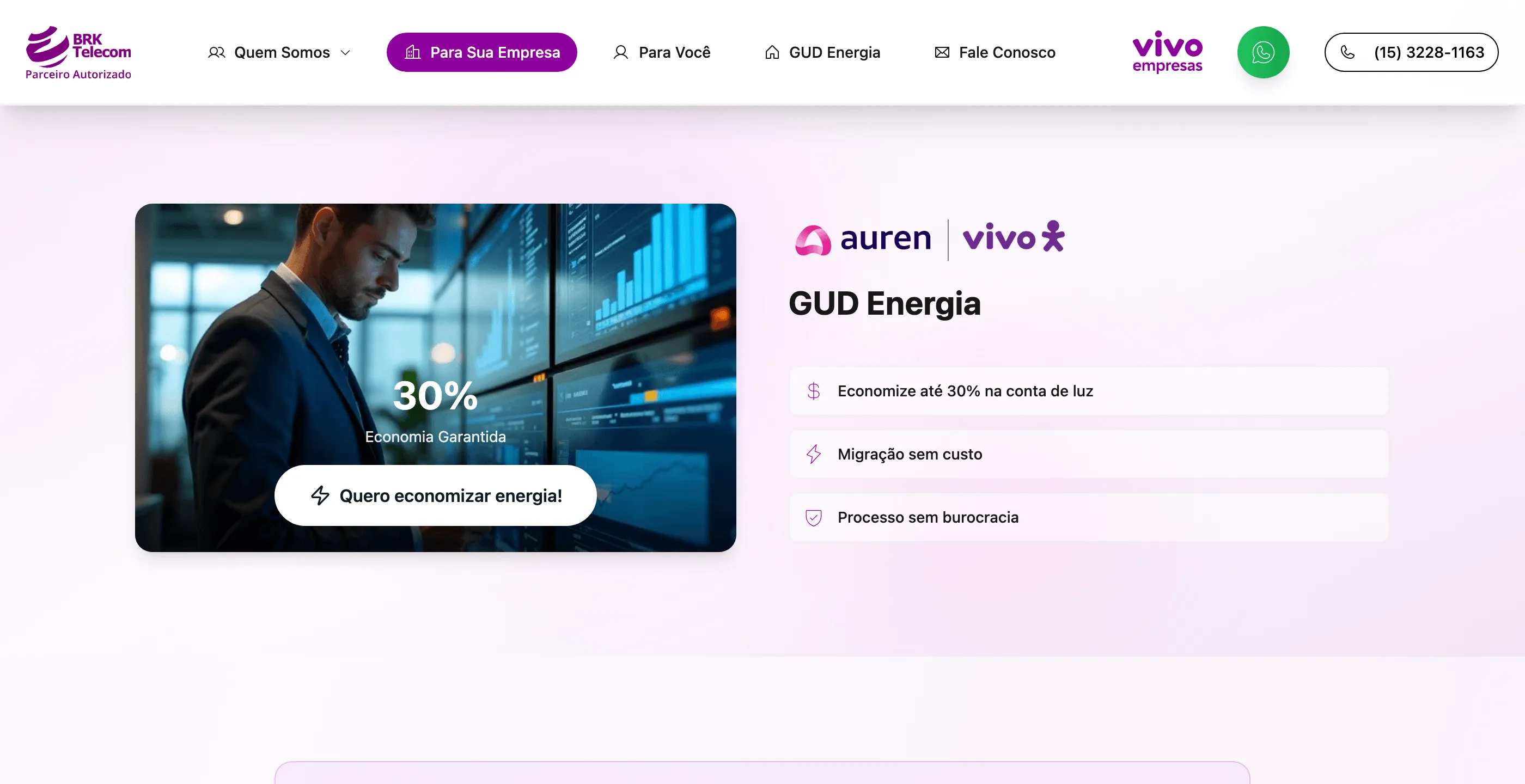
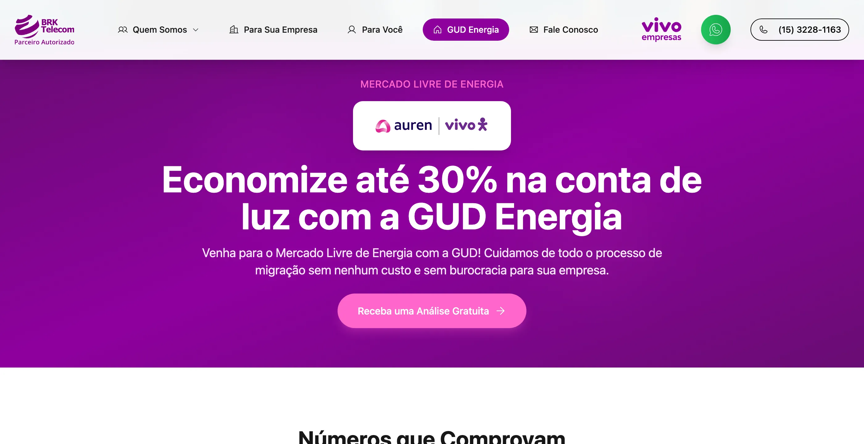
GUD Energia shows up in two ways: with a full page in the menu and as a block inside the business page. Someone already thinking about the company’s fixed costs sees a second way to save right there, without having to go looking for it.
WhatsApp without losing the lead
The rule that took the most work to get right: when the visitor picks WhatsApp, the site first logs the contact by email to BRK and only then opens WhatsApp with a ready-made message containing name, email, phone and whatever the person wrote. If logging the record fails, WhatsApp opens anyway. The customer is never stuck because of a problem on the reseller’s side.
The sticky WhatsApp button in the header uses a lean version of the same form: name and phone required, email optional, no message field. Whoever clicks there wants to talk now, not write.
Designed for mobile
The homepage has dedicated versions of its sections for small screens, not just a squeezed layout. On mobile, the form becomes a sheet that slides up from the bottom of the screen, the menu highlights the three main entry points as big buttons, and the phone number becomes a tap-to-call button. The project history shows several rounds just to make submission work on mobile. The site waits for the contact record to finish and only then switches over to WhatsApp; on desktop, it opens WhatsApp in a new tab.
The site also has corporate pages (about us, careers, team), a privacy policy, a cookie notice, structured data for search engines, a sitemap and analytics.
Stack: React, Vite, Tailwind and shadcn components, built with AI on Lovable. Email sending runs in PHP on the client’s own shared hosting, which only serves files and PHP. So there’s no application server to maintain.
What I took from this project
The form is the most important piece of a website that sells through conversation, and there doesn’t need to be more than one. What it needs is to carry context. A button that tells the form “this came from the dedicated internet card, business page” saves the first question of every conversation.
It’s a small automation. The triage a rep would do by hand, asking every contact, comes already done by the button.
The other lesson is about channels. Letting customers choose WhatsApp doesn’t force the reseller to give up the record. You can have both, as long as a failure in one never blocks the other.
Later on, BRK got a system to manage its customer portfolio, but that’s another story.