WebsiteAgents for Life2026
Every AI website promises to transform your company. This one shows what the squad does on its own, where it stops for a person to approve, and what each step cost.
- Client

- Role
- Product builder: research, messaging strategy, design and AI-assisted development
- Timeline
- 2 days
- Disciplines
- Messaging strategy, Information architecture, UX/UI, Performance
- Live
- Visit the site
The context
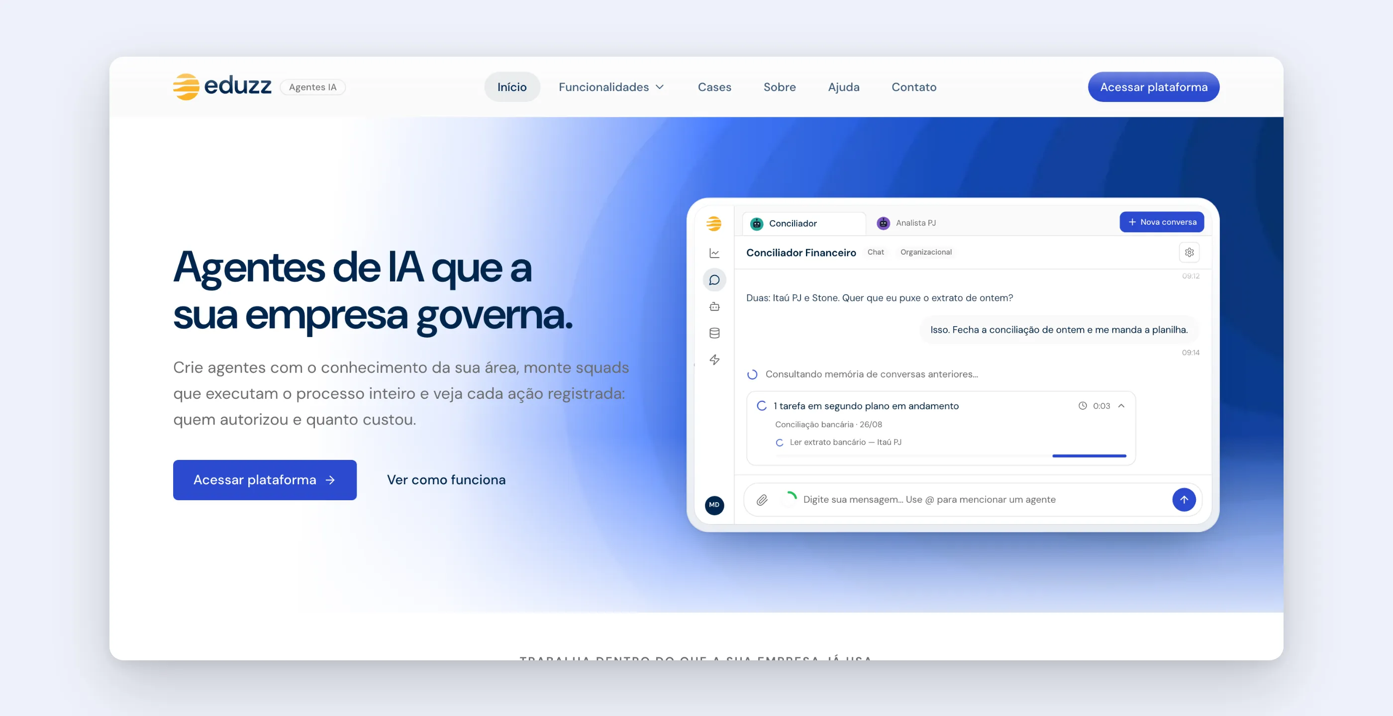
Agents for Life (AFL) is Eduzz’s AI agent platform, and the website presents it under the Eduzz Agentes IA brand. It puts AI agents and autonomous squads (sequences of agents, automations and human approvals) to work inside an organization: with the company’s knowledge base, the integrations it already uses, role-based permissions, model cost control and a record of everything that was done.
What the platform sells is taking manual processes off a team’s hands. What the site needed to show is how that actually happens: what the squad does on its own, at which point it stops for someone to decide, and what’s on record at the end.
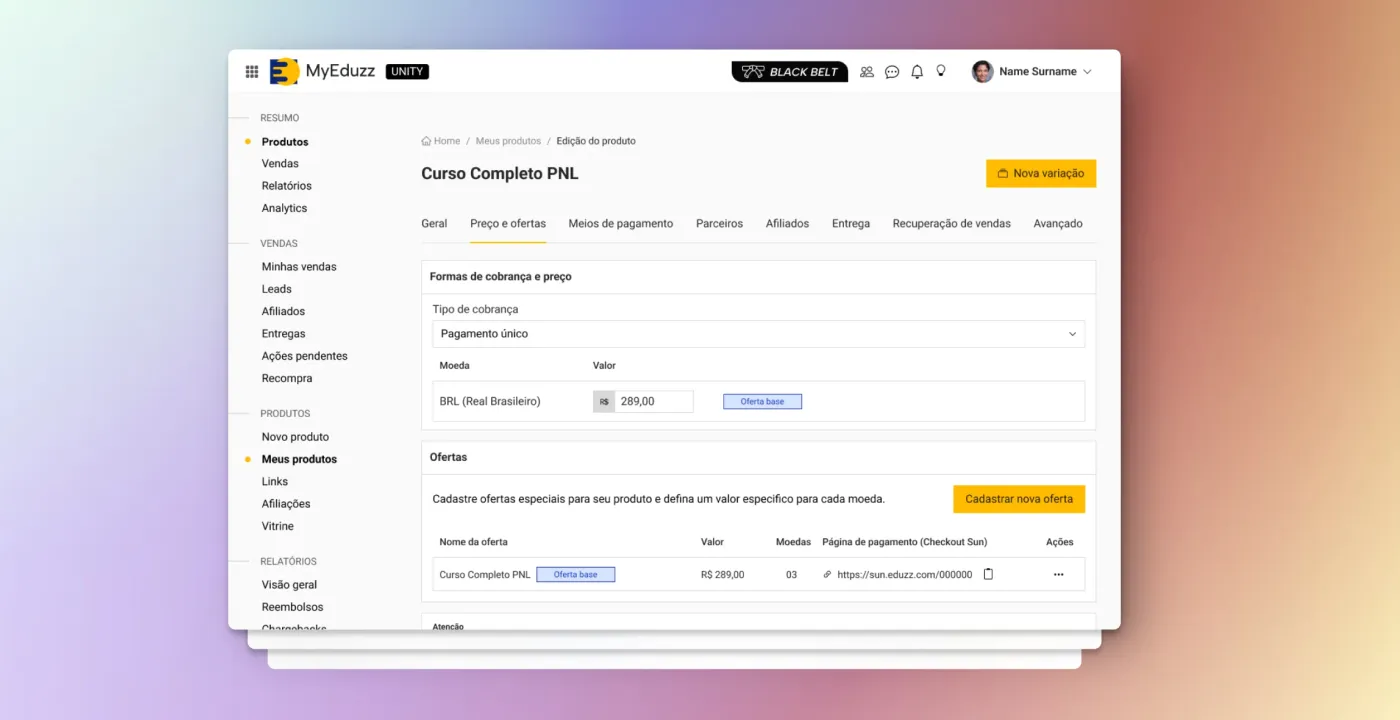
The old site had aged along with the product. It talked about features that no longer existed, had a pricing page and testimonials that didn’t match how the product was actually sold, and listed channels the platform didn’t offer. The goal of the new site was to generate qualified conversations with business and technology teams at mid-size and large companies.
The pain
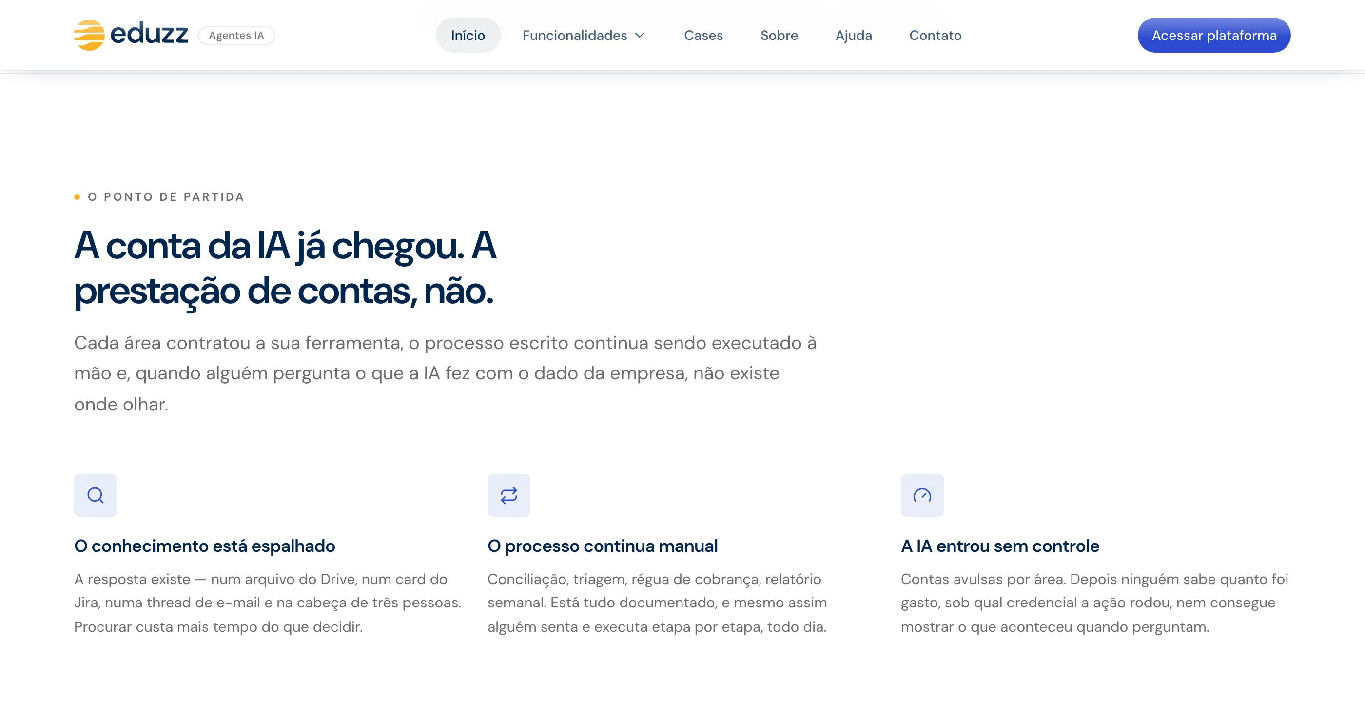
Anyone buying AI for their company today has already heard every promise. The technical buyer shows up with three questions almost no website answers: how much does it spend, who authorized it, and what was recorded? The business side shows up with another: where does this fit into my day?
A generic site loses both. And a site built on product screenshots gets older with every release.
The research
Before any design, a review of 46 real homepages from products in the same market and from open-source projects. It produced concrete rules:
- Headlines of 5 to 8 words (the median was 6), and none of the best ones use “platform”, “solution” or “transform” in the headline.
- A one-sentence subheadline with three verbs, and two buttons, not five.
- No badge above the headline. When the good examples have one, it’s news, never self-description.
- An FAQ on the homepage is rare, and pricing on the homepage is zero among enterprise-sales competitors.
- The market has reached a stage where promises no longer set anyone apart. The headline has to talk about the mechanism: governance, cost caps, auditing.
That’s also where the competitor test came from: swap the product’s name for another one. If the sentence is still true, it’s generic and it goes.
With no testimonials to use, social proof came from elsewhere: integration logos instead of customer logos, numbers from the product itself, security posture, and use cases labeled as scenarios, not as customer stories.
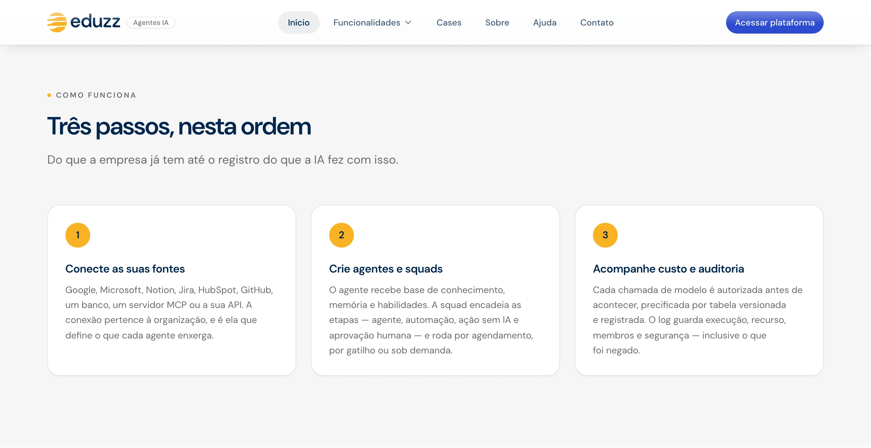
The final homepage structure: hero, integrations, the pain, how it works in three steps, the product in action, use cases by team, governance, capabilities and contact.
The solution
The product in motion, not in screenshots
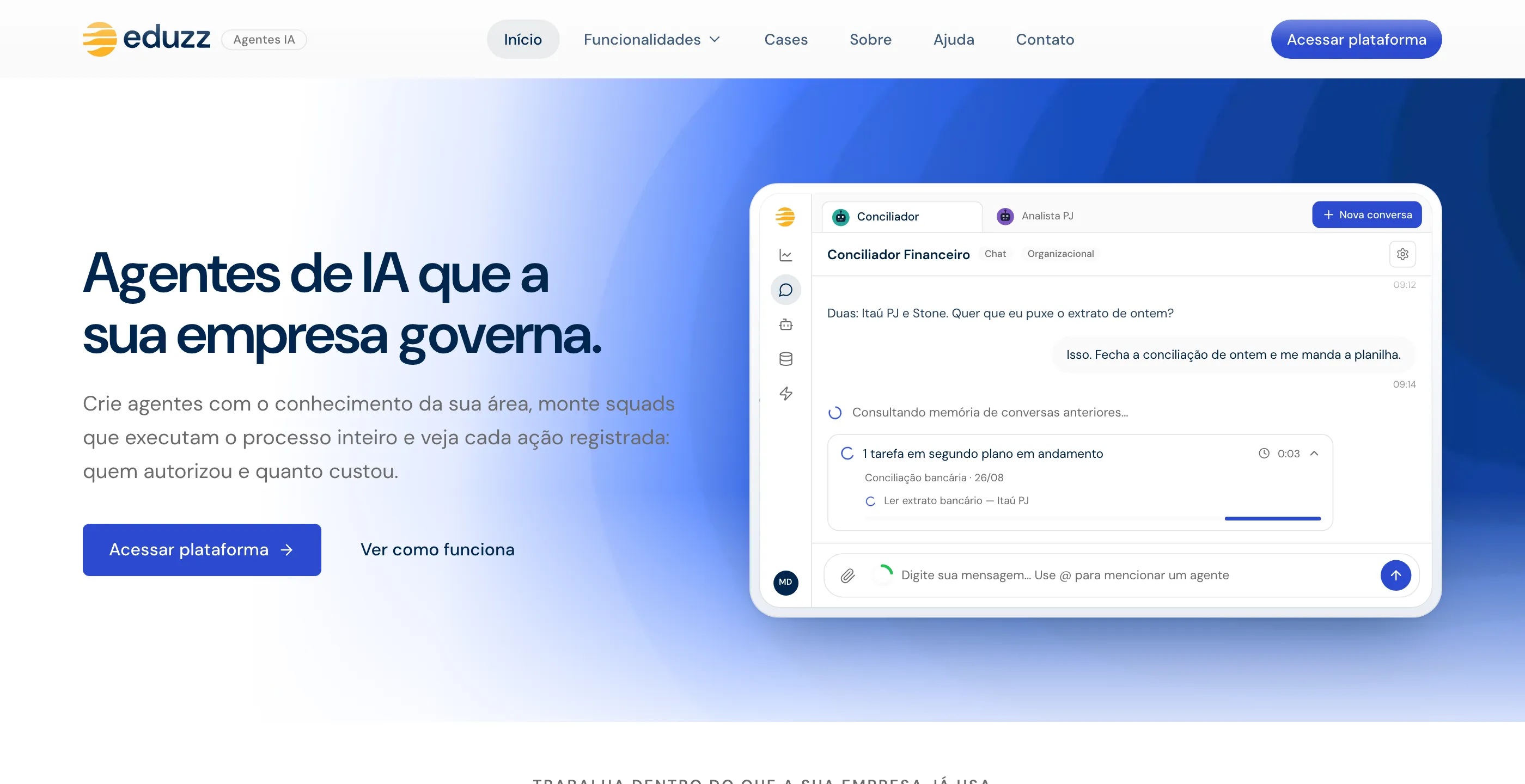
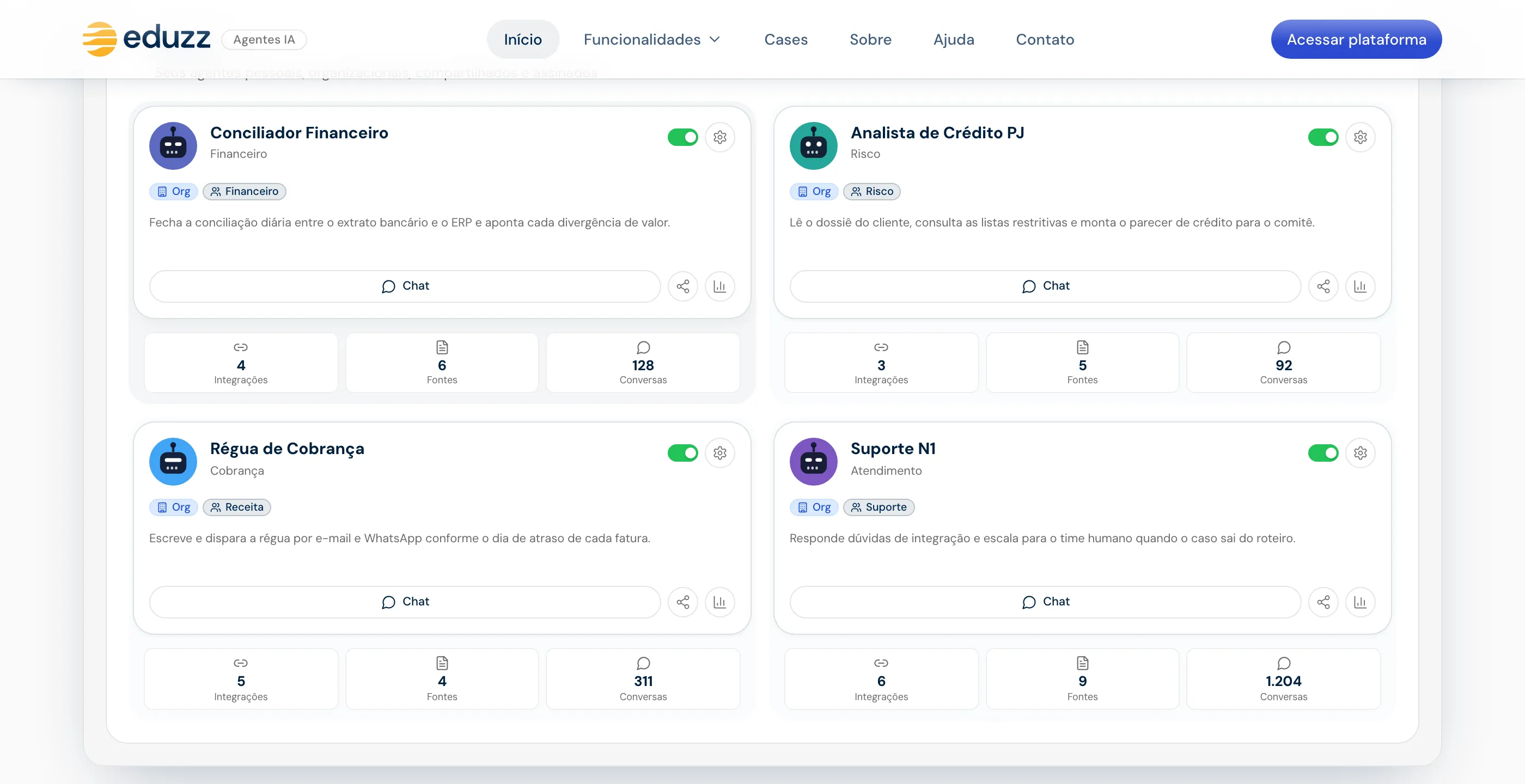
What sets the site apart are the staged scenes: the product’s main screens (a conversation with an agent, a squad run paused for approval, the usage and audit dashboard, the agent library) rebuilt as live components, animated in a loop. They don’t go stale the way screenshots do, they weigh a few kilobytes, and they tell a story a still image can’t.
Every scene was checked against the product’s code, not from memory: the color of the user’s message, the way the agent replies (running text, no bubble), the “thinking” indicator, the labels and status colors of each run. All names and numbers are fictional.
The squad that stops for a person
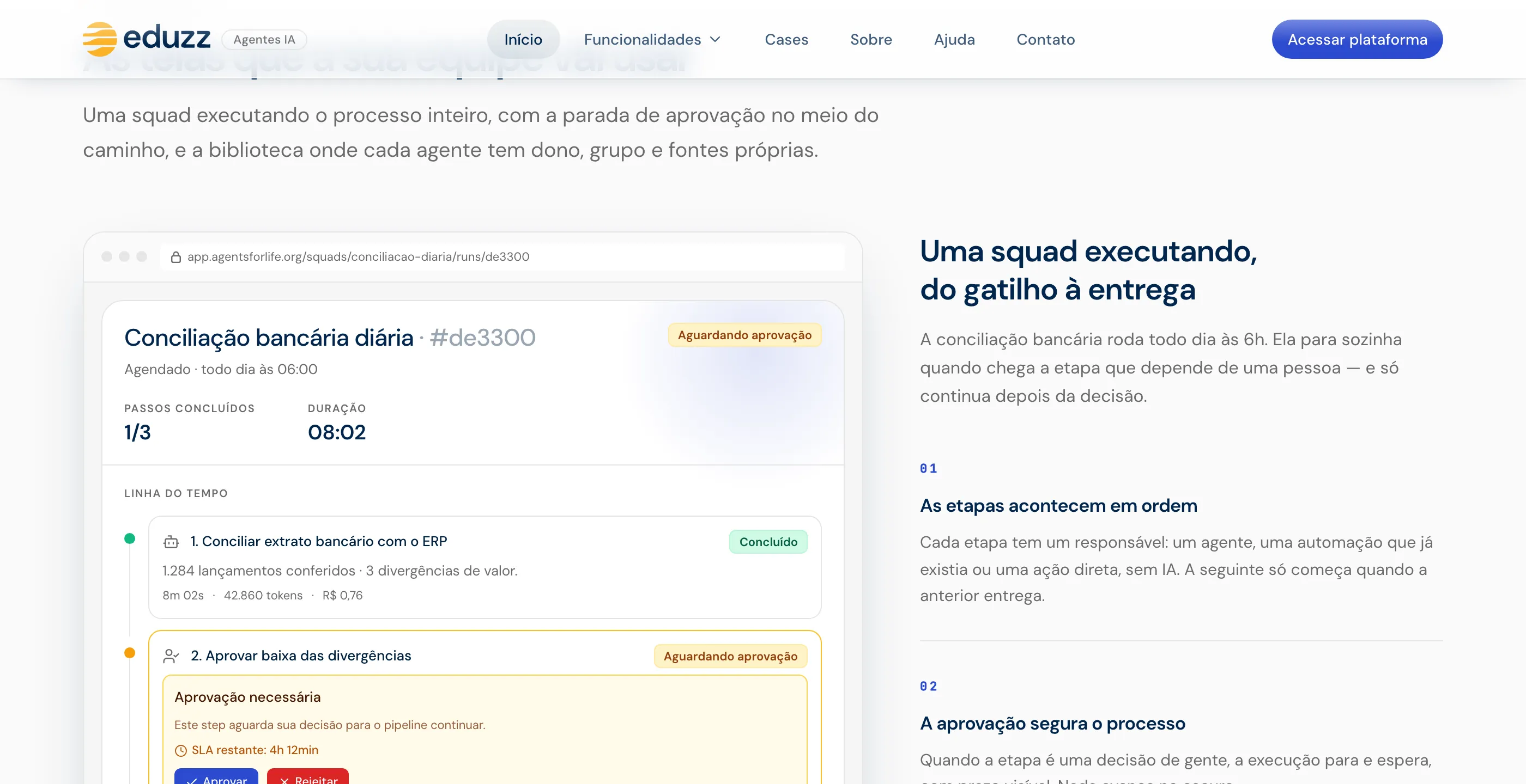
The central scene is a bank reconciliation squad. It runs through its steps on its own and pauses at the human approval step, with the timeline and the cost of each step showing up as it happens. It’s the whole mechanism on one screen: automation up to the point where someone has to decide.
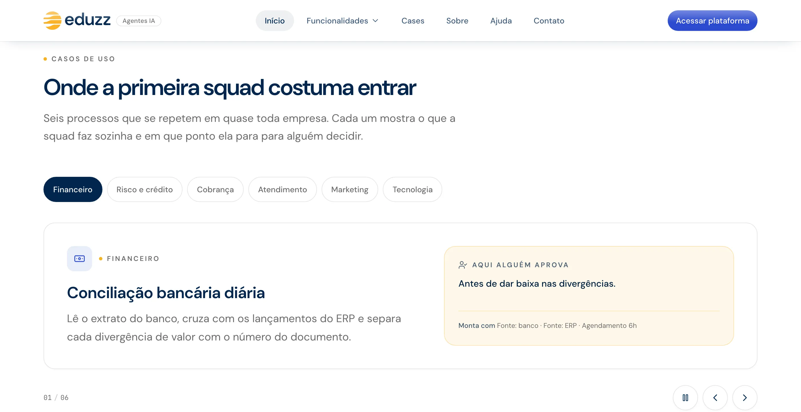
The use cases sit in tabs by team (finance, risk and credit, collections, customer service, marketing, technology). Each scenario shows what the squad does on its own and at which point it stops for someone to decide.
Governance answered on screen
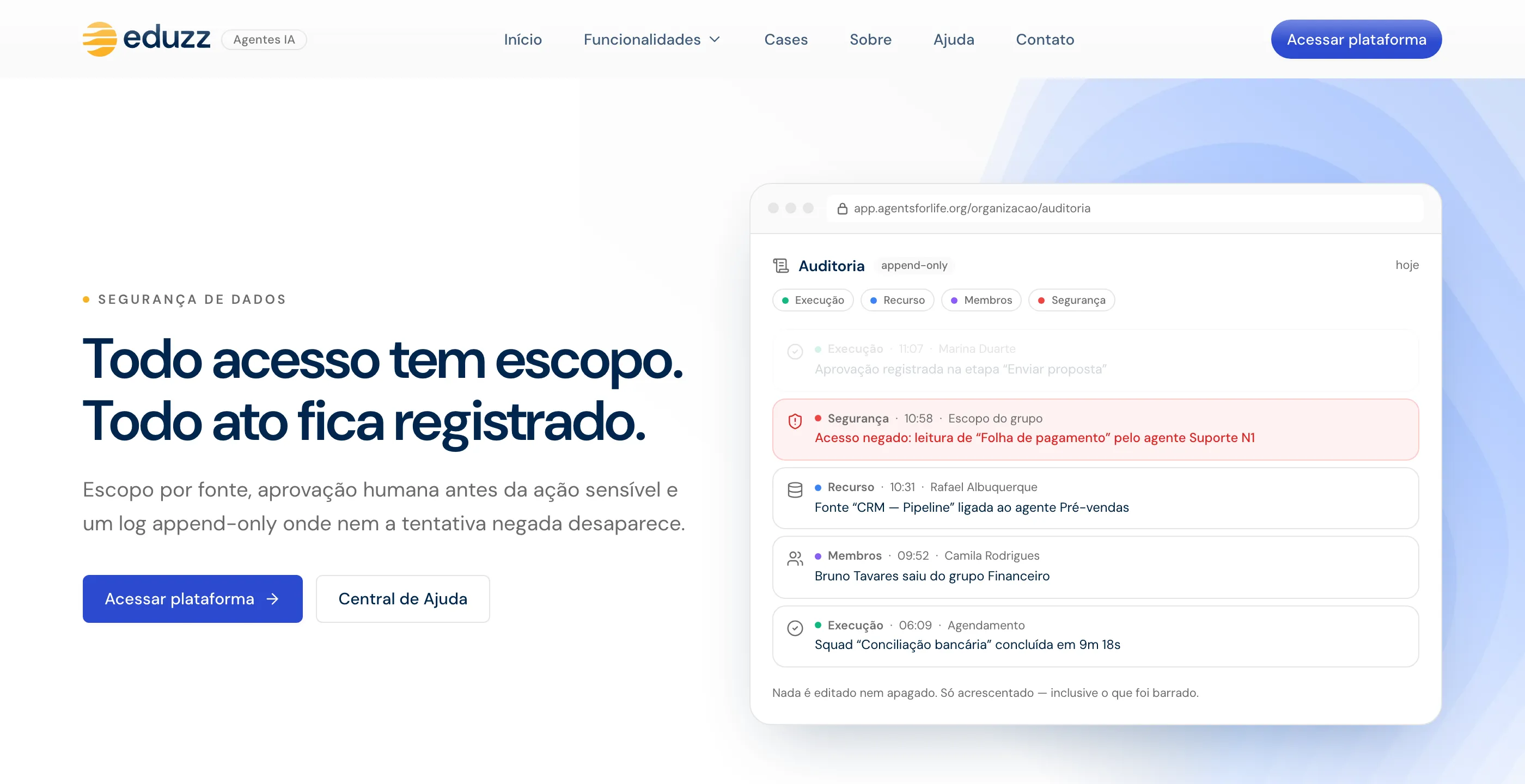
The governance section answers the technical buyer’s three questions with the product’s own screens: usage by hierarchy level with caps, an audit feed with a denied access on record, and the security posture numbers.
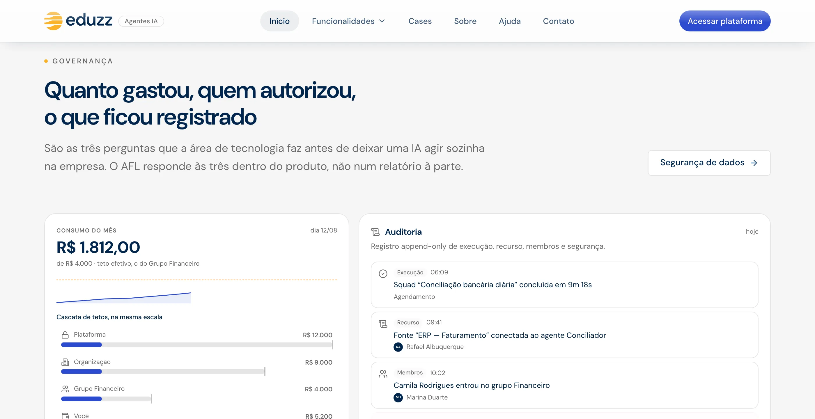
The inner pages go deeper into each area (agents, squads, organization, documents, integrations, costs, security) with the same pattern: a mechanism headline and a product screen in the frame.
Contact is deliberately simple: email and WhatsApp, no form and no middleman.
How it was built
React, Vite, Tailwind and Framer Motion, built with AI as a pair programmer. Three technical decisions came out of real problems:
- Performance measured, not guessed. There was a complaint that the site “felt laggy”, and measuring confirmed it: 30 frames per second while scrolling, with the CPU throttled 4x. Animations were running offscreen; the typewriter effect repainted the whole page; and the biggest culprit was the blur radius on the frosted-glass header. Testing one suspect at a time, scrolling went up to 43 frames, and the idle page held at 60, with no stutter.
- Motion with respect. People who ask their system for reduced motion see each scene in its final state, still.
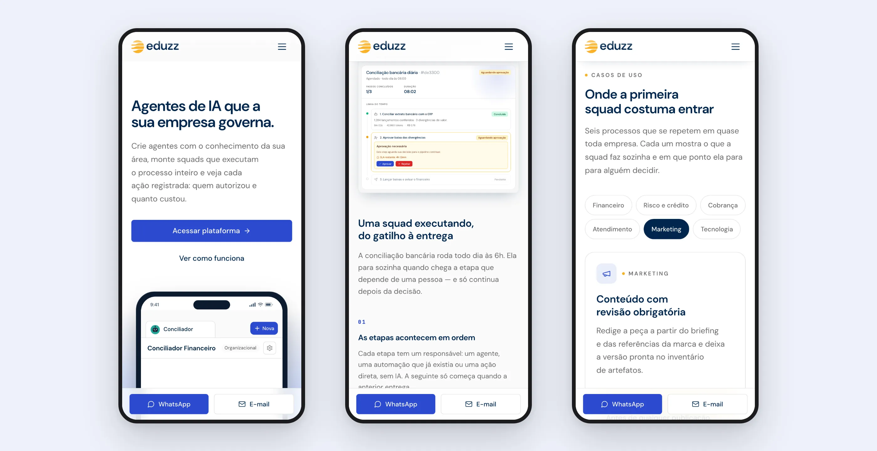
- Dense screens on mobile. A scaling component shrinks the whole block instead of letting the frame cut off information.
SEO was built for AI answers too: title, description and canonical per route, structured data for the organization and the software, a sitemap, robots rules that let AI crawlers in, and an llms.txt file with a summary of the product and a section on what not to claim about it.
What changed
The new site is live, after two days of work, without the pricing page, the testimonials, and the channels that didn’t match the product.
What was done by hand. In the scenarios the site shows, the bank reconciliation, collections, and customer service a team handles step by step. On the old site, the product screenshot that had to be redone with every release.
What became automatic. In the product, the squad’s steps up to the approval point, with the cost per step and a record of everything. On the site, the scenes that run in a loop and show that without a still image.
Where a person decides. In every scenario, at the human approval point the screen shows. On spending, through the cap per hierarchy level. And on access, through the audit feed where even a denied access is on record.
What I took from this project
- Market research becomes a writing rule. “Headlines of 5 to 8 words, no ‘platform’” is more useful for making decisions than “be clear”.
- Removing what doesn’t exist is part of the redesign. Pricing, testimonials and channels the product doesn’t have cost credibility once the buyer finds out.
- Showing the product working is more convincing than describing it, as long as the scene is faithful to the real product. Hence checking against the code.
- Meta-copy is a defect. Sentences about how the page was made interest the people who made it, not the people buying. They all came out.