Offers systemOffers & Pricing2024
Creators used to duplicate the entire product, by hand, for every promotion or currency. Now they create an offer with its own price per currency, inside the same product.
- Client
- Eduzz
- Role
- Product designer
- Timeline
- 2 weeks
- Disciplines
- Ideation, UX/UI, Information architecture, Usability testing
The context
Eduzz is a platform for digital products: courses, mentoring programs, subscriptions, e-books. The people who sell there, the creators, register a product, set the price, and get a checkout link to share. In an ecosystem with more than 2 million creators, any friction in that flow turns into support volume, lost sales, or workarounds.
And there were workarounds.
The pain
The original model treated product and price as one and the same: one product, one price, one checkout. That works until the day the creator wants to do what everyone who sells does:
- a special offer for a group (VIP list, launch, past cohort), without touching the list price;
- sell outside Brazil, charging in dollars or euros, with a price designed for that market rather than an automatic conversion from the real (BRL).
Without that, the path was to duplicate the entire product for every variation. Reports got scattered, the members area got duplicated, and the creator lost sight of how much that course was really selling.
The problem wasn’t “a currency field is missing.” It was that the system’s mental model didn’t match the seller’s.
The research
Before designing any screen, the work was to pull apart concepts that had been glued together:
- Product is what gets delivered.
- Offer is a commercial condition for that product: name, audience, price.
- Currency is a dimension of the offer: each offer can have a price per currency and, therefore, a checkout link per currency.
With that mapped out, the main flow became linear, with a single branch, at the moment of choosing currencies:
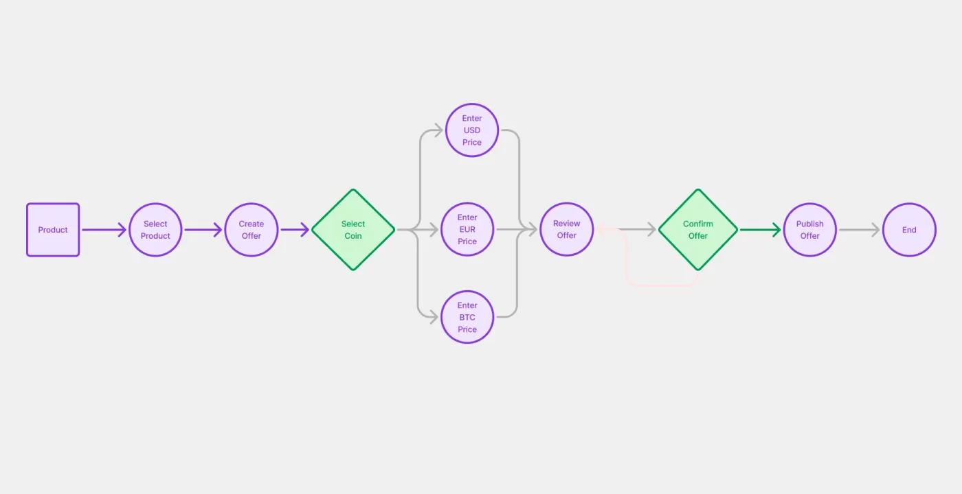
The information architecture followed that model: offers came to live inside the product, in a pricing tab, rather than as standalone products in the catalog. Then came usability testing with the prototype to validate the points where the creator could get lost: where to find the offer they created, which link to send to which audience, what happens to the base offer.
The solution
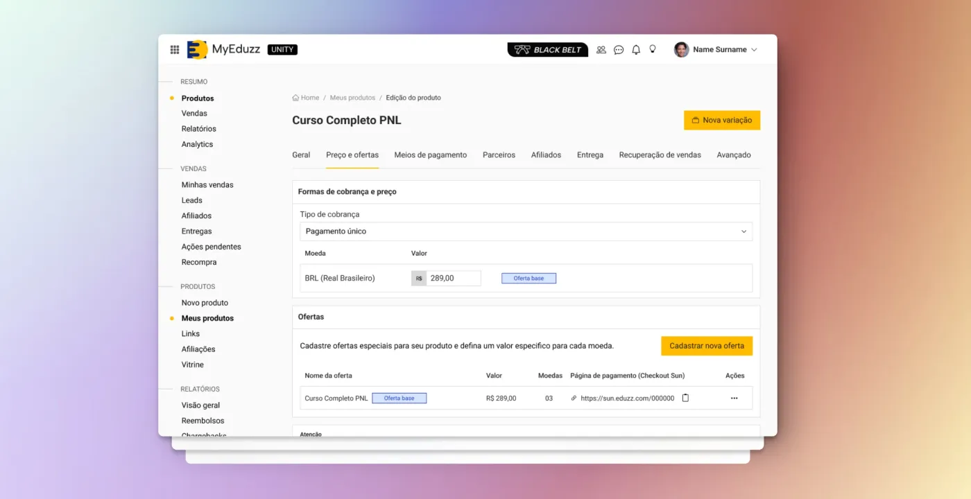
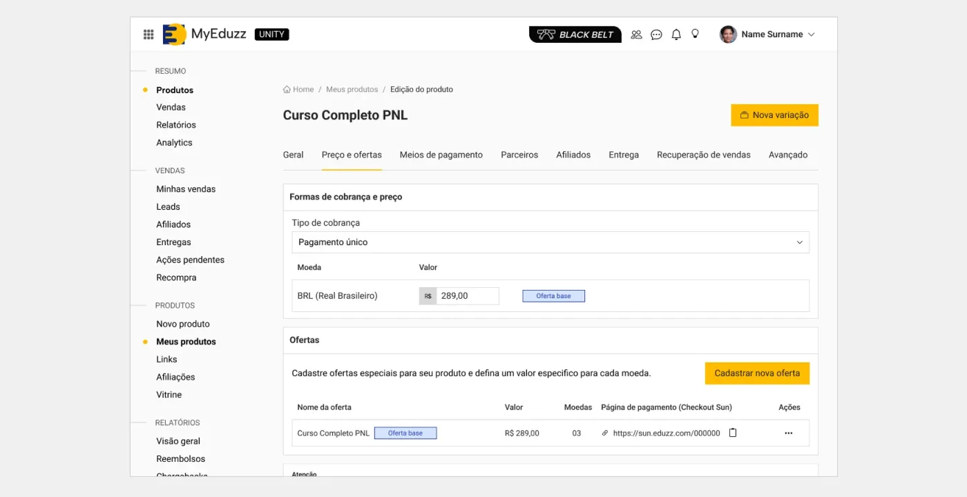
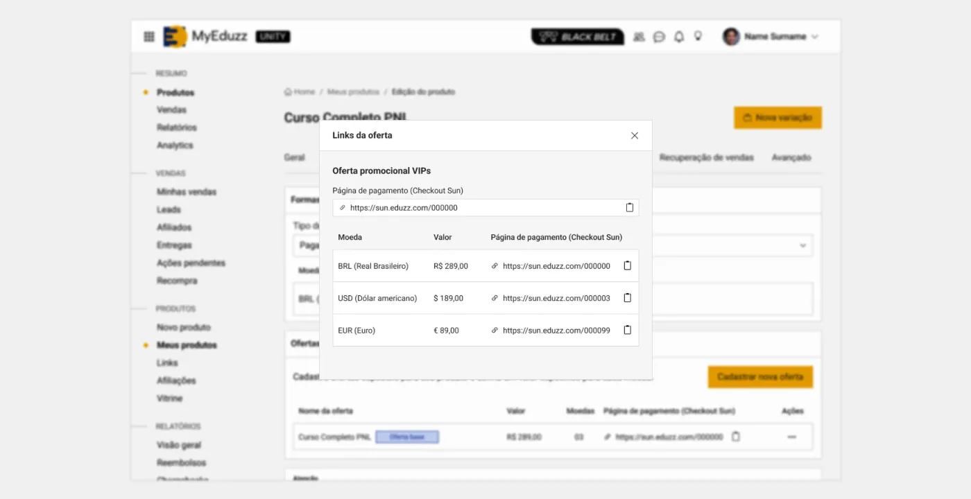
On the product page, a table shows every offer: name, price, how many currencies each one accepts, and the checkout link. The original offer is labeled as the base offer, so nobody confuses the list price with the promotion.
Creating an offer asks for the minimum: a name, an optional description, and the price in reais. Right below, a direct line (“Set specific prices for international currencies”) and a button to choose the currencies.
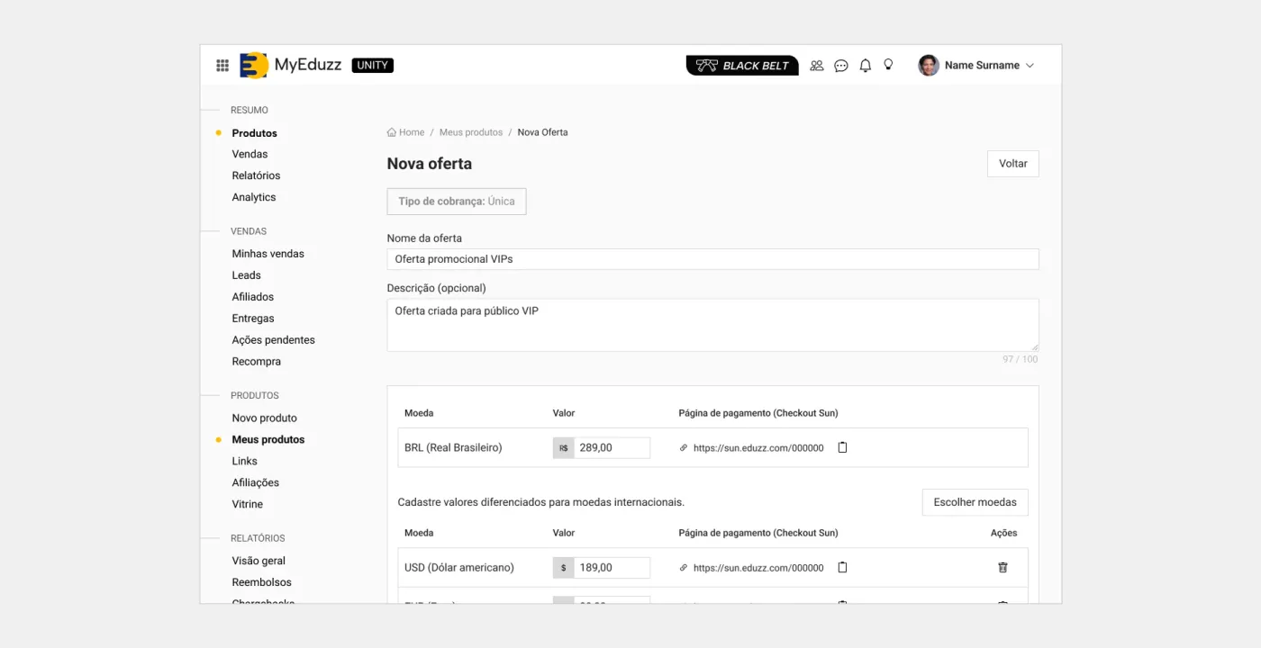
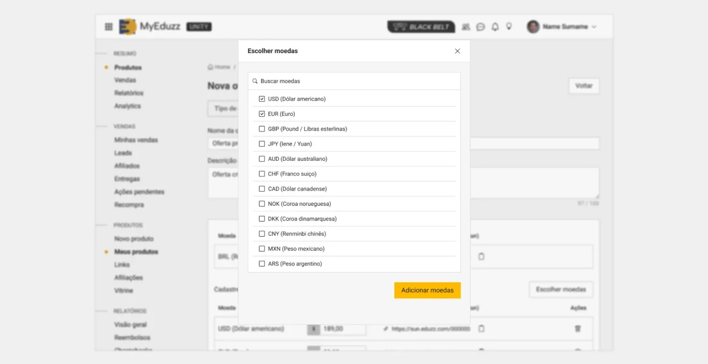
Finally, what the creator really needs day to day: the right link for the right audience. Each offer opens a panel with the checkout for each currency, ready to copy.
What changed
Creators gained control over their pricing strategy without duplicating products: a promotion for one group, a regional price for another country, all in the same place and with consolidated numbers. For the platform, it opened the door to selling in other markets without relying on automatic conversion.
In practice, a manual chore got out of the way. Instead of copying the product for every variation and maintaining the copies, the creator creates an offer.
What I took from this project
The highest-impact decision didn’t show up on any screen: it was separating product, offer, and currency. With the right model, the interface almost designs itself. With the wrong model, no interface can save it.