Design systemHouston DS2024
Eduzz's products looked like they came from different companies. Houston became the place where design and engineering look up the same answer.
- Client
- Eduzz
- Role
- Product designer, design system project for Eduzz
- Reading
- 2 min
- Disciplines
- Design system, UI Design, Accessibility, Documentation
The context
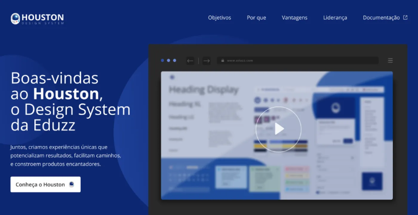
Eduzz isn’t one product, it’s an ecosystem: checkout, members area, creator dashboard, marketing tools, apps. Each one was born at a different time, with a different team, and carried its own choices about buttons, color, spacing, and tone.
For users, that showed up as a vague sense that “every part works differently.” For the people building it, it showed up as rework: the same component designed and implemented over and over, a little different each time.
The pain
Three symptoms kept coming back:
- Slow to ship. Every new feature started from scratch on the interface.
- Expensive maintenance. Changing a pattern meant hunting down the same element across several products.
- Decisions with no reference. Product, design, and engineering debated the same question again and again, because there was no place to look up the answer.
The research
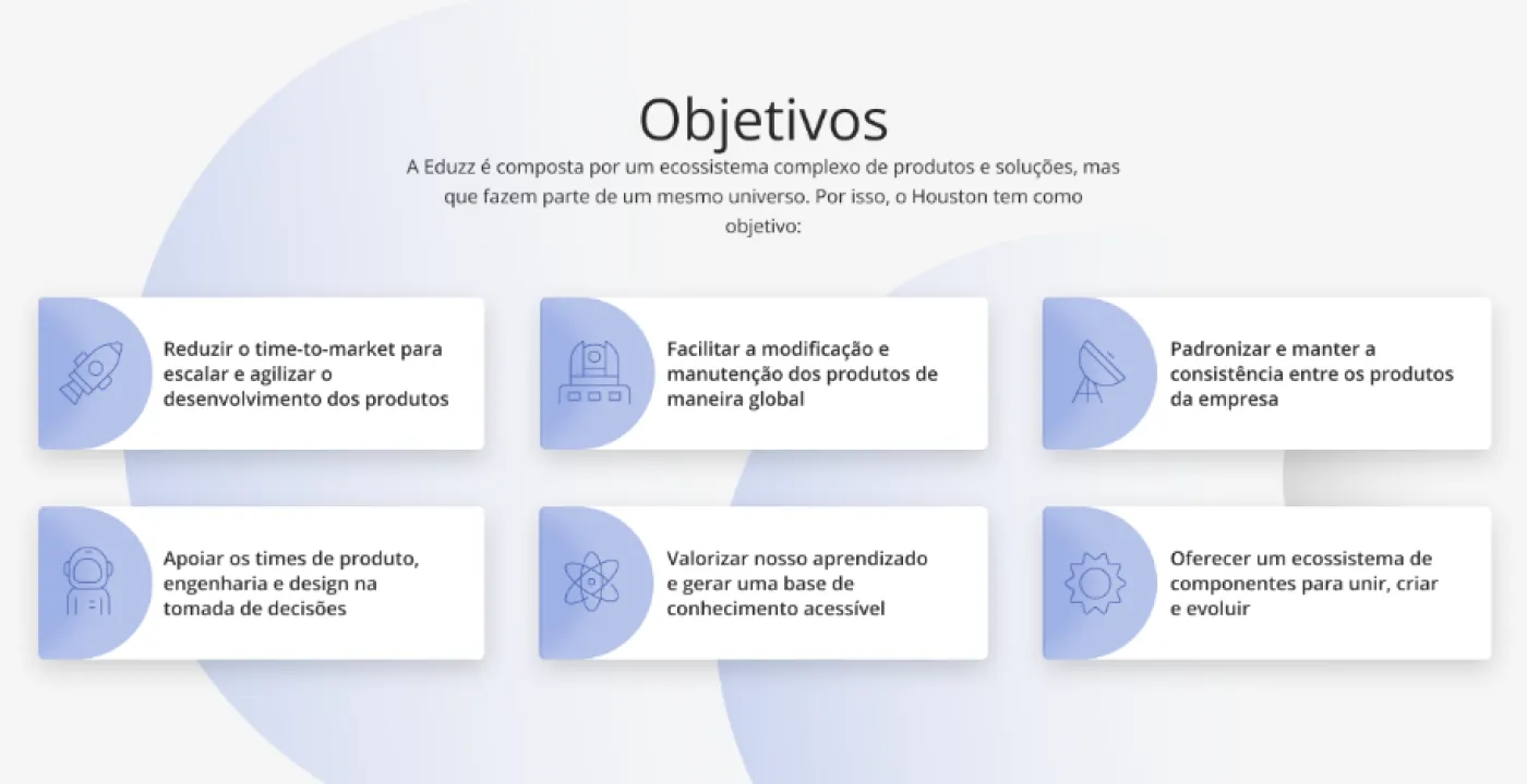
Before designing a single component, the project started by agreeing with Eduzz’s team on why the system existed. Those goals became the first page of the documentation and the test for what made it into Houston and what didn’t:
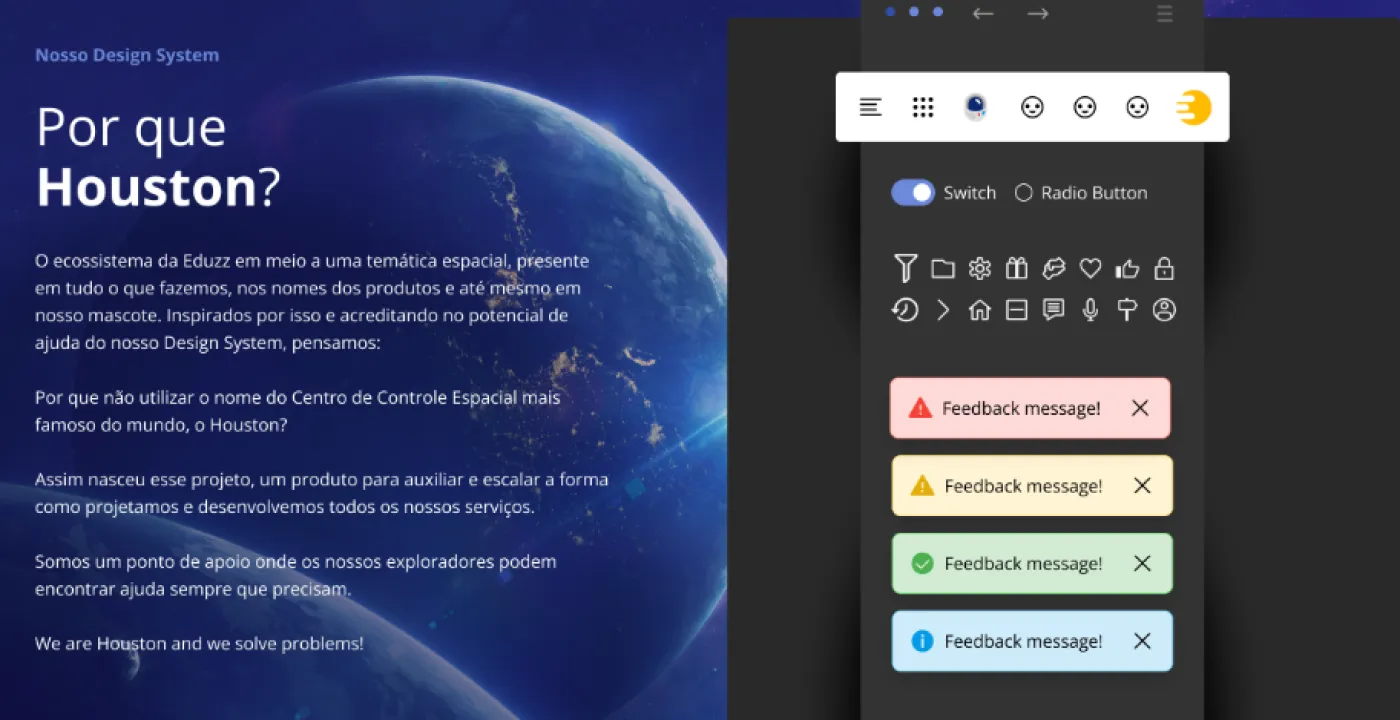
The name came from the company’s own culture. Eduzz already used a space theme for its product names and mascot; a system whose job is to support the people building things could only be named after the most famous control center in the world.
The solution
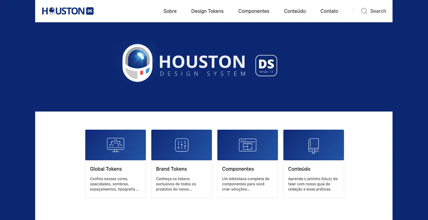
The system was organized in layers:
- Global tokens: colors, typography, spacing, radii, and shadows shared by every product.
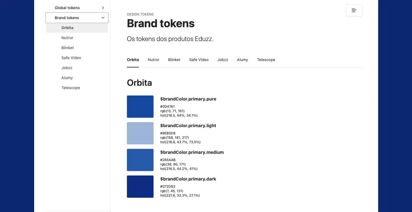
- Brand tokens: each product in the ecosystem has its own palette but inherits the same structure. That allows distinct identities without breaking consistency.
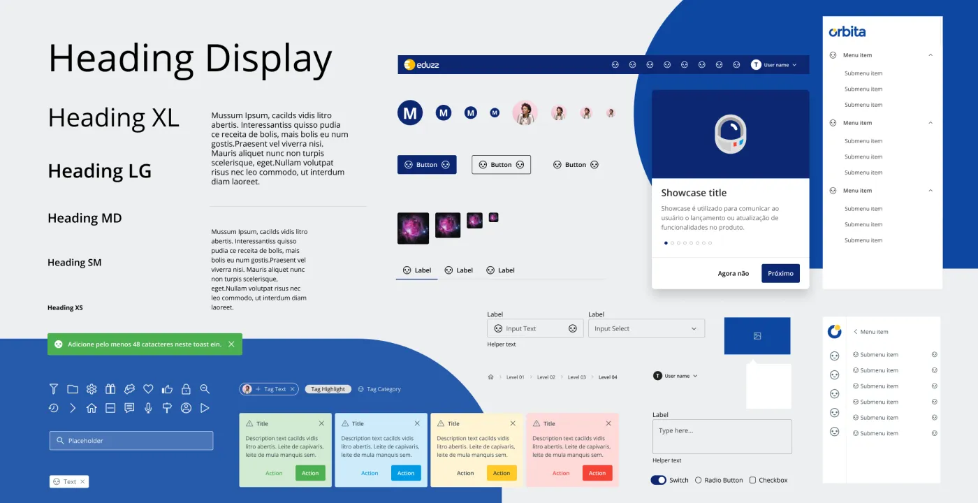
- Components: buttons, forms, feedback, navigation, each with usage, anatomy, code, and accessibility documented.
- Content: writing and tone guidelines.
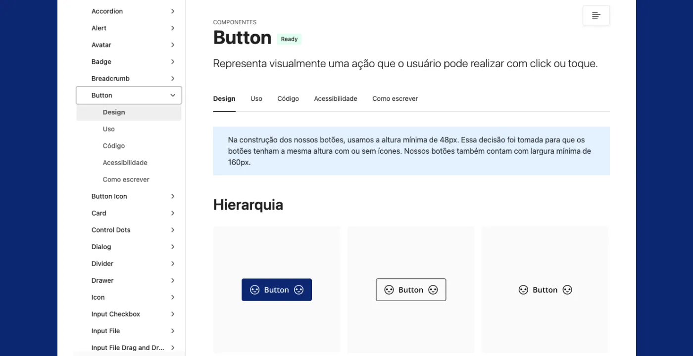
Every component page follows the same structure, with Design, Usage, Code, Accessibility, and How to test tabs. Whether you come from design or engineering, you land on the same source of truth.
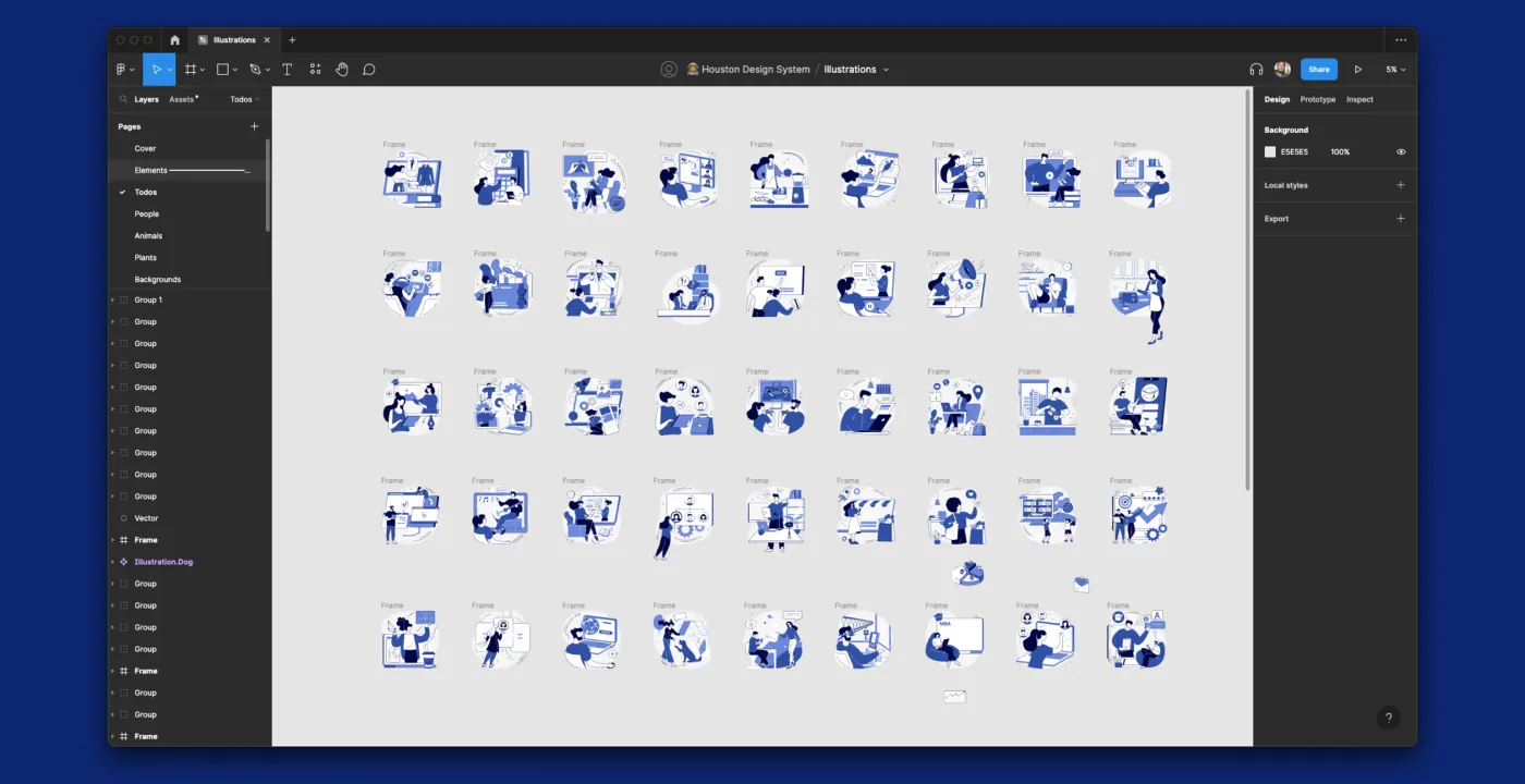
In Figma, the library mirrored the documentation: typography, components, and icons organized for product teams to consume.
What changed
Product teams got a shared starting point. An interface question now had an address (the documentation), and a pattern change happened in one place and propagated to the products.
What I took from this project
A design system is an internal product, and its users are the team. The most important part wasn’t the prettiest component, it was documentation with the same tabs for design and engineering. A system nobody consults doesn’t standardize anything.
That lesson got more relevant once I started building with AI agents. An agent doesn’t guess a pattern, it follows what’s written down. A named token and a documented usage rule work for both: the team and the agent.