Interactive experienceYear in Review 20222022
The sales numbers were already in the dashboard, in tables. The recap turned that data into recognition, in the format people already use to tell their own lives.
- Client
- Eduzz
- Role
- UI designer and visual identity
- Timeline
- 6 weeks
- Disciplines
- UI Design, Visual identity, Storytelling
The context
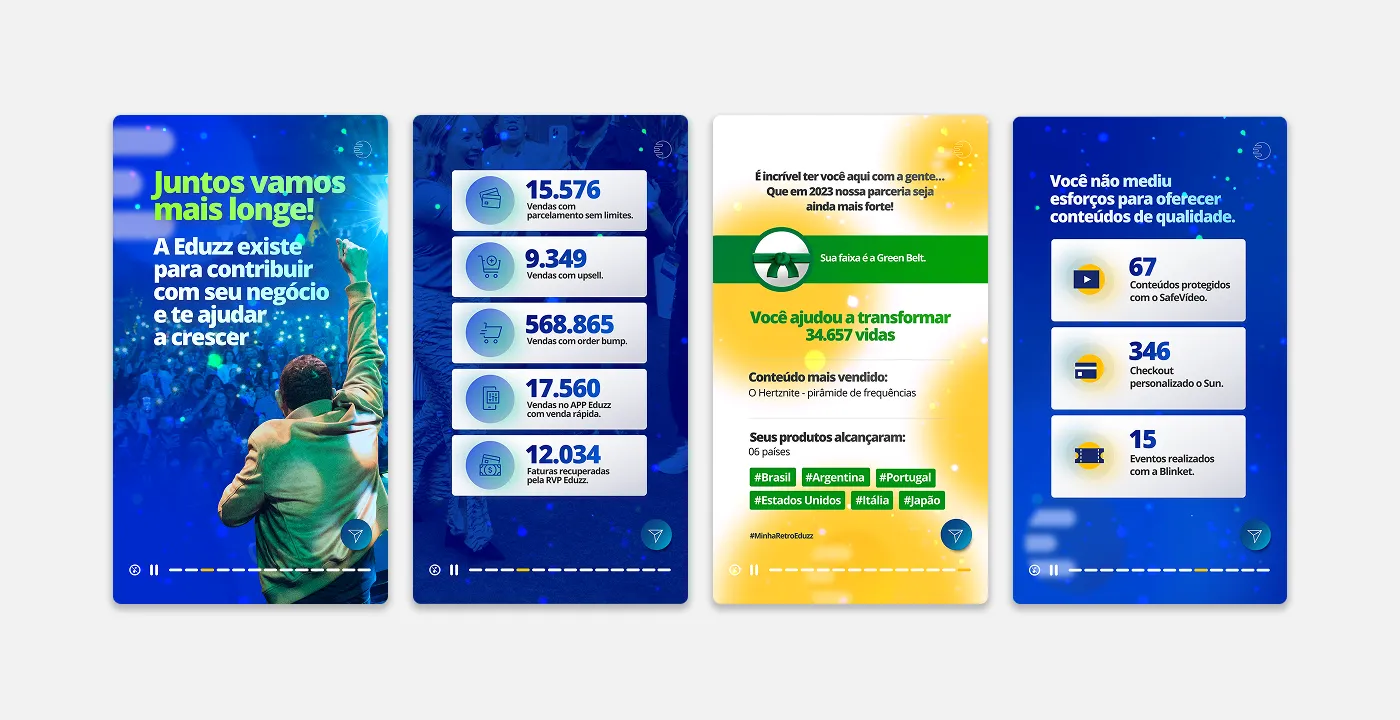
At the end of 2022, Eduzz wanted to do something the big consumer platforms were already doing: give customers back, as a story, what they had built during the year. On Eduzz, the customer is the digital creator (someone who sells courses and other digital products), and their wins are sales, students, reach, and countries.
The pain
All the data was already in the creator dashboard, in tables and charts. The problem is that a dashboard informs, but it doesn’t move anyone. For the platform, year-end is the moment to strengthen the relationship, and a report doesn’t strengthen a relationship with anybody.
The research
Two decisions guided the project:
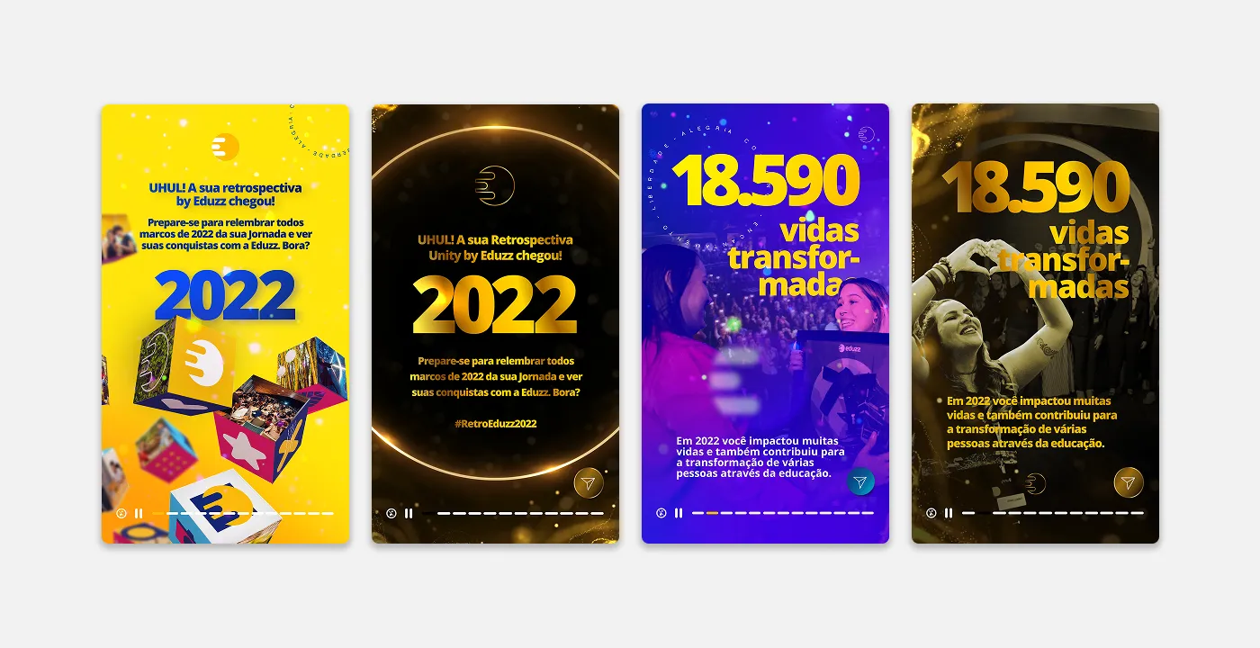
- Stories format. It’s the language creators already use to tell their own story, and something they can share effortlessly.
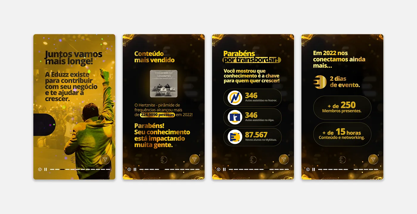
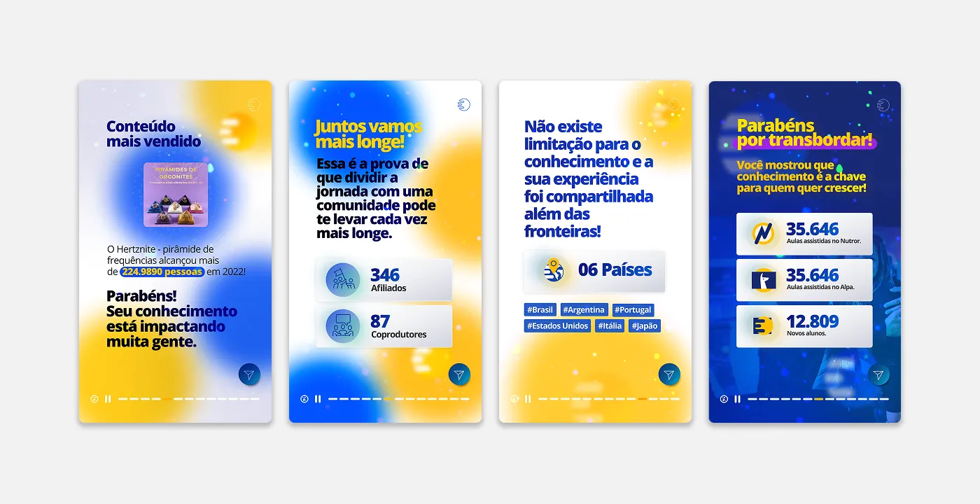
- One idea per screen. Each screen carries one big number, one short sentence, and one meaning. “Lives transformed” carries more weight than “students enrolled.”
The solution
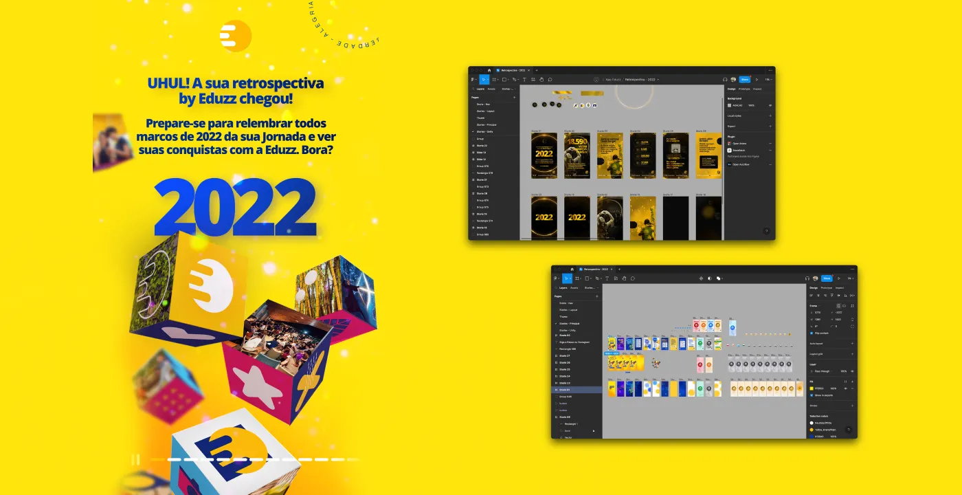
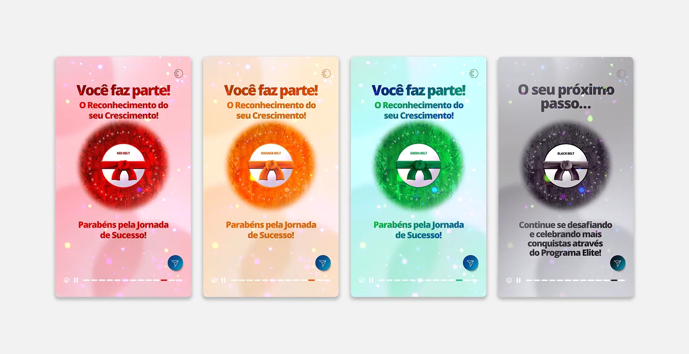
The identity grew out of the brand’s yellow, with cubes and three-dimensional shapes, and got a dark-and-gold version for the celebration moments.
What came next
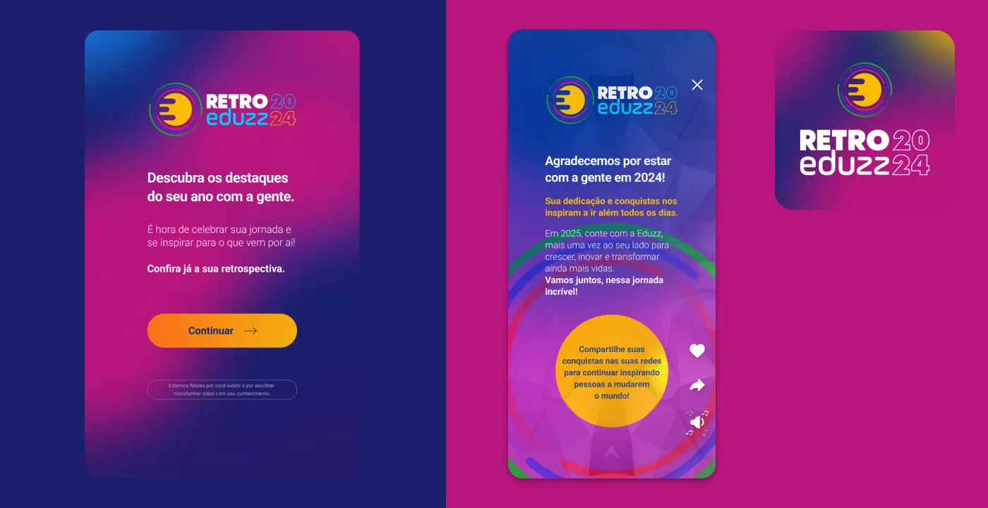
The following recaps kept the format and started measuring which screens got shared the most. That data was the starting point for the Year in Review 2024.
What I took from this project
The data already existed and the platform already existed; what was missing was the narrative. Often the opportunity isn’t building a new feature, it’s telling users what they already have in a different way.
The design is a single template. What fills each screen is the data the platform already had on each creator.