Interactive experienceYear in Review 20242024
What do creators actually share? I designed this "Wrapped" from last edition's data, not from my own taste.
- Client
- Eduzz
- Role
- Product designer
- Timeline
- 2 weeks
- Disciplines
- Discovery, Benchmarking, Stakeholder ideation, Branding
The context
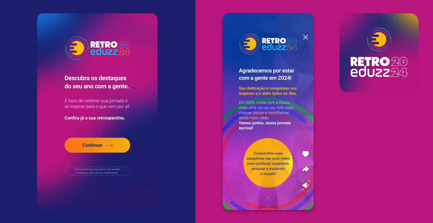
Every platform wants customers to feel they grew alongside it. Eduzz did that at the end of each year with a personalized recap: every creator (Eduzz sells digital products for creators) got a sequence of screens with their own wins, like sales, reach, best-selling content, and countries reached.
In 2024 the question wasn’t “how to make a beautiful recap,” because that already existed. It was how to make a recap people want to show off. A recap nobody shares is just a report with animations.
The pain
A recap does two jobs: it recognizes the creator, and it takes the brand outside the platform when they post it. Both depend on the content being about something the person is proud of. The risk was repeating the formula of filling screens with metrics and hoping someone found them interesting.
The research
Looking at what had already happened
The previous edition left behind a valuable piece of data: the share rate of each screen. Side by side, the numbers told a clear story.
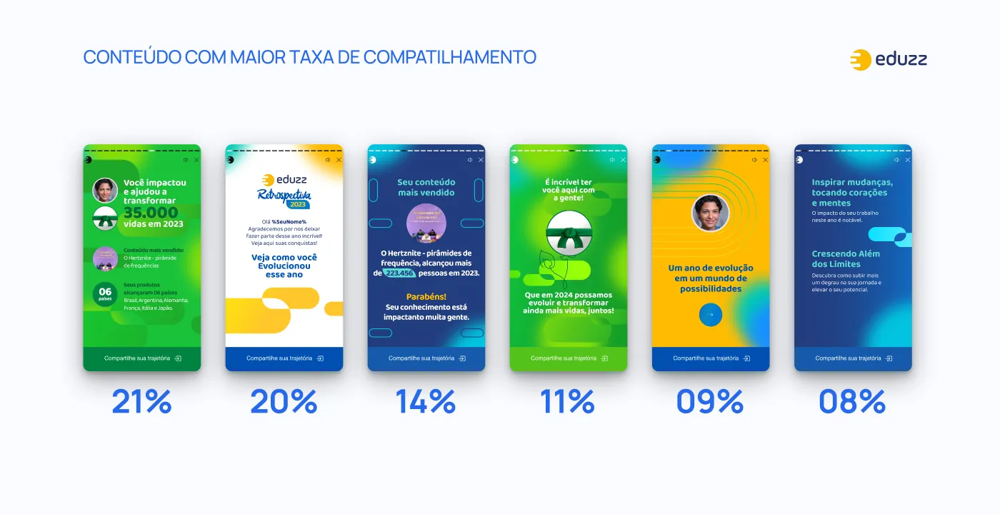
The most shared screen (21%) wasn’t about revenue. It was the one saying how many lives the creator helped transform. Right behind it (20%) came the personalized opening with the person’s name. The generic screens with institutional messages sat at the back of the line.
People don’t share numbers. They share what the numbers say about them.
Benchmarking
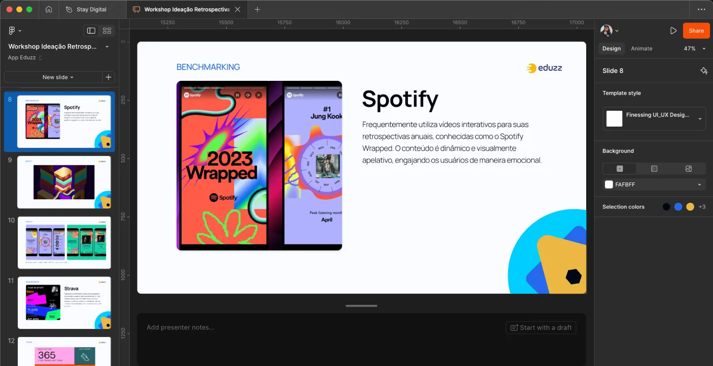
Spotify Wrapped is the obvious reference, and for good reason: stories format, one idea per screen, personal data turned into identity (“you’re in the top 0.5% of listeners…”). Benchmarking was used to understand the pacing and the language, not copy the look.
Ideation with stakeholders
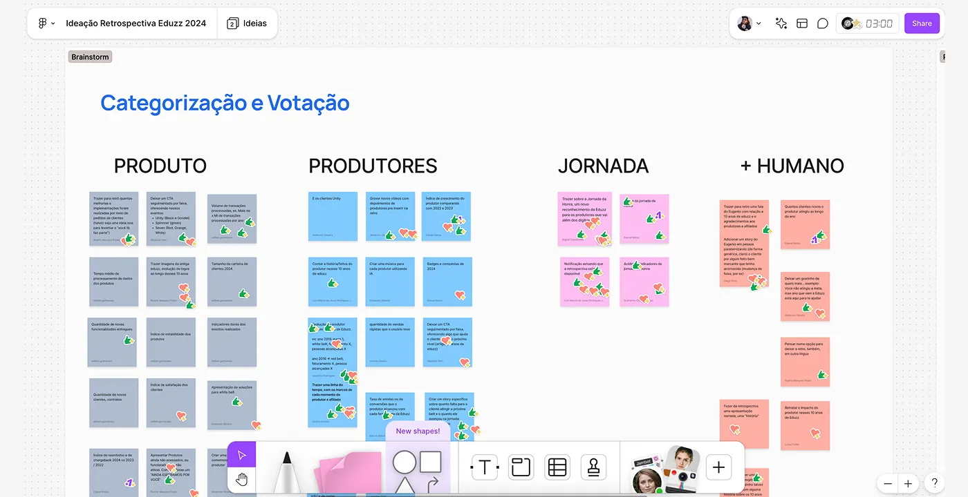
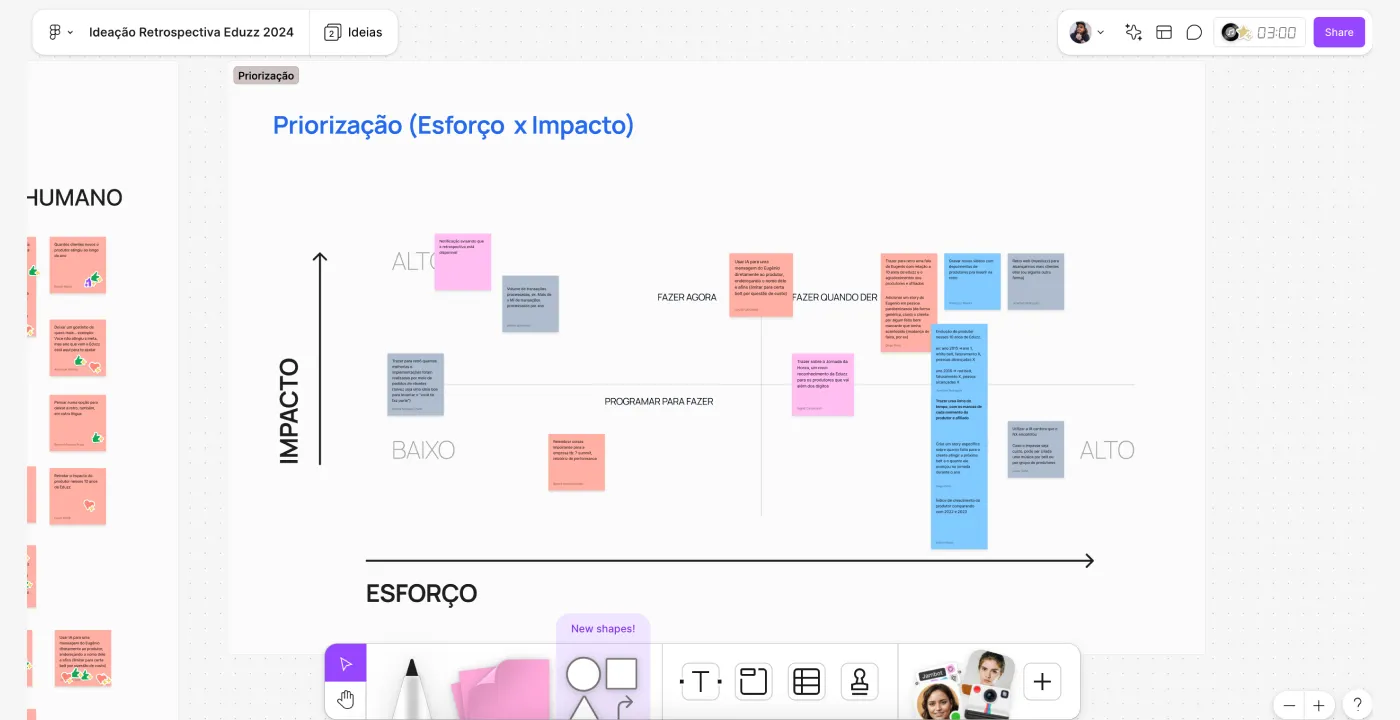
In October 2024, a stakeholder workshop grouped the ideas into four tracks: Product, Creators, Journey, and +Human. Then each idea was placed on an impact vs. effort matrix to decide what made it into this edition.
The solution
The narrative was built as a journey: it starts with the creator (personalization), moves through their impact on people, and ends looking ahead.
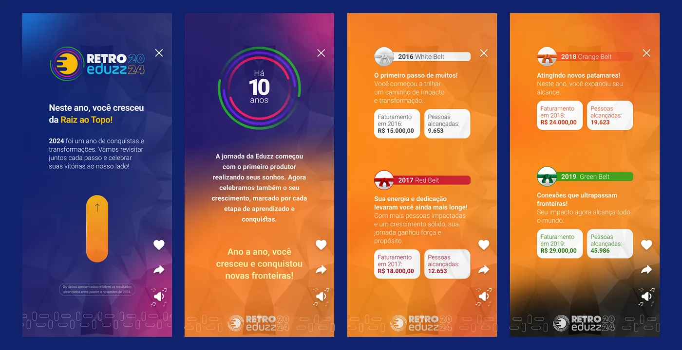
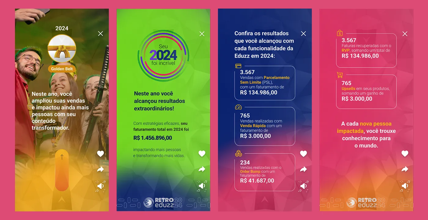
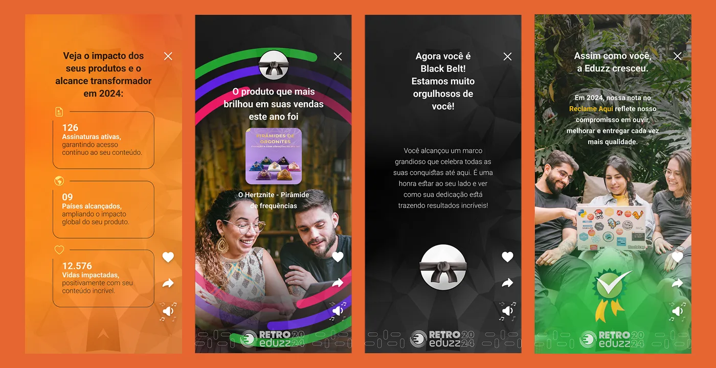
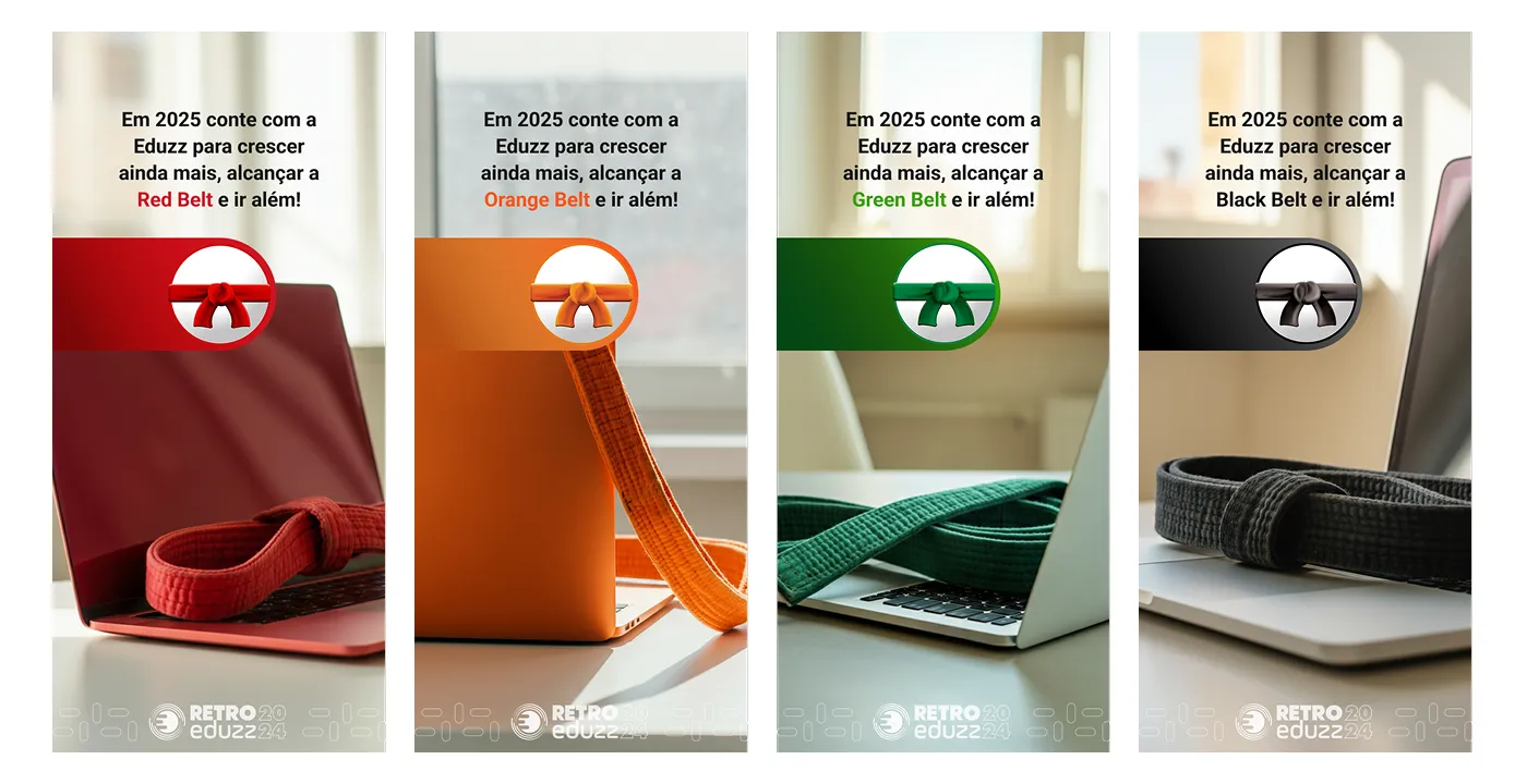
The ending ties the recap to the platform’s recognition program: each creator sees which belt they can reach in 2025, whether Red, Orange, Green, or Black Belt. The recap stops being just a look back and becomes an invitation to the next year.
The prototype was built to be interactive, so stakeholders could navigate it the way a creator would, on a phone, screen by screen.
What I took from this project
The best design input on this project didn’t come from an interview or a reference. It came from the previous edition’s share data. Before coming up with new ideas, it pays to look at what users have already told you through their behavior.