WebsiteOR&C Advogados2025
Two areas of law, two audiences, one website. Nobody has to read what isn't meant for them.
- Client

- Role
- Product builder: strategy, design, and AI-assisted development
- Timeline
- About 4 weeks
- Disciplines
- Information architecture, UX/UI, Content, Local SEO
- Live
- Visit the site
The context
OR&C Advogados (Oliveira Ribeiro & Chemim) is a young São Paulo law firm with two partners, working in two very different practices: business law, focused on debt recovery and collections, and real estate law, focused on getting properties legally regularized. Whoever hires one practice is rarely the one who hires the other. On one side, a CFO with a portfolio of late payers. On the other, a family with a property that has no deed.
The website had a clear goal: generate qualified leads and convey the seriousness a small firm has to prove more than a large one.
The pain
Law firm websites usually fail in one of two ways. Either they’re too generic (“complete legal solutions”) and nobody sees themselves in them. Or they list thirty practice areas and the visitor can’t tell whether the firm solves their problem.
Here there was an extra risk: mixing both audiences in a single storefront. The business owner trying to recover a debt doesn’t need to read about adverse possession, and vice versa.
The research
The core architecture decision was to separate the two practices without building two websites:
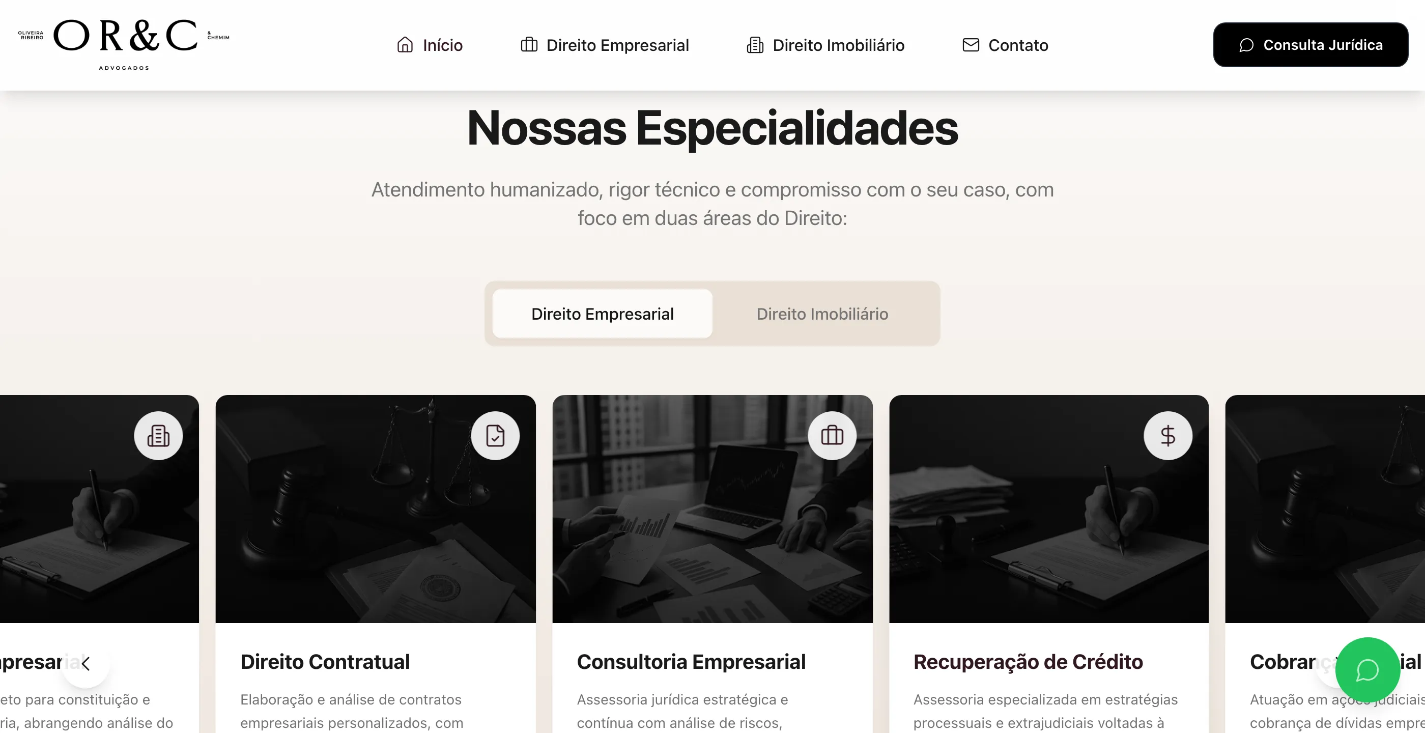
- Tabs on the home page. The practice areas section opens on “Business Law” and switches to “Real Estate Law” with one click. Each tab has its own cards: debt recovery, judicial collections, out-of-court settlements, advisory for investment funds; and property regularization, adverse possession, documentation, and lot subdivision and splitting.
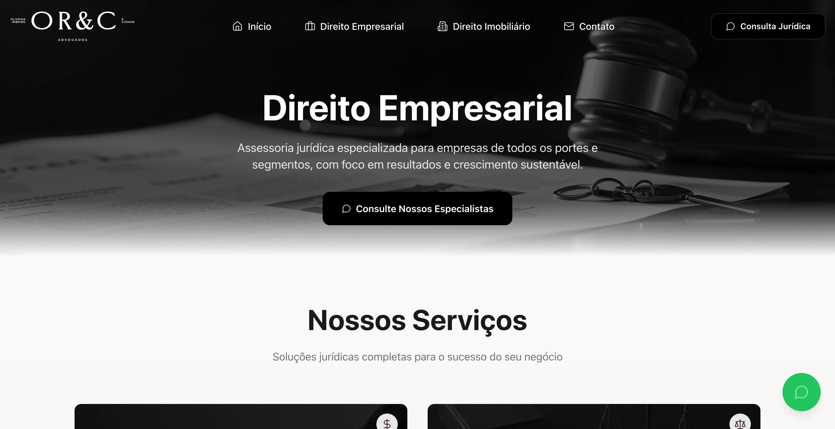
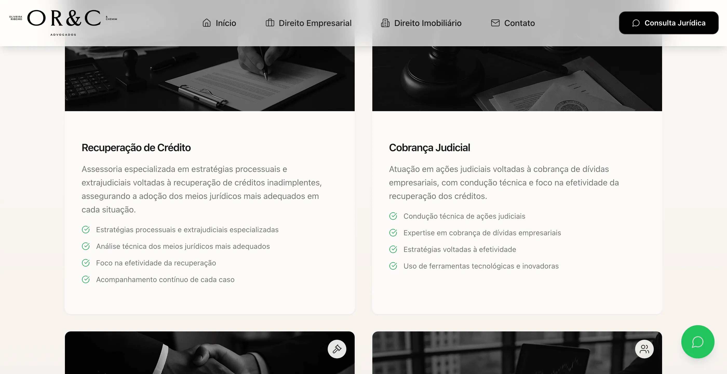
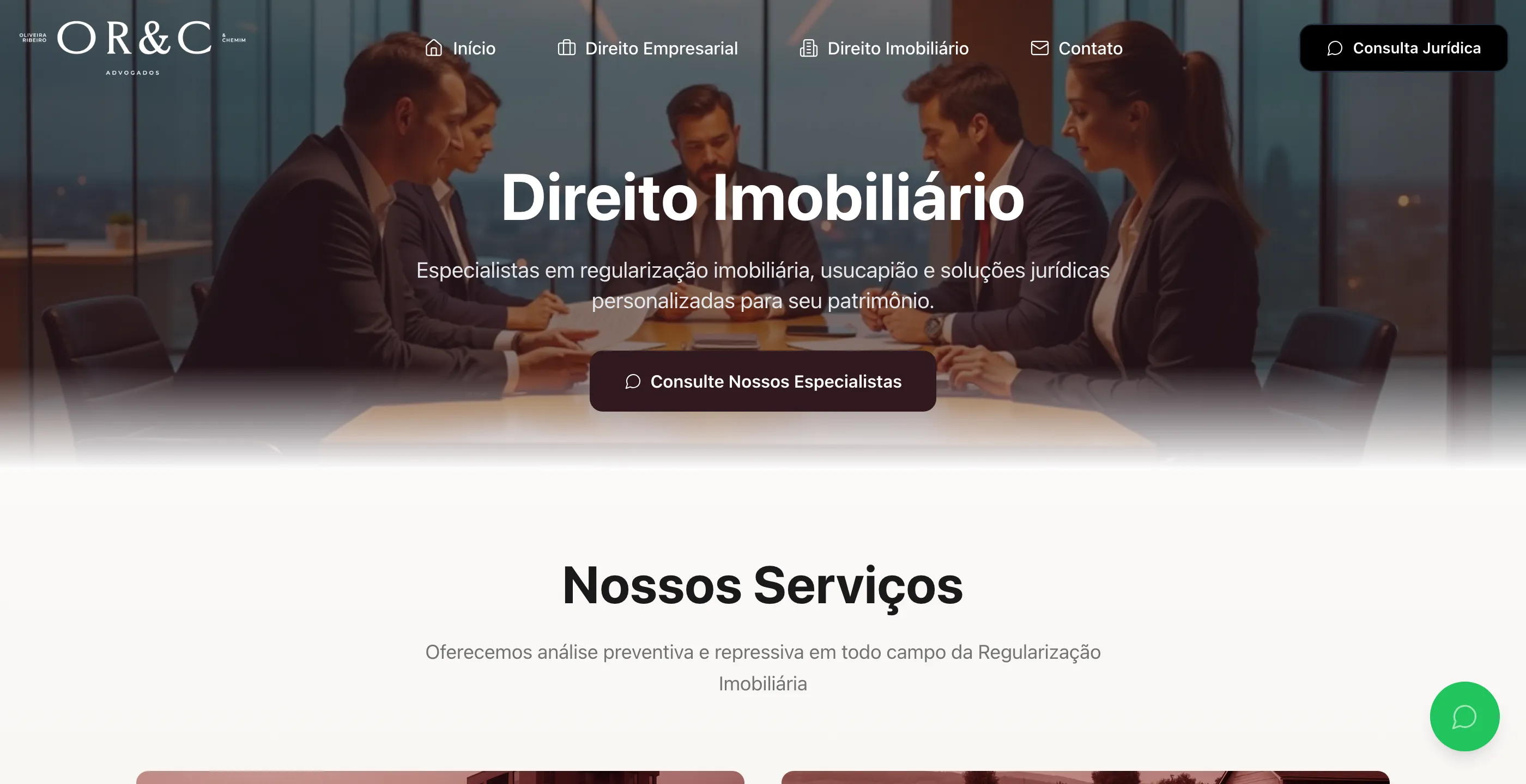
- One page per practice, with services detailed in cards (what it is, what the firm does, in bullet points) and an invitation to talk to a specialist at the end.
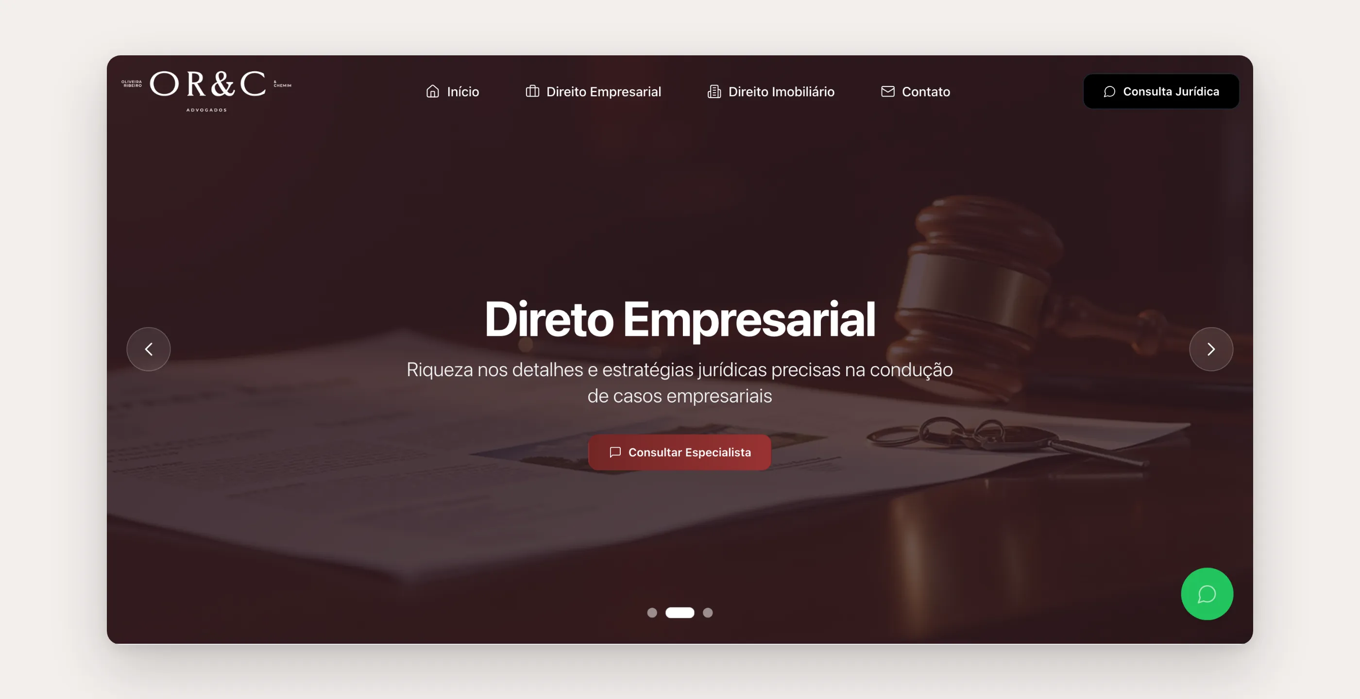
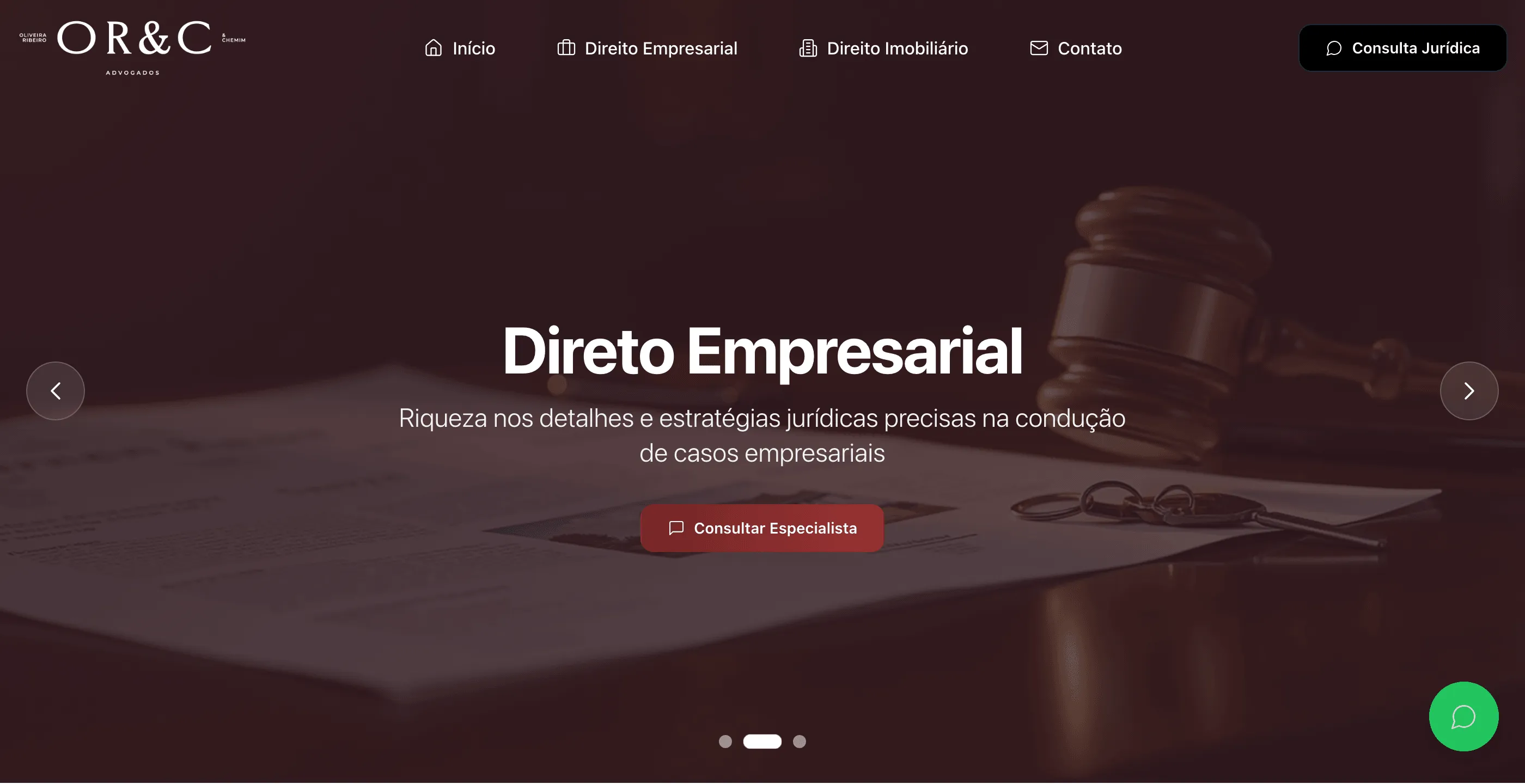
- The banner speaks to both audiences in rotation: asset recovery, business law, property regularization. Each slide has a button with that audience’s verb (“Recover debts,” “Talk to a specialist”).
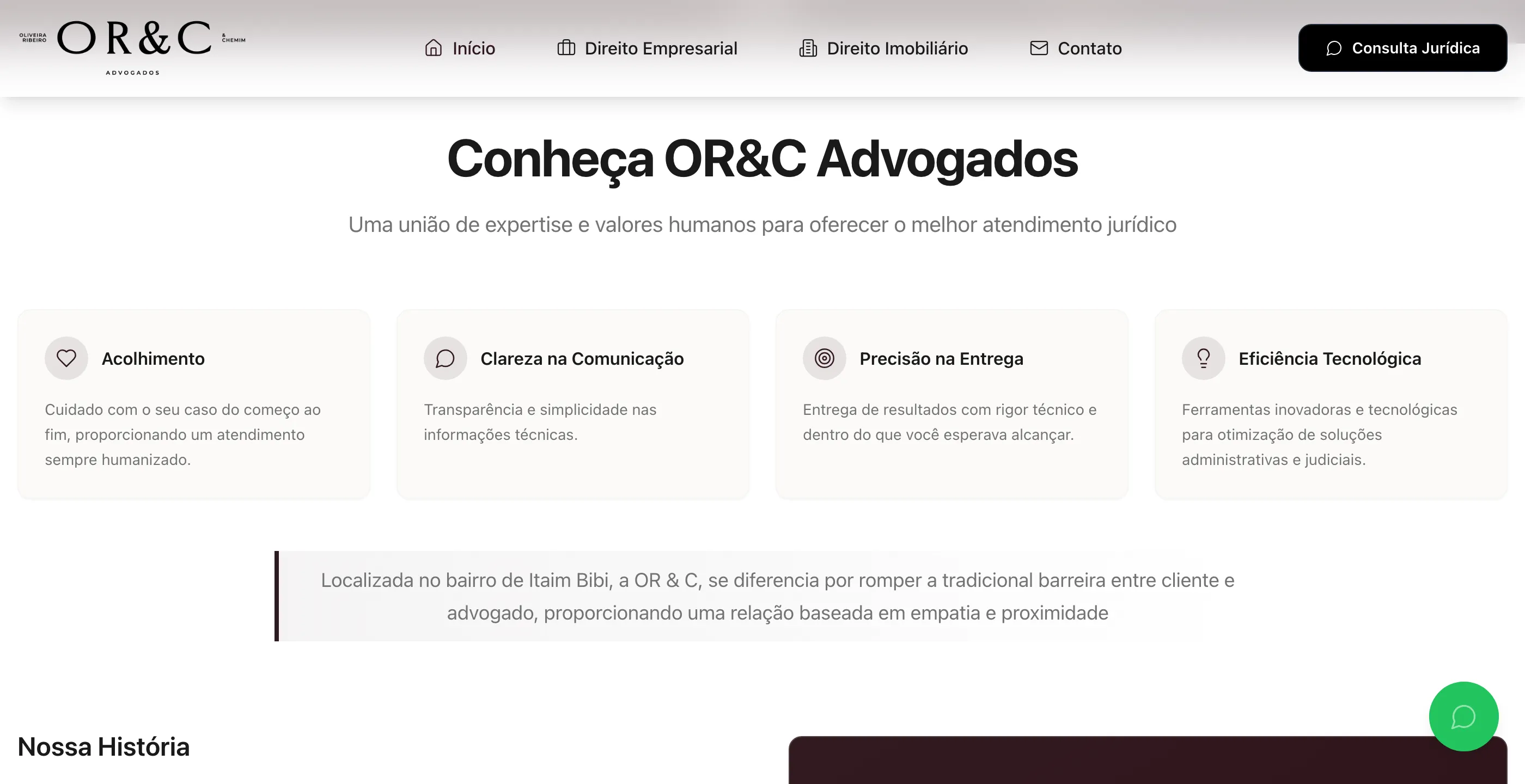
- Trust before the form: service principles, the partners’ story with their OAB (Brazilian Bar Association) registration visible, the team’s credentials, testimonials, and only then the contact.
The solution
The home page is a short funnel: who the firm is, what it does (in the tabs), who the people are, what clients say, and how to reach them.
Each practice page goes deeper without turning into legalese. Every service has a paragraph and a short list of what the firm delivers, so visitors can recognize their own case.
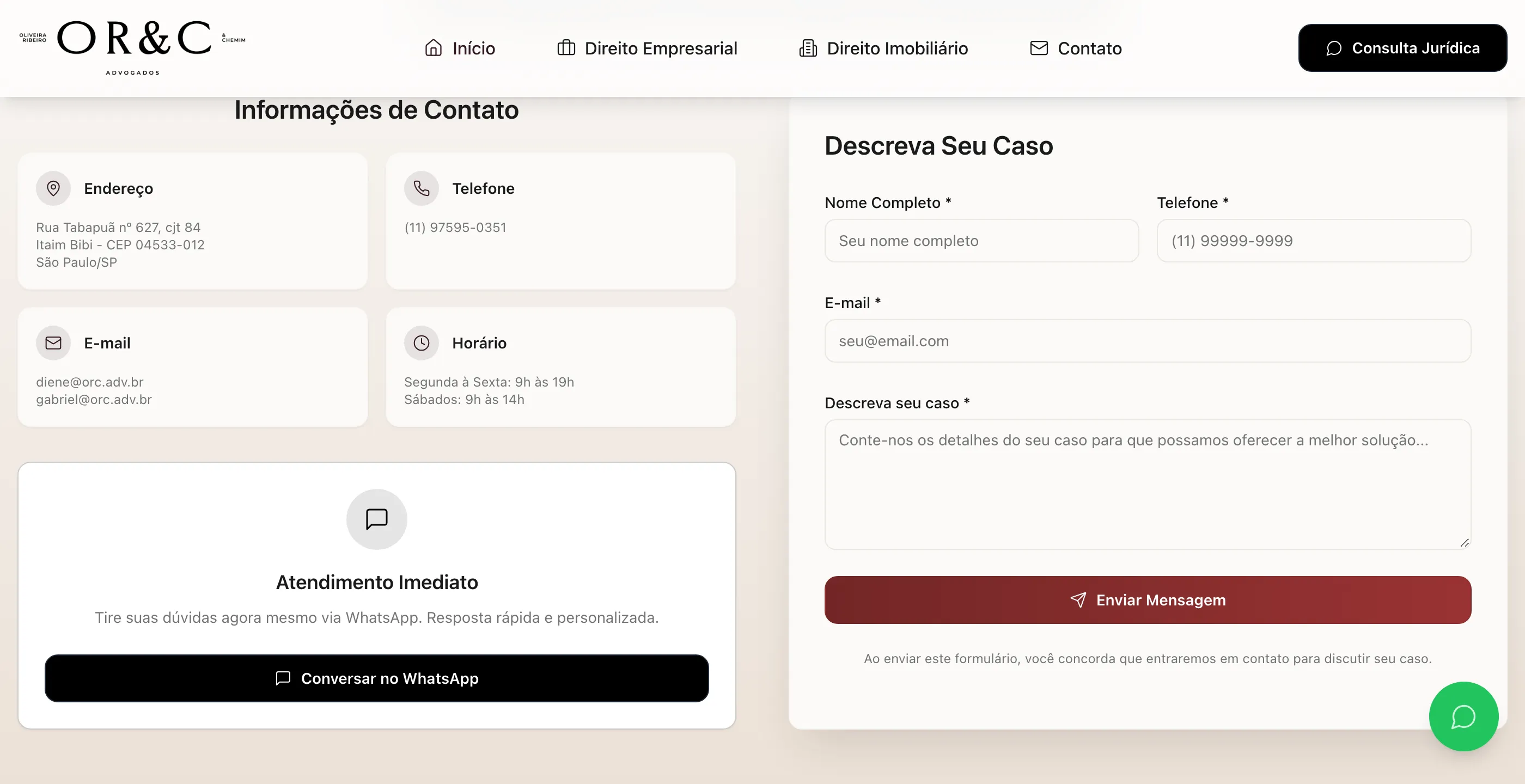
Contact has three doors: WhatsApp for immediate help, a form to describe the case, and the firm’s address. The form sends straight to the firm’s inbox through a transactional email service called from the browser, with no backend to maintain. Whoever writes through it has already described their case, so the first conversation with a lawyer starts one step ahead.
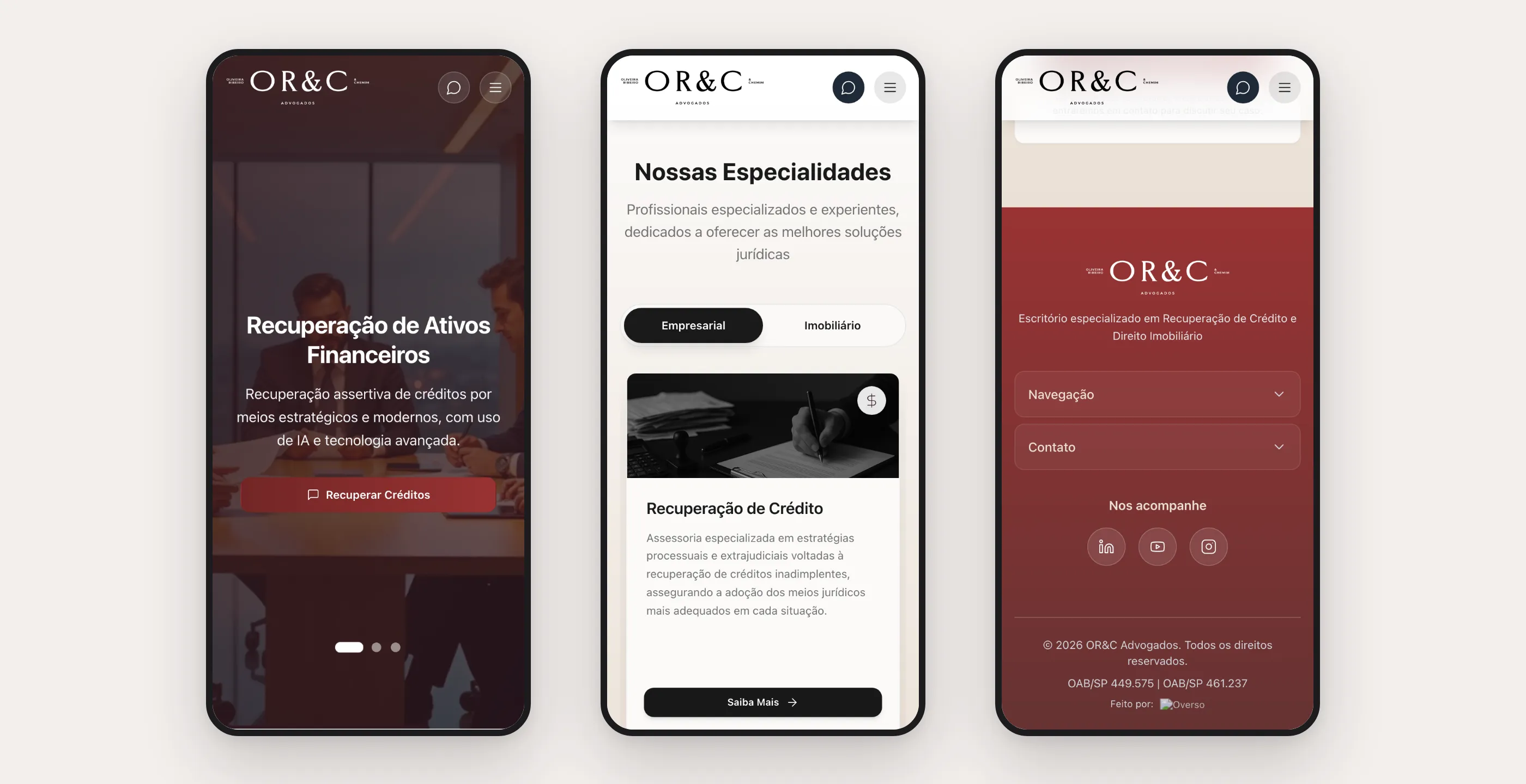
On mobile, the tabs, services carousel, team, and testimonials have dedicated versions, and the footer turns into an accordion so three columns of links don’t pile up.
How it was built
React with Vite, Tailwind, and accessible components, generated and iterated with an AI interface builder and adjusted by hand. Per-page SEO (title, description, canonical, Open Graph), structured data for a legal practice (schema.org LegalService) with address, service area, and partners, plus sitemap and robots reviewed after launch, when the domain changed. Lazy-loaded images, a cookie banner with per-category preferences, a privacy policy, and a tag manager to measure campaigns. Deployment runs automatically from the repository straight to the firm’s hosting.
This site also became a foundation for other projects: its structure (rotating banner, principles, practice areas, team, testimonials, CTA, and contact) was reused as the starting point for another corporate website for an independent professional.
What I took from this project
- Two audiences call for separation, not two websites. Tabs and per-practice pages solved it with half the maintenance.
- The button’s verb belongs to the audience. “Recover debts” converts a different person than “Talk to a specialist.” It’s worth writing one per slide.
- A small firm sells people. A visible bar registration, the partners’ credentials, and service principles do the job a big firm’s name does.
- A good structure becomes a product. This site’s skeleton shortened the next project.