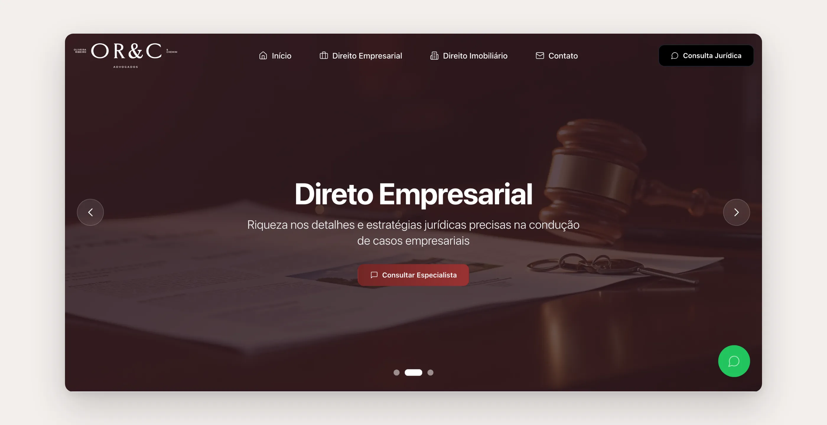
WebsiteDr. João Vitor Garcia2025
A patient with hand pain searches for the symptom, not the doctor. So the website explains the condition before offering the appointment.
- Client

- Role
- Product builder: strategy, design, and AI-assisted development
- Timeline
- About 6 weeks
- Disciplines
- Information architecture, UX/UI, Content, Local SEO
- Live
- Visit the site
The context
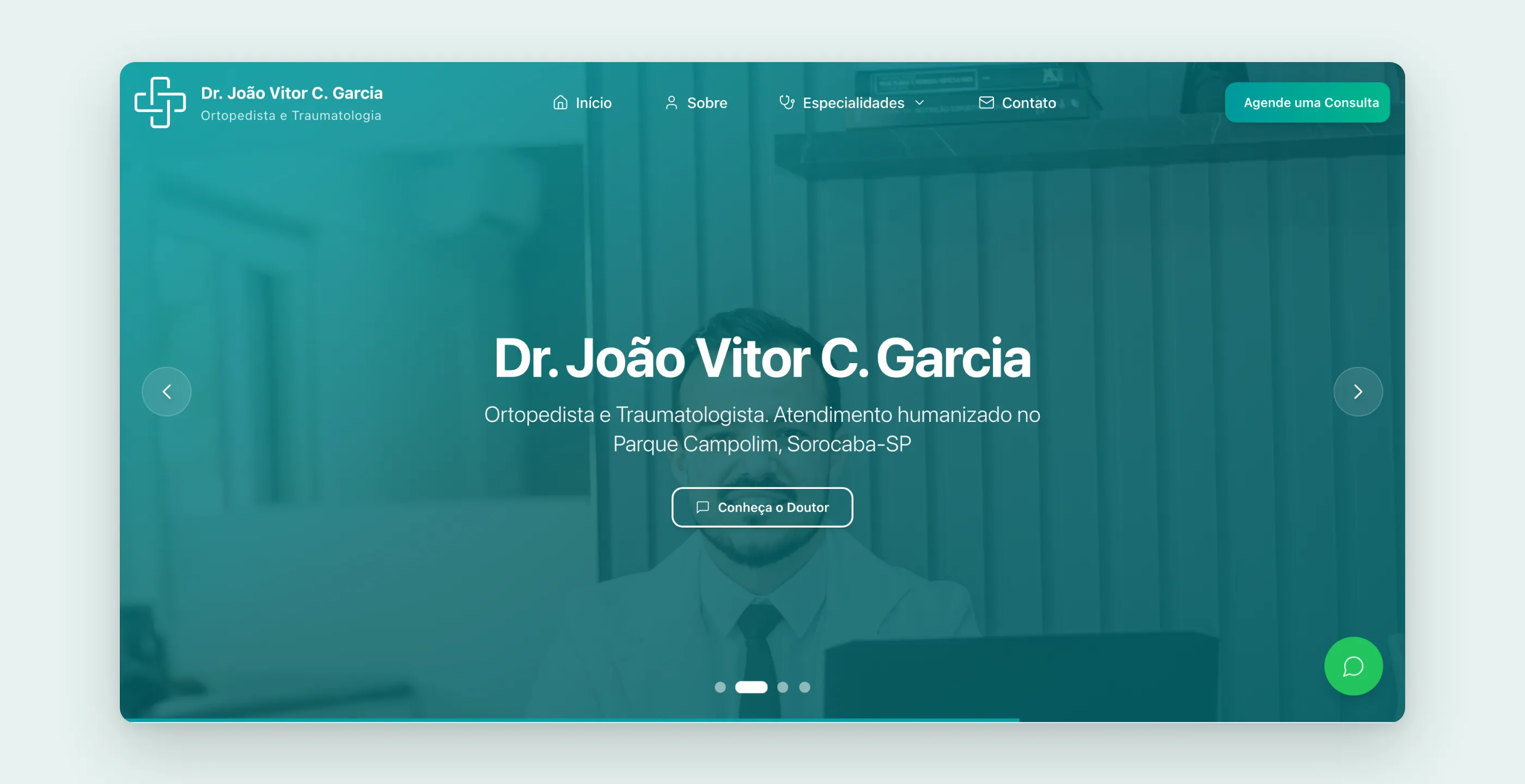
Dr. João Vitor Garcia is an orthopedic surgeon trained in hand and wrist surgery, practicing in Sorocaba, in the state of São Paulo. He was opening his own practice. He had a strong résumé (residency, fellowship, microsurgery) and an online booking system already in place. What was missing was the place where patients discover all of that before booking.
The business goal was easy to state: turn searches into booked appointments. To get there, the site had to do two things at once: convey medical trust and remove any friction on the way to booking.
The pain
People who land on an orthopedist’s website almost never arrive looking for the doctor. They arrive with a symptom: tingling in the hand at night, a finger that locks, wrist pain when holding a phone. They search for what they feel, end up on generic content, and only later decide who to see.
A site that only talks “about the doctor” loses that patient at the first search. And a site that explains things well but hides the booking button loses them at the last step.
The research
The information architecture came out of that reading of the patient’s path:
- Conditions as the front door. Each treated condition got its own page (carpal tunnel, trigger finger, De Quervain’s tendinitis, meniscus, lumbar disc herniation, knee injections, minimally invasive surgery), plus a “how the appointment works” page. Eight content pages, each with its own title, description, and keywords.
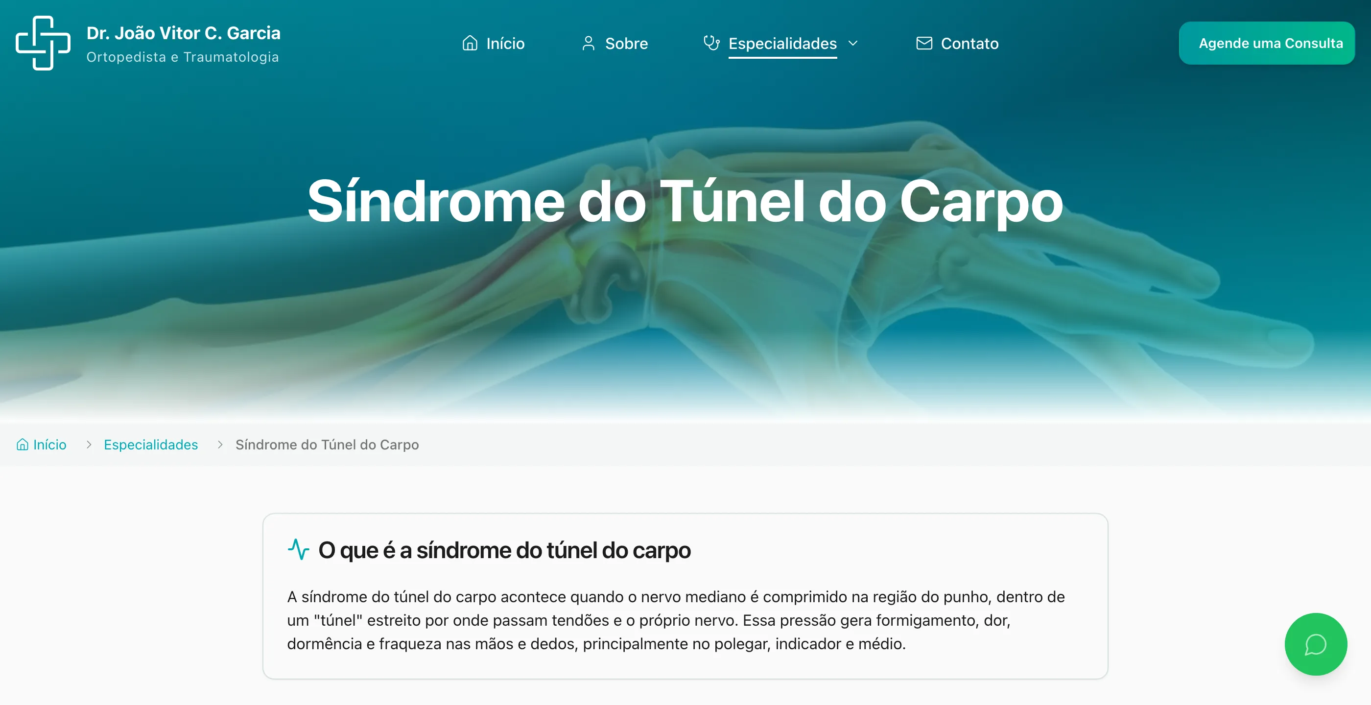
- A fixed outline per page: what it is, how it affects daily life, symptoms, causes and risk factors, treatment (conservative first, procedures after), FAQs, and the next step. Patients read about their own situation before reading any credentials.
- Credentials in the middle, not at the top. Training and areas of practice show up after the patient’s problem has been acknowledged. That’s where they carry weight.
- Booking everywhere. The button to the online calendar sits in the sticky header, the banner, every condition card, the doctor’s section, and the end of every page. A floating WhatsApp button for those who’d rather talk.
The solution
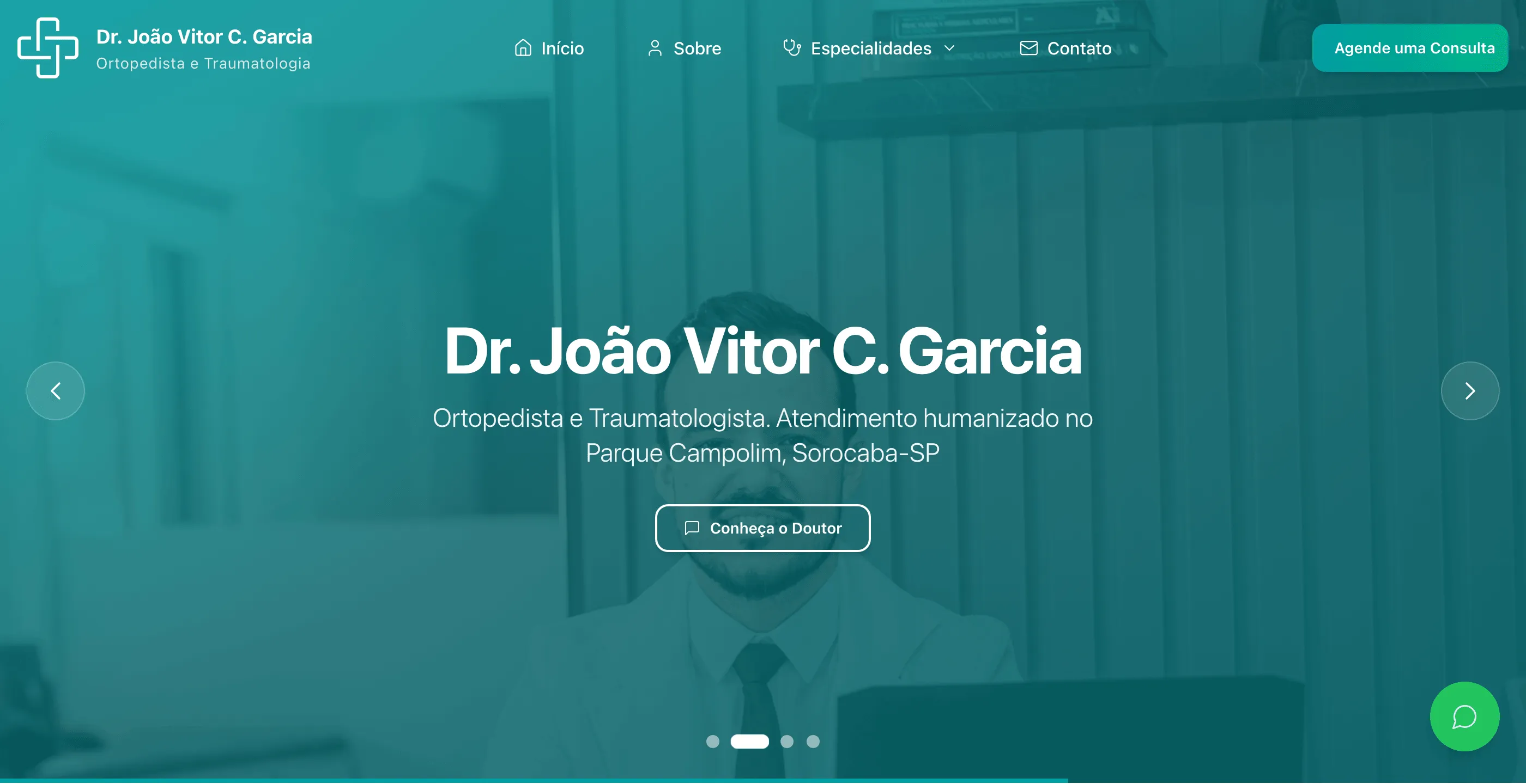
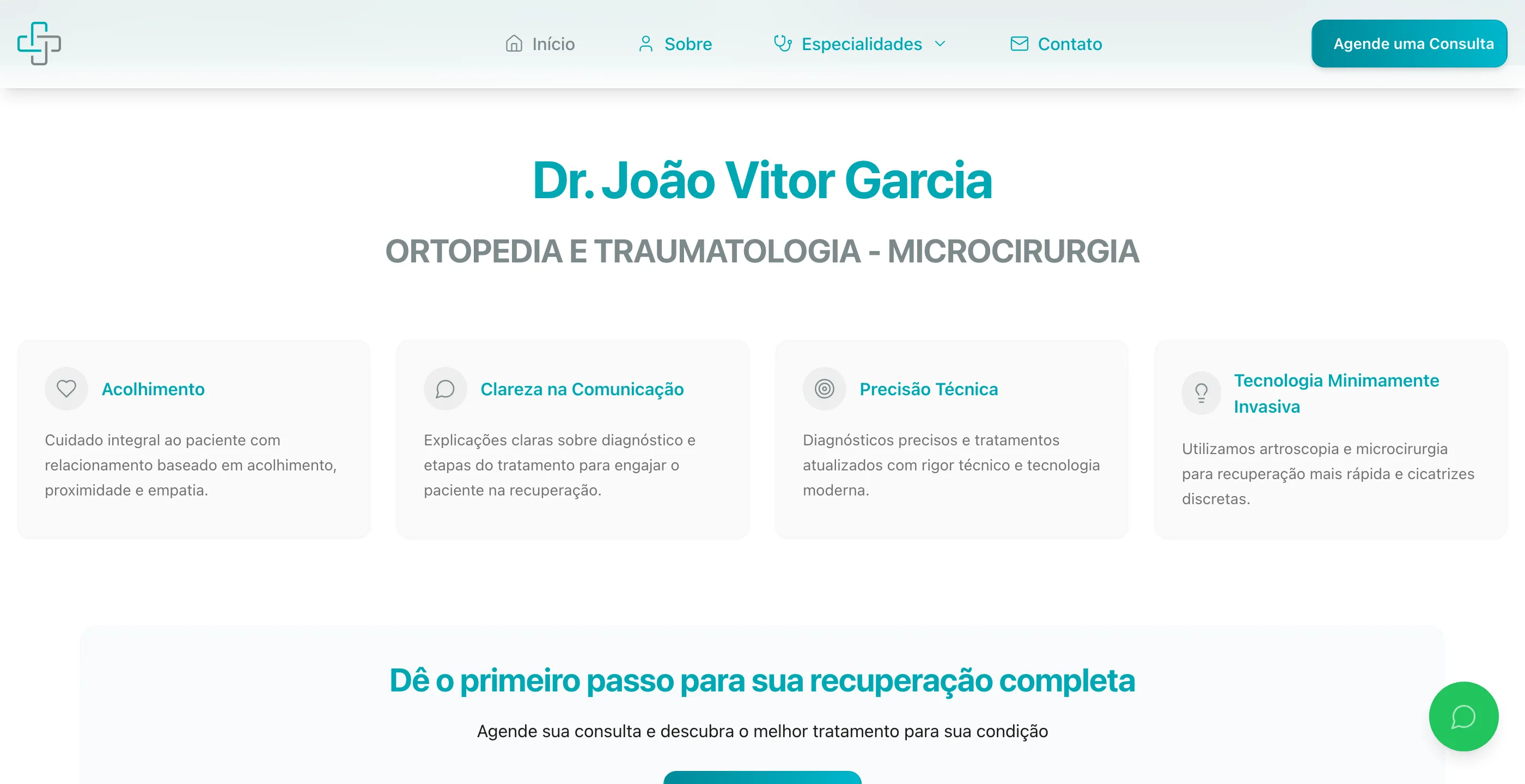
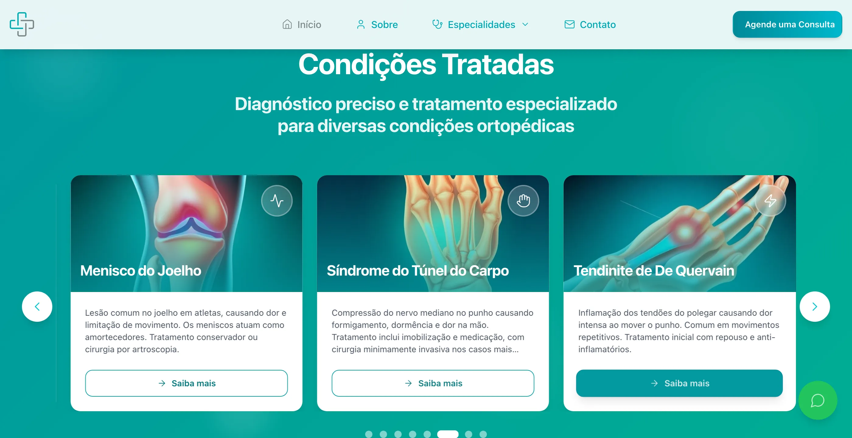
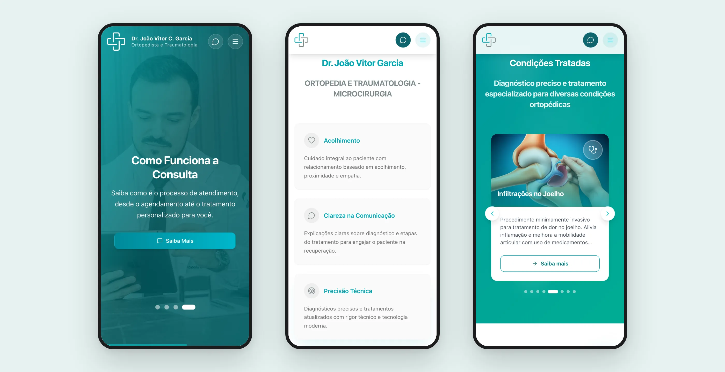
The home page works as an index of the practice. The pillars of care come right after the banner, followed by a carousel of treated conditions, each card leading to the condition page or straight to booking.
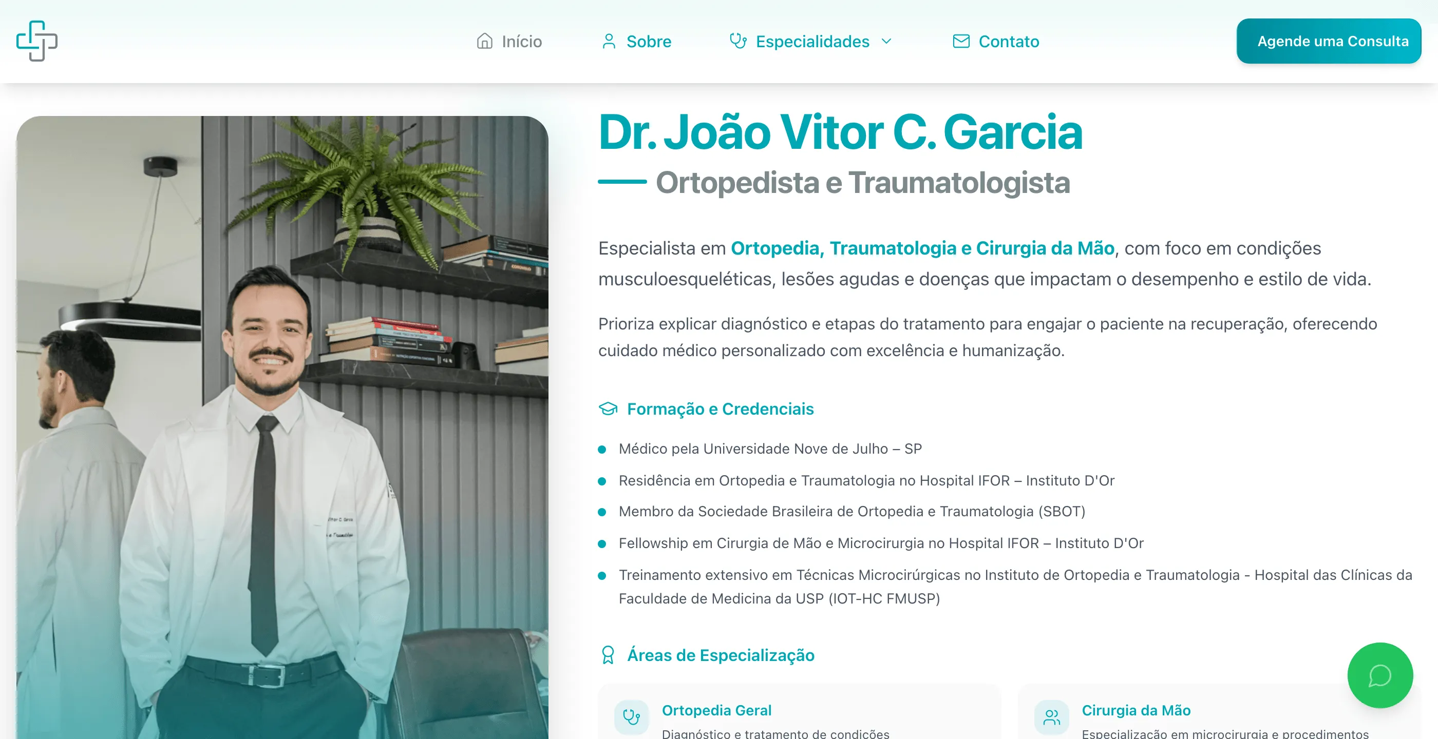
Dr. João Vitor’s section brings together a photo, training, and areas of specialization in short cards. It’s proof of competence, written for a layperson.
The condition pages follow the outline defined in the research. Since this is health content, the tone is informative and makes no promises about results; the ending is always the same invitation: book an evaluation.

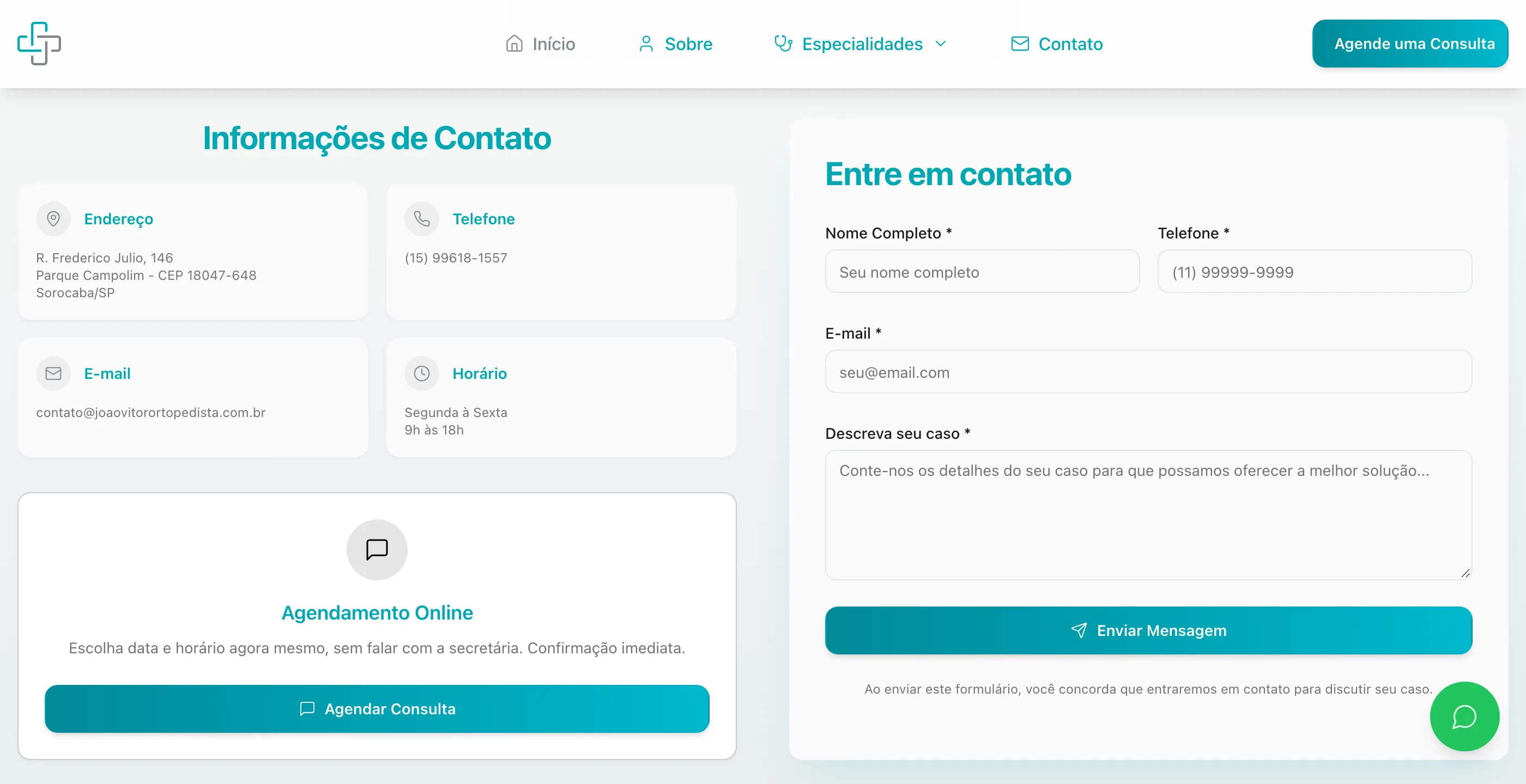
Contact was set up in three layers: online booking (no need to talk to the receptionist), WhatsApp, and a form for those who want to describe their case first. The idea is for the repetitive part, like explaining how the appointment works and booking a time, to get handled on the site, and for conversation to be left for those who need it. The form validates fields in the browser and sends through an email script on the hosting server itself, with no paid service in between.
On mobile, the site got dedicated versions of the banner, conditions, and testimonials, instead of just stacking the desktop layout.
How it was built
React with Vite, Tailwind, and an accessible component library, generated and iterated with an AI interface builder and refined by hand. SEO was treated as part of the product: per-page title, description, canonical, and Open Graph, structured data for a physician (schema.org Physician) with address and service area, sitemap, and robots. Privacy too: a cookie banner with separate preferences per category (necessary, analytics, marketing), stored in the browser, and a dedicated privacy policy.
Deployment is automatic: every approved change in the repository triggers the build and publishes via FTP to the hosting the client already had. No new server to maintain.
What I took from this project
- In healthcare, content is the conversion. Patients only click “book” after they feel someone understood their symptom. The condition page does that job better than any banner.
- Repeating the CTA isn’t clutter when it’s the only goal. The site has one action that matters and offers it at every decision point.
- Use what the client already has. An online calendar already paid for, shared hosting, and their own email. The site fit into the existing operation instead of creating a new one.
- AI speeds up building, not deciding. The AI builder cut weeks of repetitive code. The page structure, the content outline, and where the button shows up were still design work.