PortalAssociação Horizontes2025
For a nonprofit, the website isn't a storefront. It's where donors decide whether to trust it.
- Client

- Role
- Product builder: strategy, design, and AI-assisted development
- Timeline
- About 4 weeks, with updates throughout 2026
- Disciplines
- Information architecture, UX/UI, Content, AI-assisted development
The context
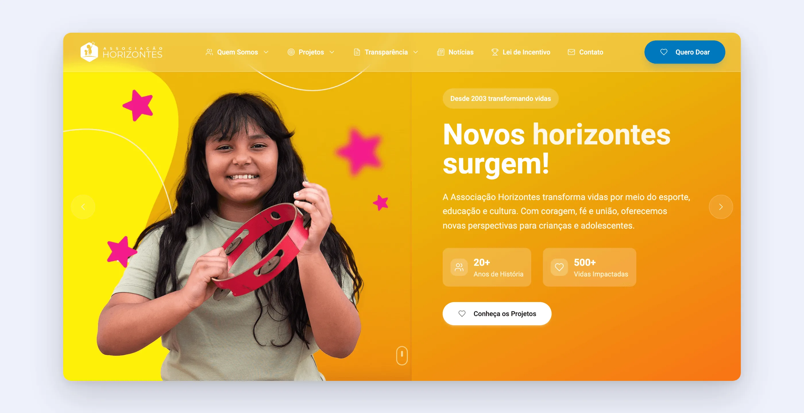
Associação Horizontes, in Votorantim, in the state of São Paulo, has more than twenty years of social work and serves children and teenagers through track and field, martial arts, dance, and recreational activities. It started in a makeshift locker room and grew into its own headquarters. It runs on donations from individuals, companies, and projects approved under Brazil’s tax incentive laws for sports and culture.
A first website was put together quickly, in a single day, just to claim the address. A few days later work began on the definitive version, with one goal that drove every decision: raise funds. From people who give a little and from people who can direct part of their taxes.
The pain
Nonprofits compete for attention with causes from all over the country, and donors have a question nobody says out loud: does this money actually get there? Without an answer to that question, no donate button works.
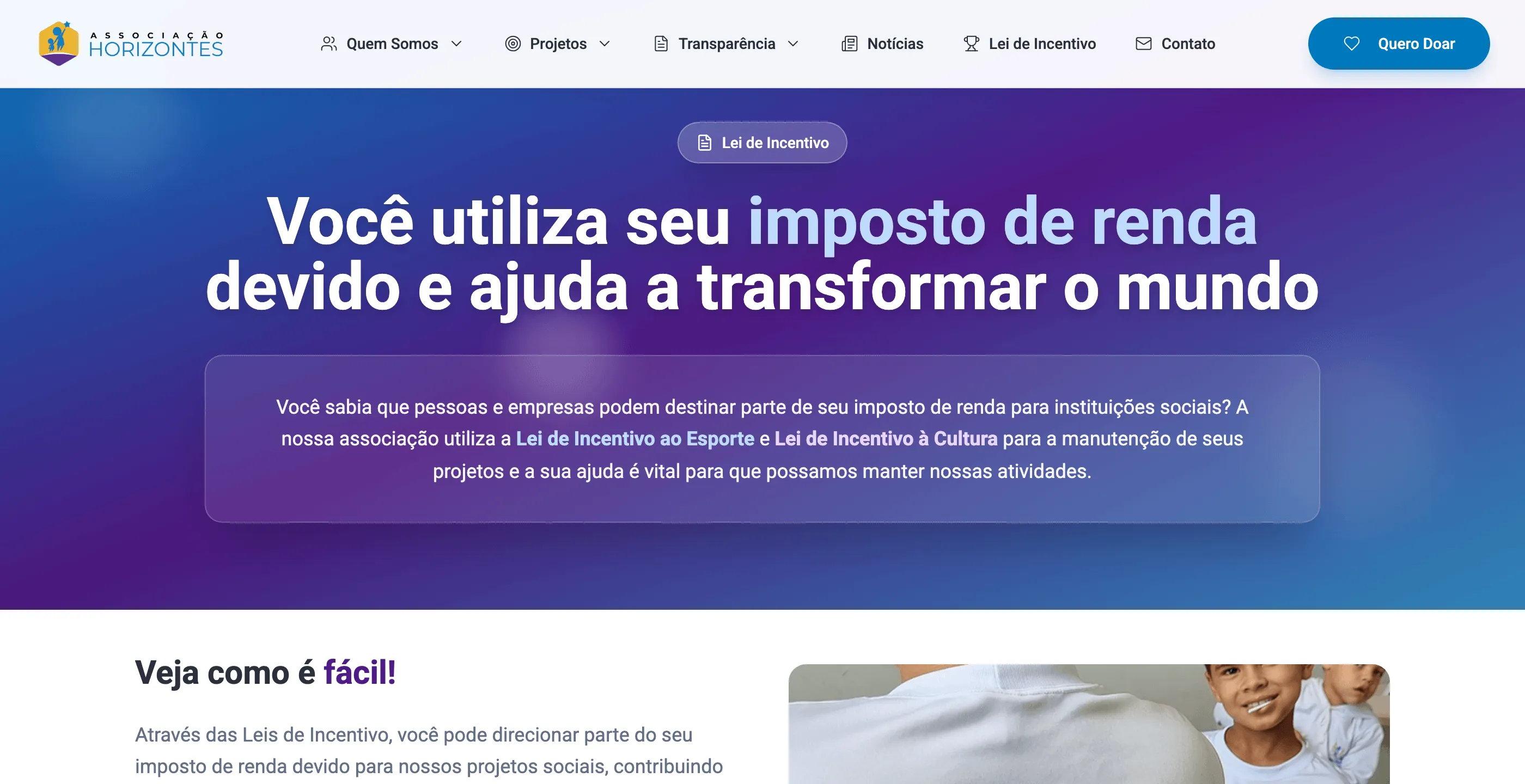
There was also an audience almost no small nonprofit website serves: companies and individuals who can direct part of their income tax to incentivized projects. They don’t know they can, and when they do, they don’t know how.
The research
The architecture was designed around three questions visitors arrive with:
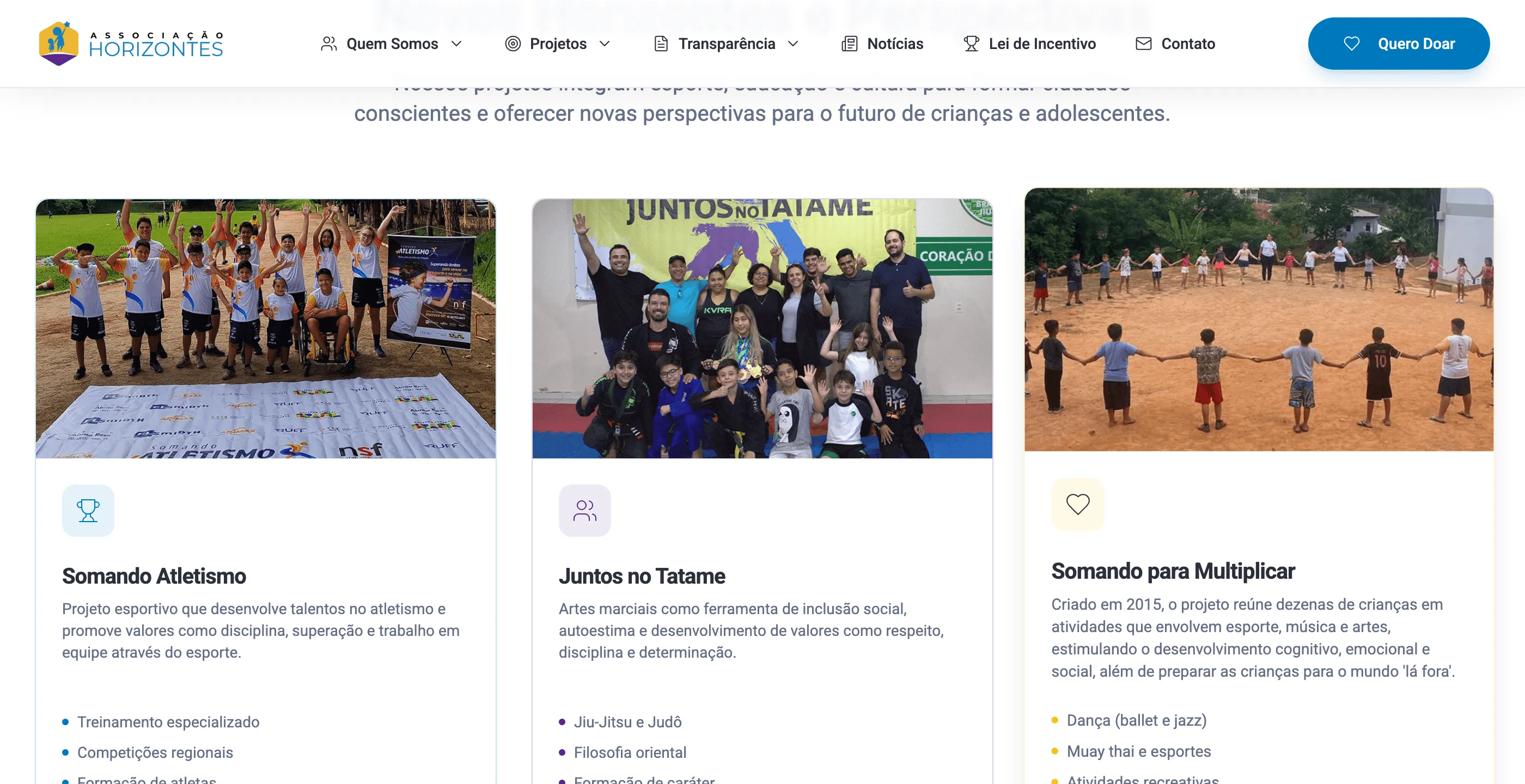
- What do you do? About us, history, headquarters, organizational structure, and one page per project, with its mission, activities, and numbers.
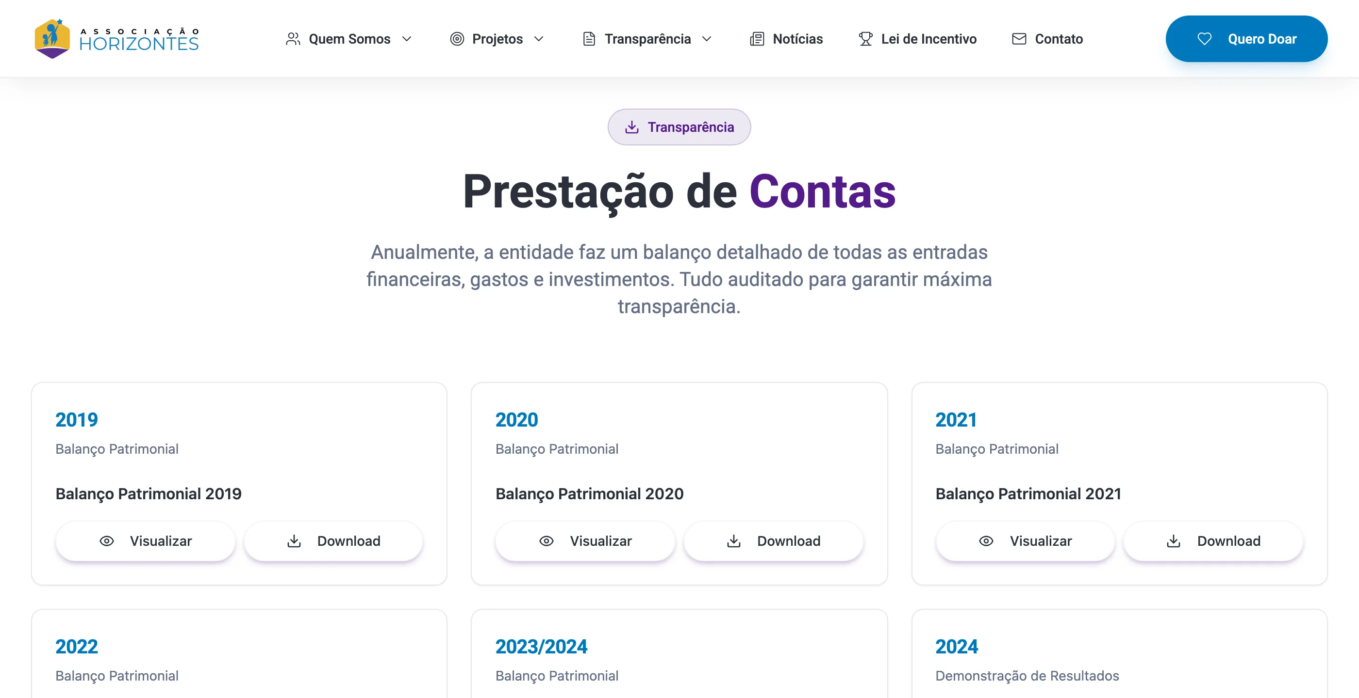
- Can I trust you? A whole transparency area: financial reporting with each year’s balance sheets and statements to view and download, official recognitions, and certifications.
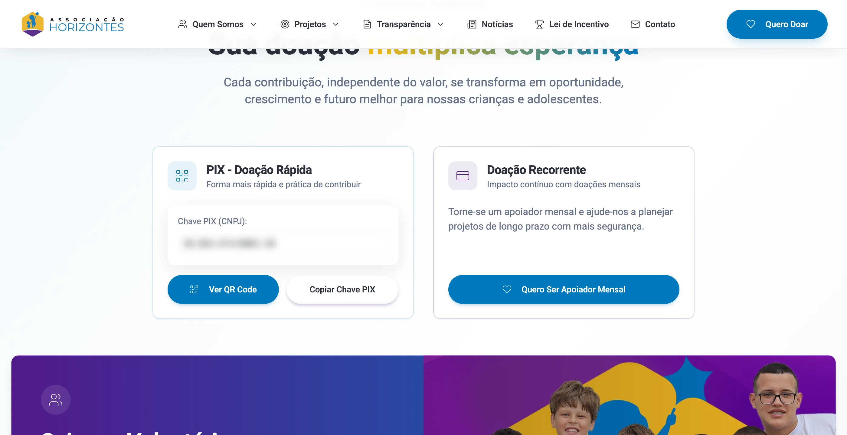
- How can I help? Three paths, from lightest to most committed: a quick donation via Pix (Brazil’s instant payment system), recurring donations, and volunteering. And a fourth, for those with taxes to direct: the tax incentive law.
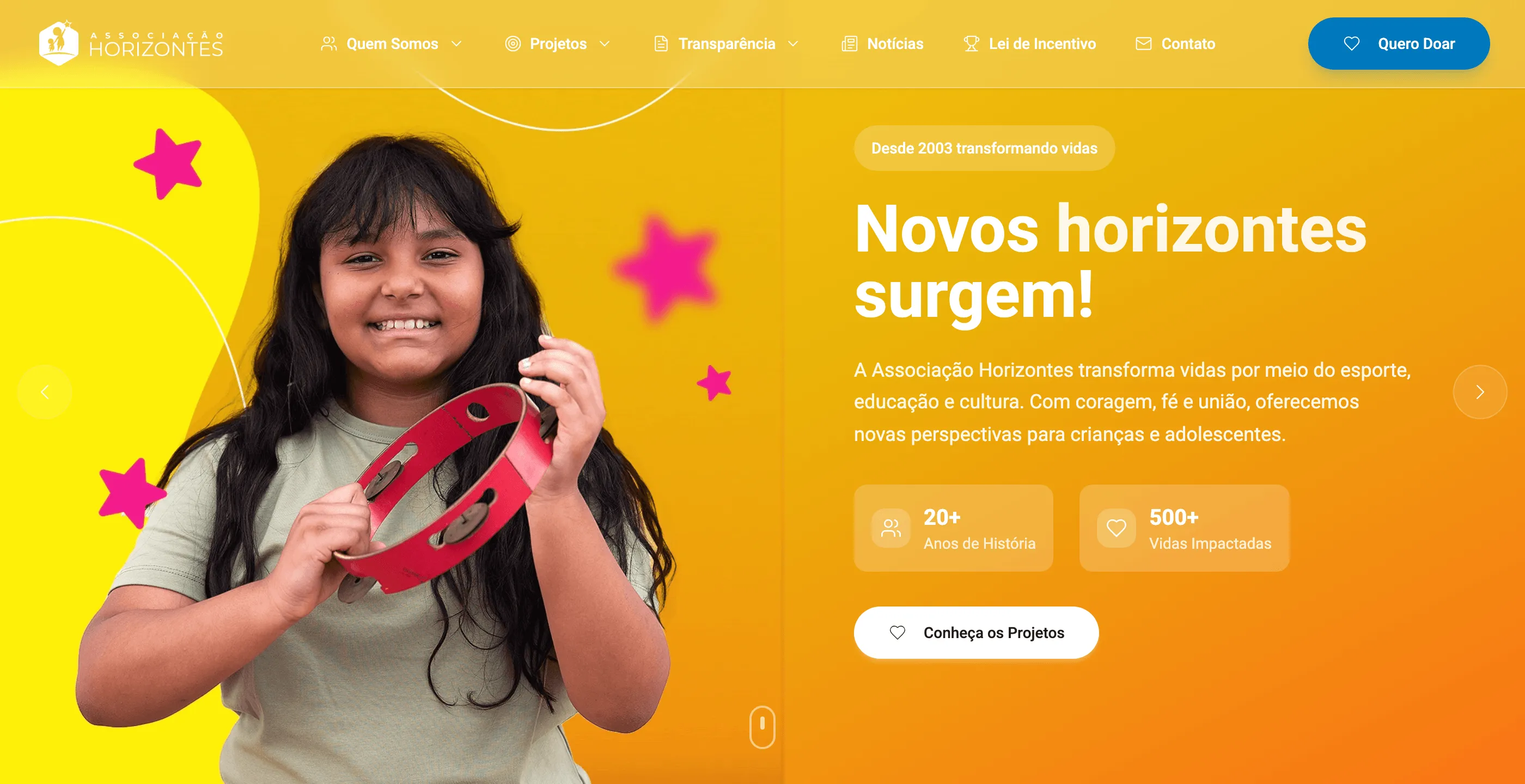
The menu follows that order. And the “Quero Doar” (I want to donate) button stays pinned to the top, highlighted, on every page.
The solution
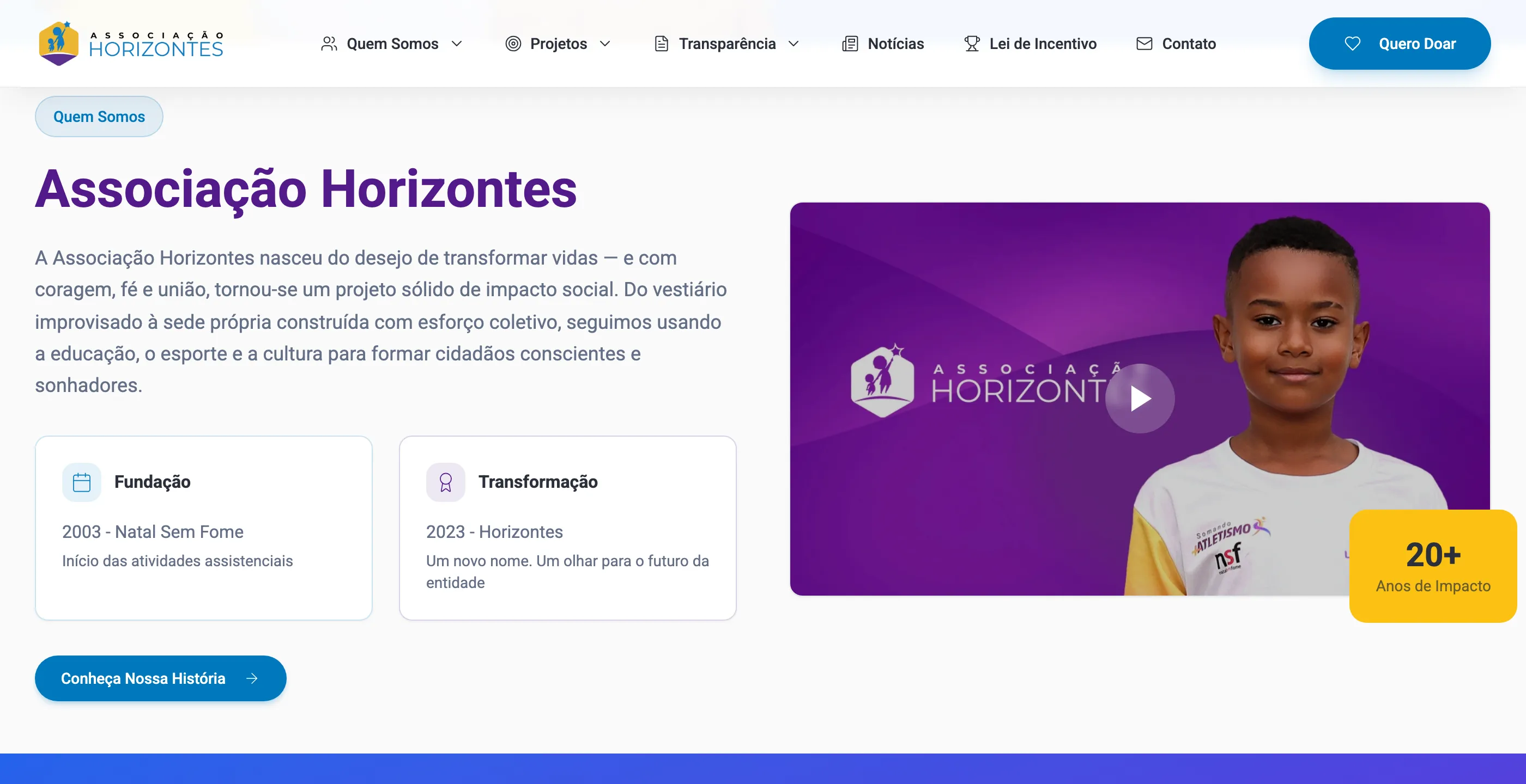
The Horizontes home page is a summary of the whole site: who we are, the mission in one sentence, the projects, the ways to donate, the financial reporting, and the latest news.
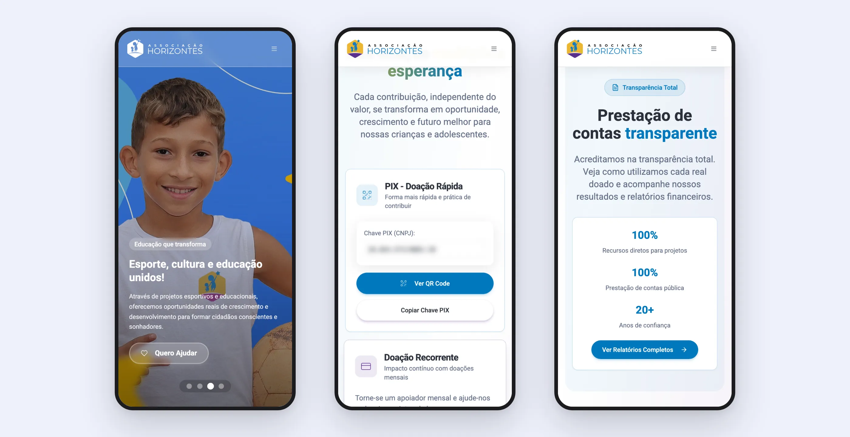
Donating was designed to be frictionless. Pix shows up with a key to copy and a QR code in a modal; recurring donations and volunteering open a short interest form.
Financial reporting is the trust piece. Each year’s balance sheets sit side by side, each with view and download. Anyone who wants to check opens the document themselves, without the team having to send anything. Every new year is just one more card: the most recent statements went in months after launch, without touching the structure.
The tax incentive page explains, in taxpayer language, that part of the tax owed can go to social projects, and walks through the steps.
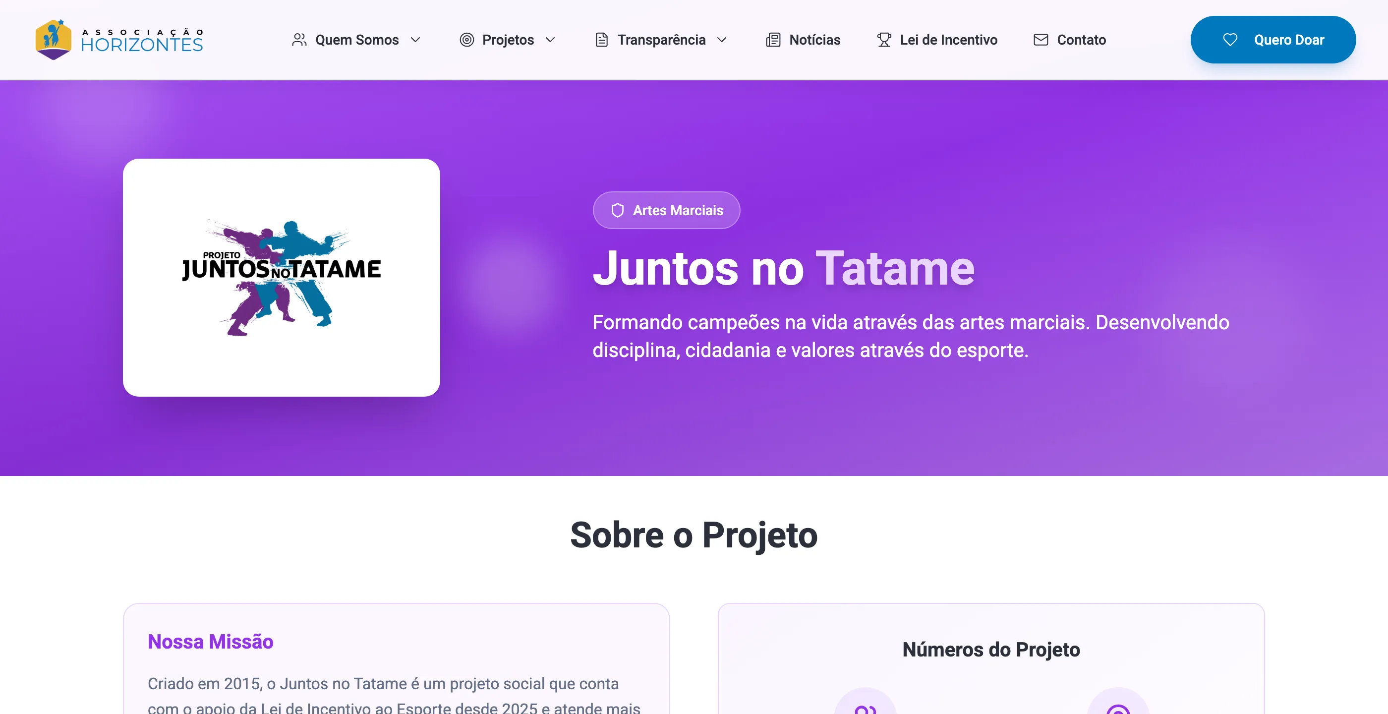
There’s also a news section with a page per story, recording events, certifications, and achievements and keeping the site alive between campaigns.
On mobile, the banner, donations, and transparency keep the same reading order.
How it was built
React with Vite and Tailwind, generated and iterated with an AI interface builder and refined by hand. There are more than fifteen pages: institutional pages, three projects, transparency, financial reporting, donations, tax incentive law, news with detail pages, contact, privacy, and terms of use. The contact form sends through an email script on the association’s own hosting, with server-side validation and a per-address send limit to hold back spam. SEO with sitemap, robots, and social share images. A cookie banner with preferences.
What I took from this project
- For a nonprofit, transparency is the sales pitch. The financial reporting page persuades more than any impact statement.
- Giving has steps. One-time Pix, recurring donations, volunteering, and the tax incentive law are different asks for different people. Putting them all behind the same button wastes the biggest ones.
- Content that changes every year needs a fixed home. Annual documents, news, and banner slides go in without rebuilding pages. That’s what kept the site up to date after handoff.
- First live, then done right. The one-day version claimed the address; the definitive one had time to be thought through.