Landing pageTiger Truck2025
A truck off the road loses money by the hour. The whole page exists for one action: requesting a diagnosis.
- Client

- Role
- Product builder: strategy, design and AI-assisted development
- Timeline
- 2 days to build, with later adjustments
- Disciplines
- Conversion strategy, UX/UI, Copywriting, AI-assisted development
- Live
- Visit the site
The context
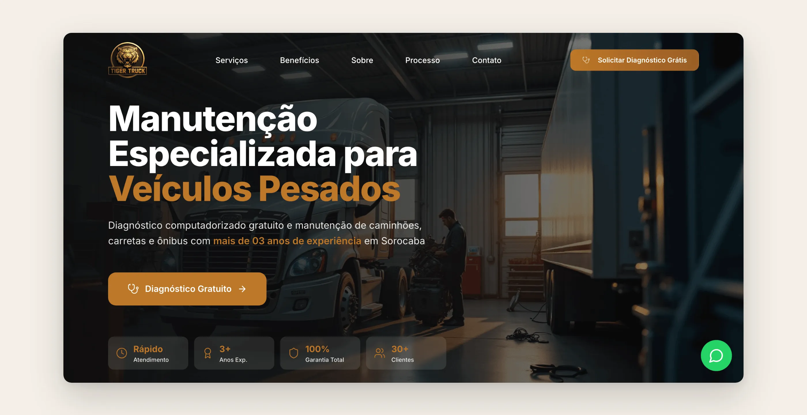
Tiger Truck is a repair shop in Sorocaba, São Paulo state, specializing in heavy vehicles. Only a few years in business, it services trucks, trailers, buses, pickups, tractors and machinery. Its customers are fleet owners and independent truckers, and what they buy isn’t a repair: it’s getting back on the road.
The ask was a landing page for ad campaigns and local search. One page, one goal: generate diagnosis requests.
The pain
For someone who makes a living hauling freight, the real cost of a breakdown isn’t the part. It’s the day off the road. This customer decides fast, on their phone, often on the side of the highway, and picks whoever answers first and looks like they know what they’re doing.
A page that talks about itself too much before offering help loses this customer. And a new shop like Tiger Truck has to prove it’s competent before it has a known name in the region.
The research
The central decision was to turn the page into a single-offer funnel: the free diagnosis. It lowers the barrier to entry (it costs nothing to hear what’s wrong with the vehicle) and it’s the natural door to the paid service.
From there, the section order followed the fleet owner’s questions:
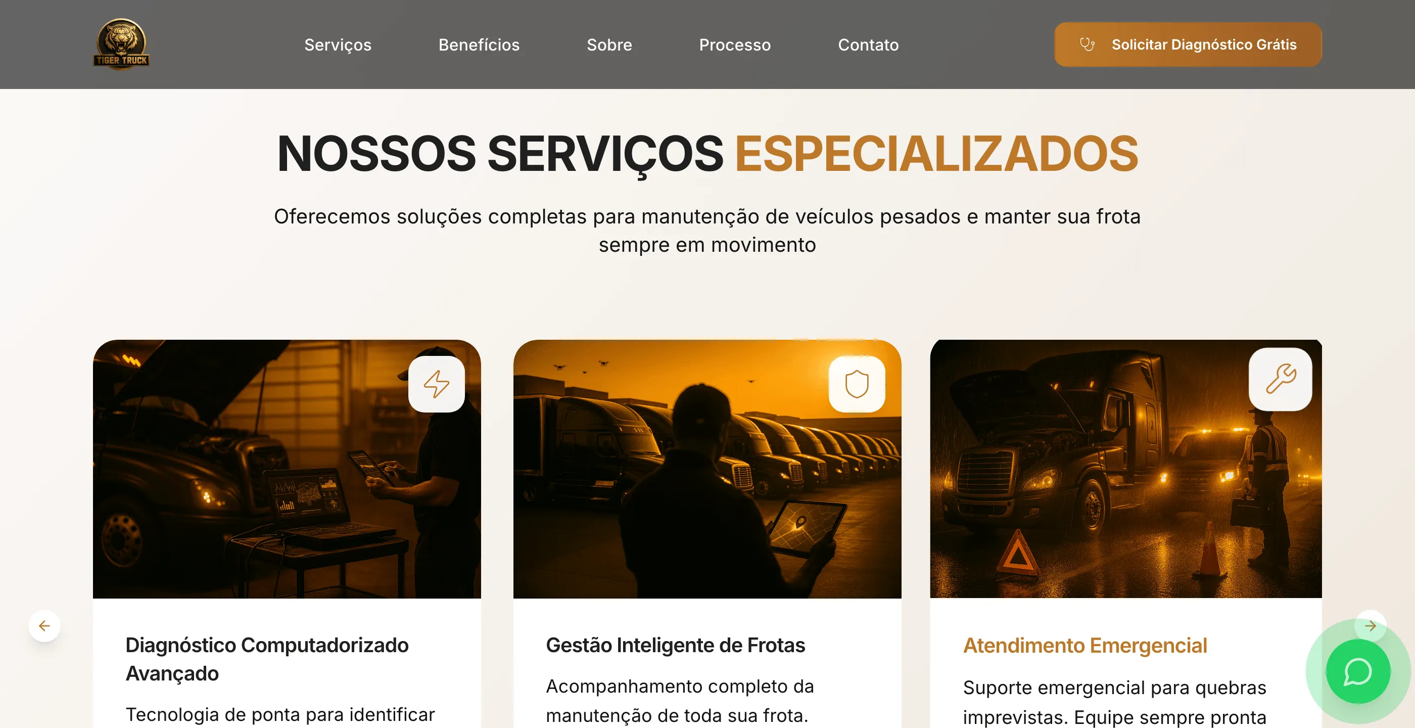
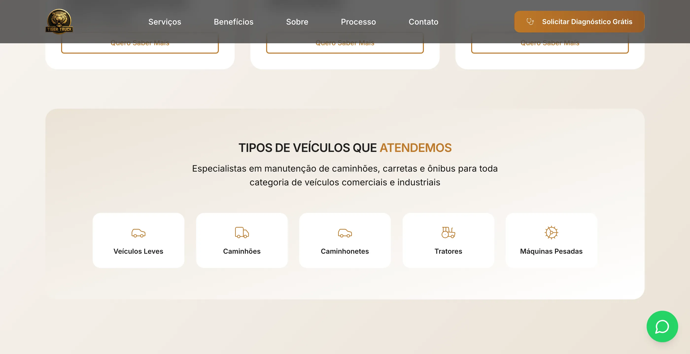
- Can you fix my problem? Services (preventive and corrective maintenance, computerized diagnostics, fleet management, emergency service) and the vehicle types they handle.
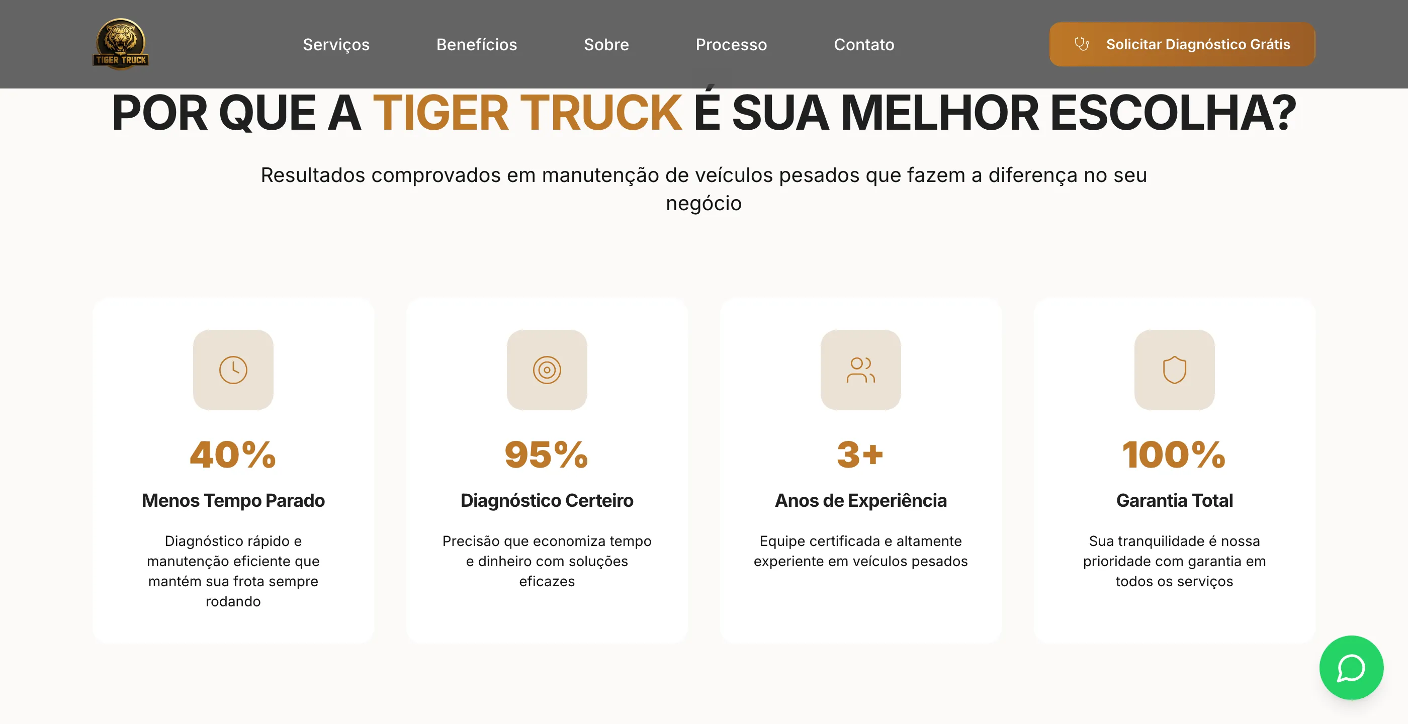
- Why you? The benefits in a fleet owner’s language: less downtime, accurate diagnosis, experience, warranty.
- Who already trusts you? Numbers from the shop’s own operation, and testimonials.
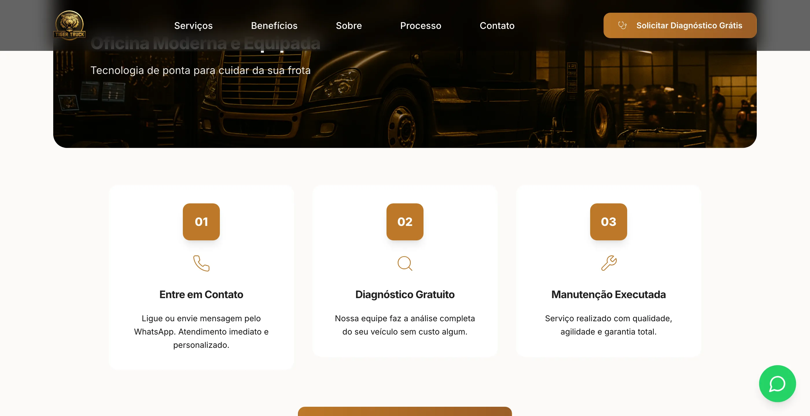
- How does it work? Three steps: get in touch, free diagnosis, maintenance done.
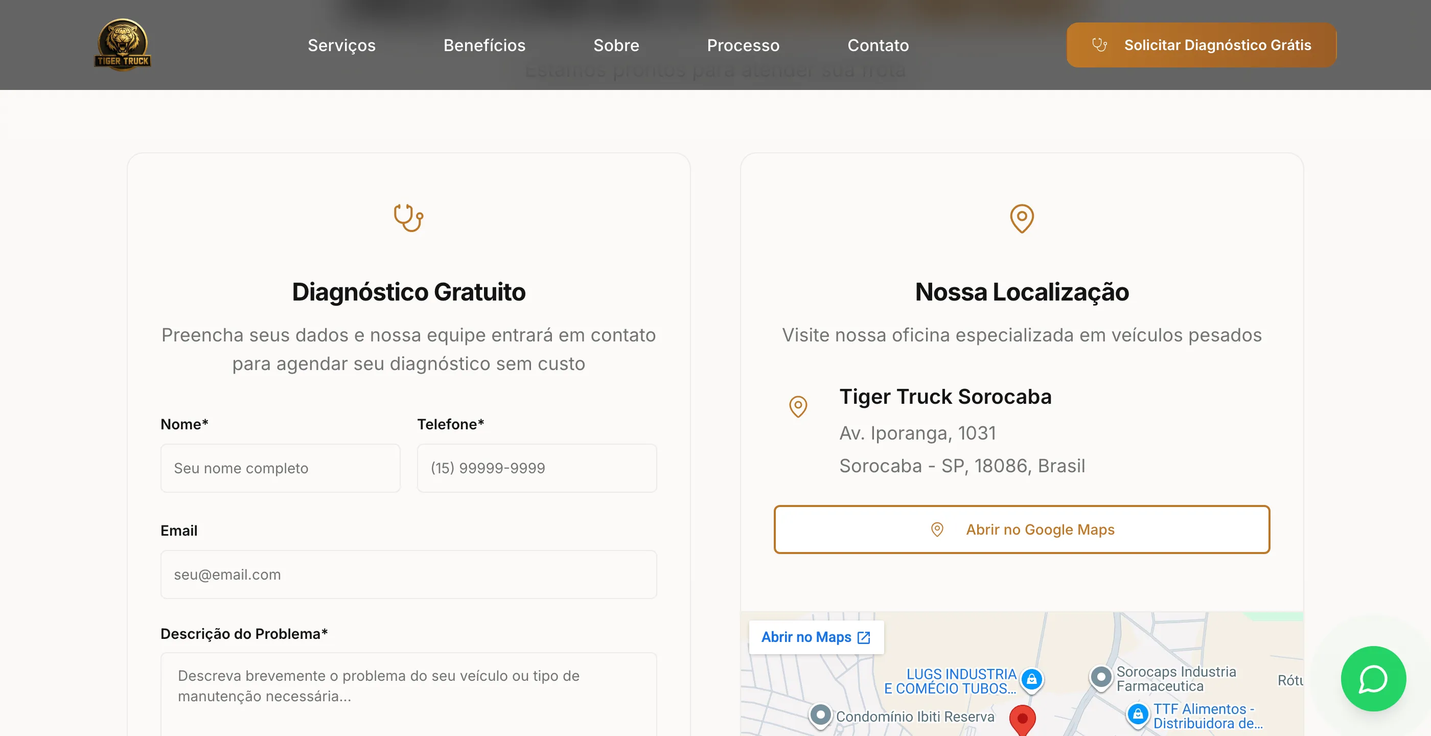
- How do I reach you right now? Form, WhatsApp, phone and map.
The diagnosis request shows up in the sticky header, in the banner, after the process section and in the contact section. A WhatsApp button floats over every fold.
The solution
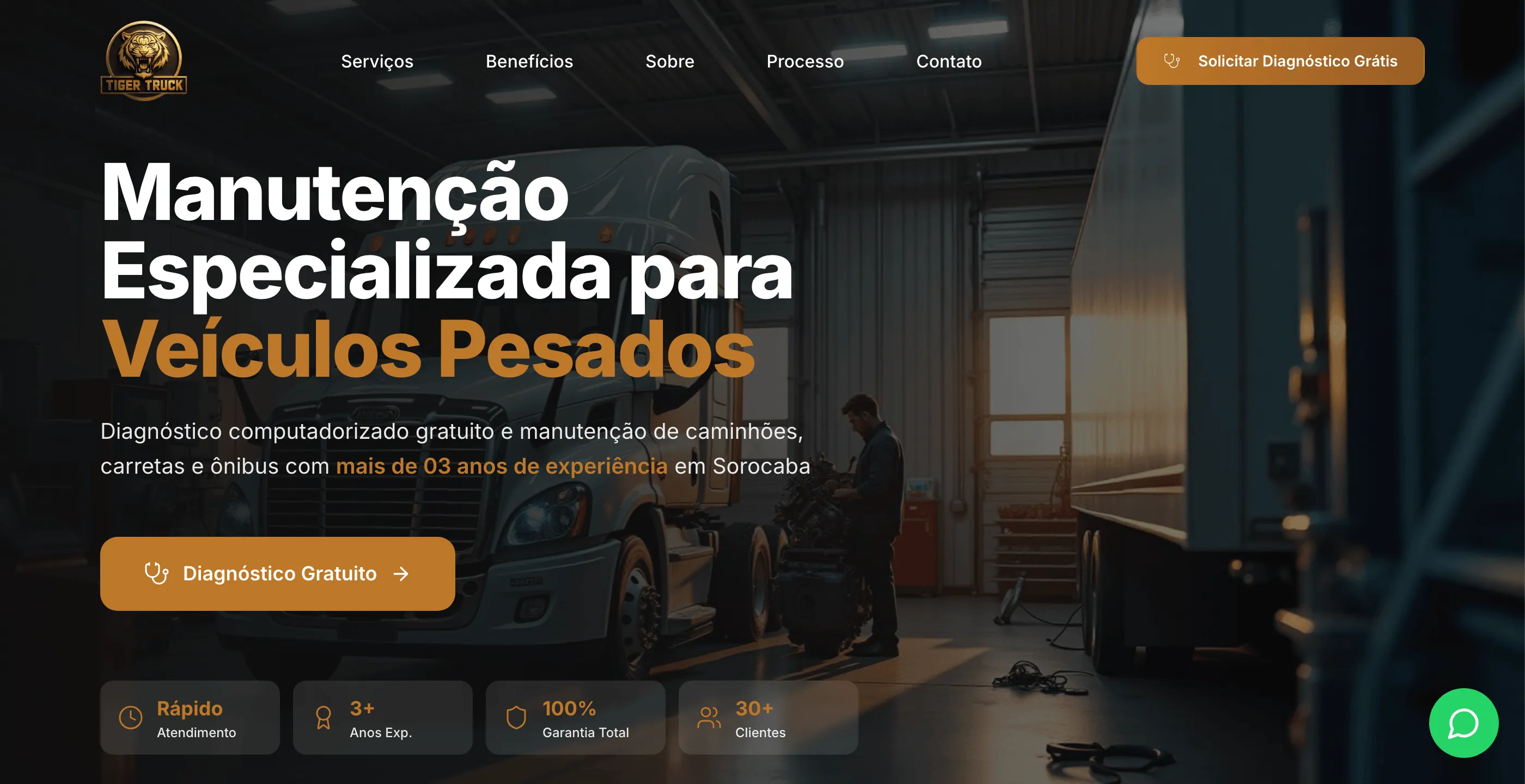
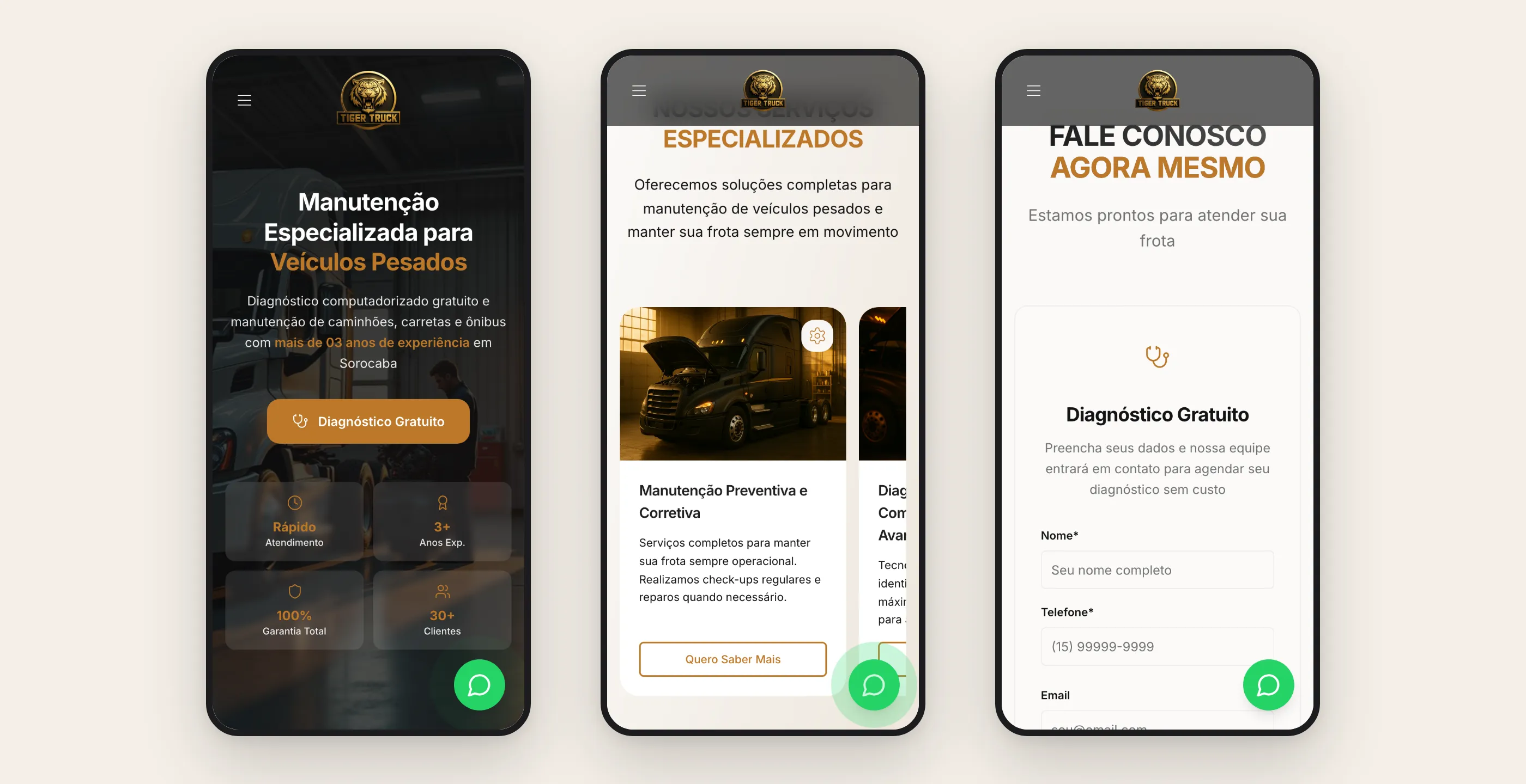
The visual identity came from the customer’s world: dark photos of the shop and trucks, the tiger logo in gold, and orange reserved for anything clickable. The eye quickly learns that orange means action.
The three-step process takes away the fear of the unknown. Someone who has never brought their truck there knows exactly what happens after the click.
The form asks for the minimum (name, phone, email and the vehicle’s problem) and sits next to the map, with a link to open directions. A capture modal with the same fields opens from the header and banner buttons, so the request doesn’t depend on scrolling to the bottom.
Because the form already asks what’s wrong with the vehicle, the request reaches the shop with the subject attached. The first conversation doesn’t start from zero.
On mobile, where this customer makes the call, the banner indicators become a compact grid, the services carousel becomes a swipe, and the buttons are tuned for touch.
How it was built
React with Vite and Tailwind, generated and iterated with an AI interface builder and then refined by hand. The first version was ready in two days. Performance got attention because it’s a campaign page: lazy-loaded images, an optimized image component, touch-specific tweaks on mobile and a service worker for caching. The form started as a cloud function and later moved to an email script on the client’s own hosting, so it wouldn’t depend on an outside service. A tag manager to measure campaigns, a cookie banner, privacy policy, terms of use, sitemap and robots.
What I took from this project
- One page, one offer. Every section answers a doubt that stands in the way of the diagnosis request. Anything that didn’t help with that was left out.
- The right offer lowers the barrier. A free diagnosis is an easy thing to ask for, and it’s the door to the service.
- Color as a signal. Reserving orange for actions let the page teach people where to click without instructions.
- Delivery speed is part of the product too. With AI in the build, the page went from brief to live in two days, which left time to get the section order and the copy right.