Event platformGlint2026
Ticket sales, the door, attendee relationships, and refunds run on their own within the rules. The queue only asks for a human decision on what falls outside them.
- Client

- Role
- Product builder: discovery, design, and AI-driven development
- Timeline
- About 3 weeks (June 2026)
- Disciplines
- Product strategy, UX/UI, Design system, Business rules
The context
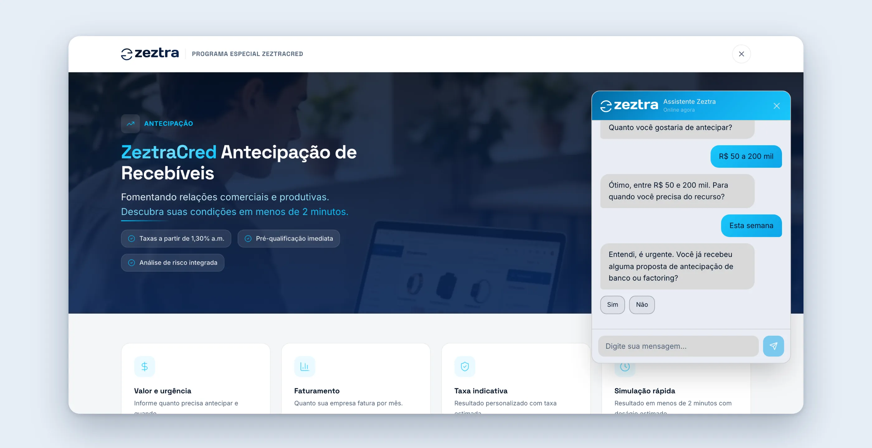
Event organizers in Brazil work with a patchwork: one tool sells tickets, another handles check-in, a spreadsheet tracks costs, and certificates are put together by hand. The data about who actually showed up ends up scattered and lost.
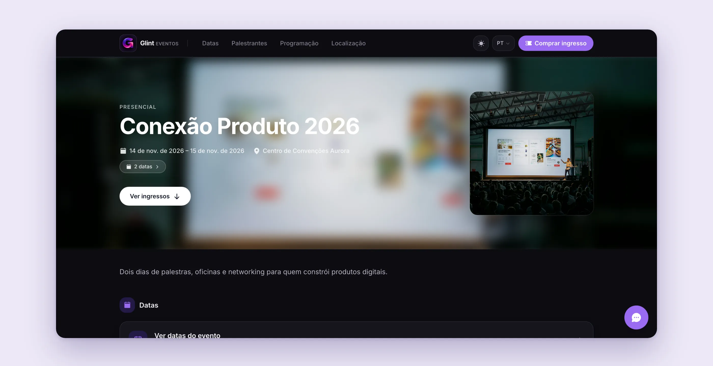
Glint was built to stitch all of that into a single product. The organizer creates the event, publishes a sales page, gets paid through Stripe, issues tickets with a QR code, runs check-in, talks to the audience, and handles post-sale support. Attendees, door staff, exhibitors, and affiliates each get their own access.
The idea that runs through the product is simple. Whatever has a clear rule runs on its own: capacity, QR scanning, refunds within the window, behavior tags. Whatever falls outside the rule becomes a queue for the organizer to decide.
The pain
Looking at how organizers actually work, the most expensive problems weren’t in the sale itself. They were at the edges, where the work is manual:
- Capacity that doesn’t match the physical space. Selling tickets by type without tying them to the real area (floor, mezzanine, VIP box) opens the door to selling more places than exist.
- Valid tickets being shared. A screenshot of the QR code circulates in a group chat and two people try to get in with the same code.
- Attendees who become a name in a spreadsheet. Someone who bought tickets to three editions, visited a booth, and gave a 10 rating shows up as three unrelated records.
- Refunds by email. The right of withdrawal exists (7 days under Brazil’s Consumer Protection Code, the CDC), but the process is manual, slow, and full of friction for both sides.
In a comparative analysis against competitors in the market, self-service refunds stood out as Glint’s biggest gap. It was one of the fronts prioritized later.
The research
Before designing, I broke the event down into model layers, because the interface depends on getting the model right:
- Event → Section → Ticket type → Ticket tier. A section is the physical area, with a capacity. A type is the commercial condition (full price, half price, day pass). A tier is the price ladder, which advances by date, by percentage sold, or when it sells out.
- One person, one timeline. Every interaction (purchase, check-in, product pickup, booth visit, rating, message, tag) becomes an event in that person’s history.
- Core and extras. What every organizer needs (event, tickets, checkout, check-in, finances) is core and is never locked. Everything else comes with a plan.
Each feature became a product spec in the repository, with goals, acceptance criteria, happy and unhappy paths, and risks. The catalog has a master document and 21 specs, and it served as the contract between design, code, and tests.
The solution
A sales page with real sections
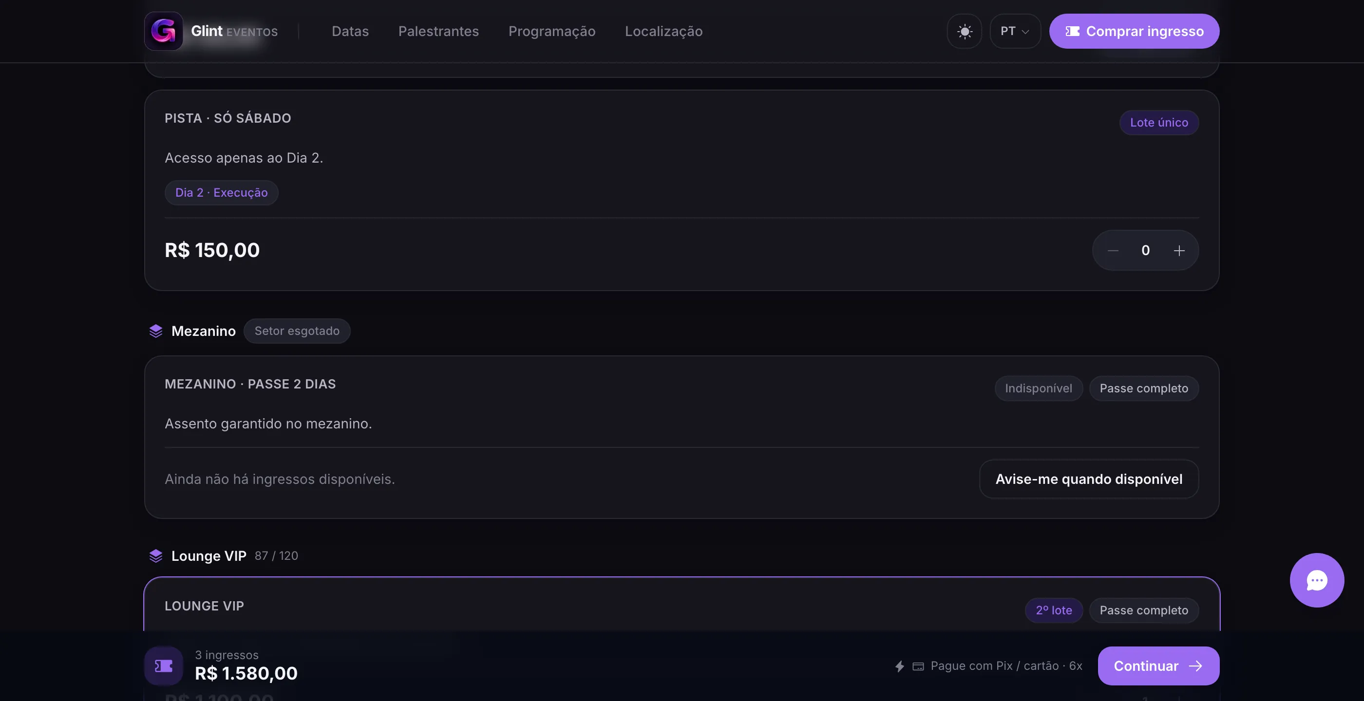
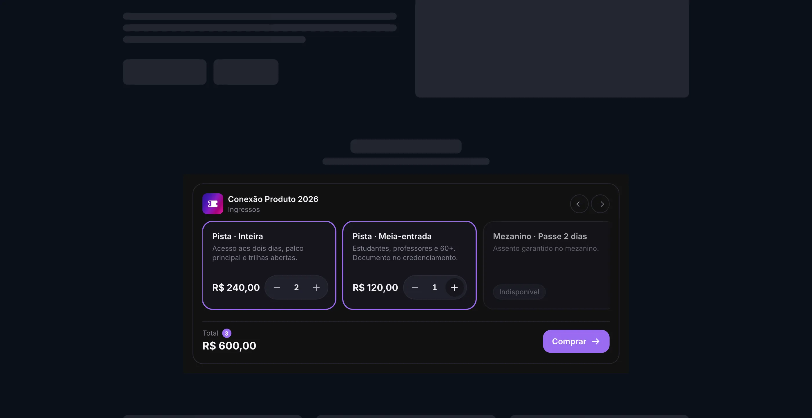
The public page groups tickets by section and shows the current tier for each one. When a section sells out, the page says so in plain words and offers a waitlist.
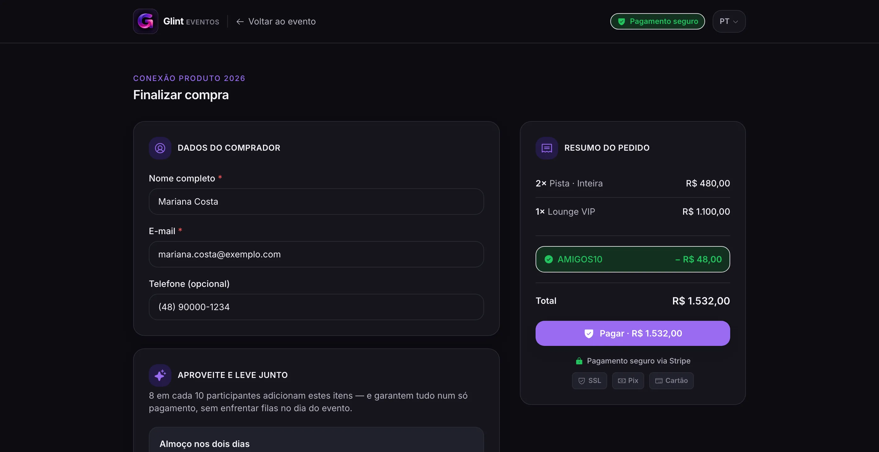
Checkout is short: buyer details, summary, coupon, and payment through Stripe. The price is always recalculated on the server, so changing the amount in the browser does nothing.
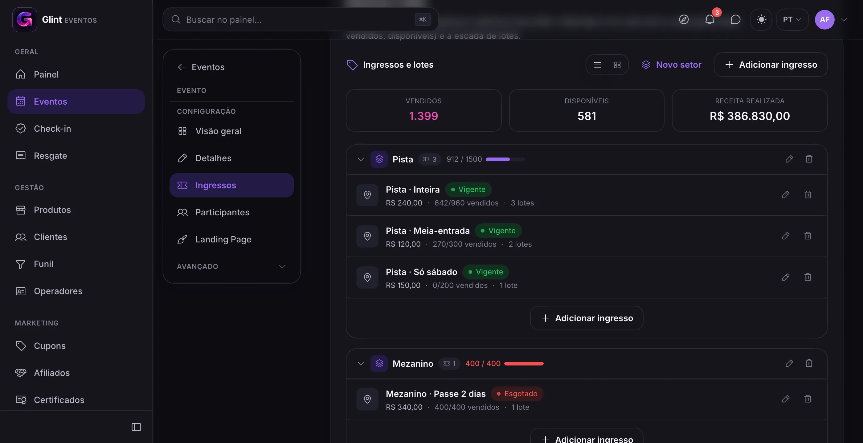
Hard capacity, enforced at configuration
The most important decision about sections was where to put the lock. The first version blocked at checkout. It worked, but it muddled the metrics: the dashboard showed tiers with availability in a section that had no room left.
The lock moved to configuration. The sum of the tiers across all ticket types in a section can’t exceed its capacity, and lowering the capacity below what’s already configured is rejected. As a result, the number the organizer sees is the number that exists. Per-tier reservations take care of the rest at purchase time, with nobody counting seats.
Rotating QR: opt-in, for a good reason
For shared tickets, the QR code can rotate. Every 30 seconds the code changes, signed by the server, and the door only accepts the current window and the adjacent one. A screenshot stops working in under a minute. When an event uses rotating QR codes, the old static code is rejected at scan.
The cost is real: the attendee’s phone needs internet at the door for the QR code to refresh. A venue with poor signal plus rotating QR codes means a guaranteed line. That’s why the option is off by default and the organizer turns it on event by event, with the warning written right on the screen. If the connection drops, the app keeps the last code instead of showing an error.
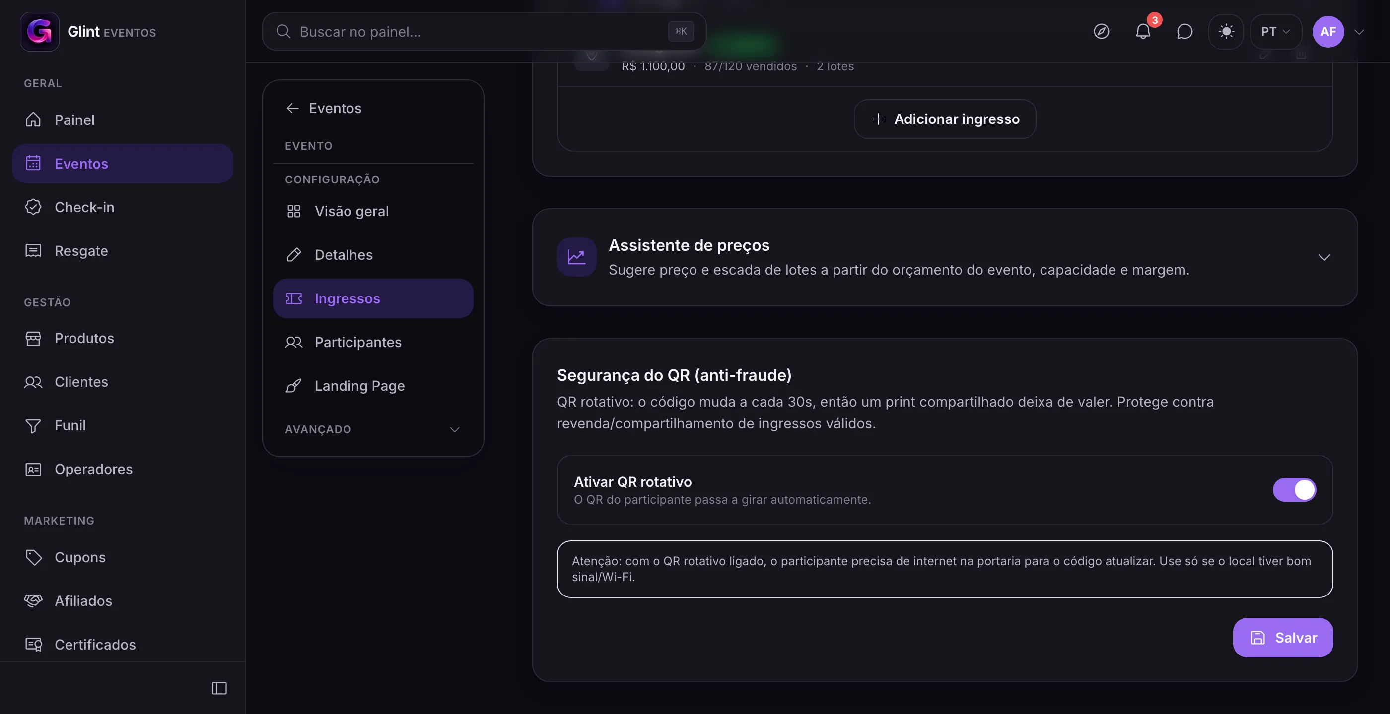
A refunded ticket, on the other hand, dies on the server, with or without rotating QR: every scan rejects the canceled code. On the web there’s no way to prevent a screenshot, so the defense lives at the scan.
Post-sale support that follows the CDC, with no email
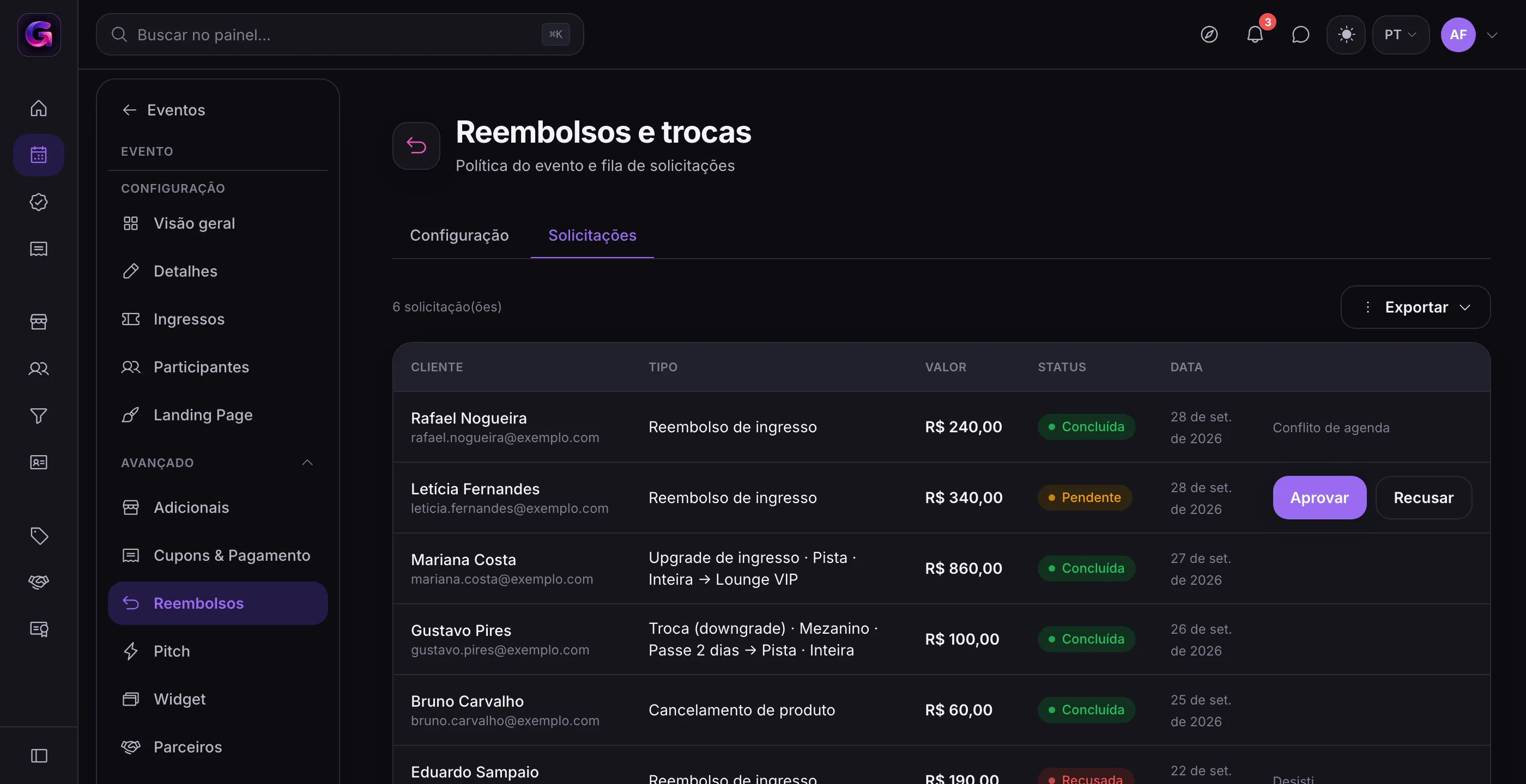
Within the window, the attendee requests a refund in the app and the money goes back immediately, straight through Stripe. Outside the window, the request goes to the organizer to approve or decline. Upgrading to a higher category is always allowed (the attendee pays the difference). Downgrading is only allowed within the window (the attendee gets the difference back). The organizer sets the window, the cutoff before the event, and the retention.
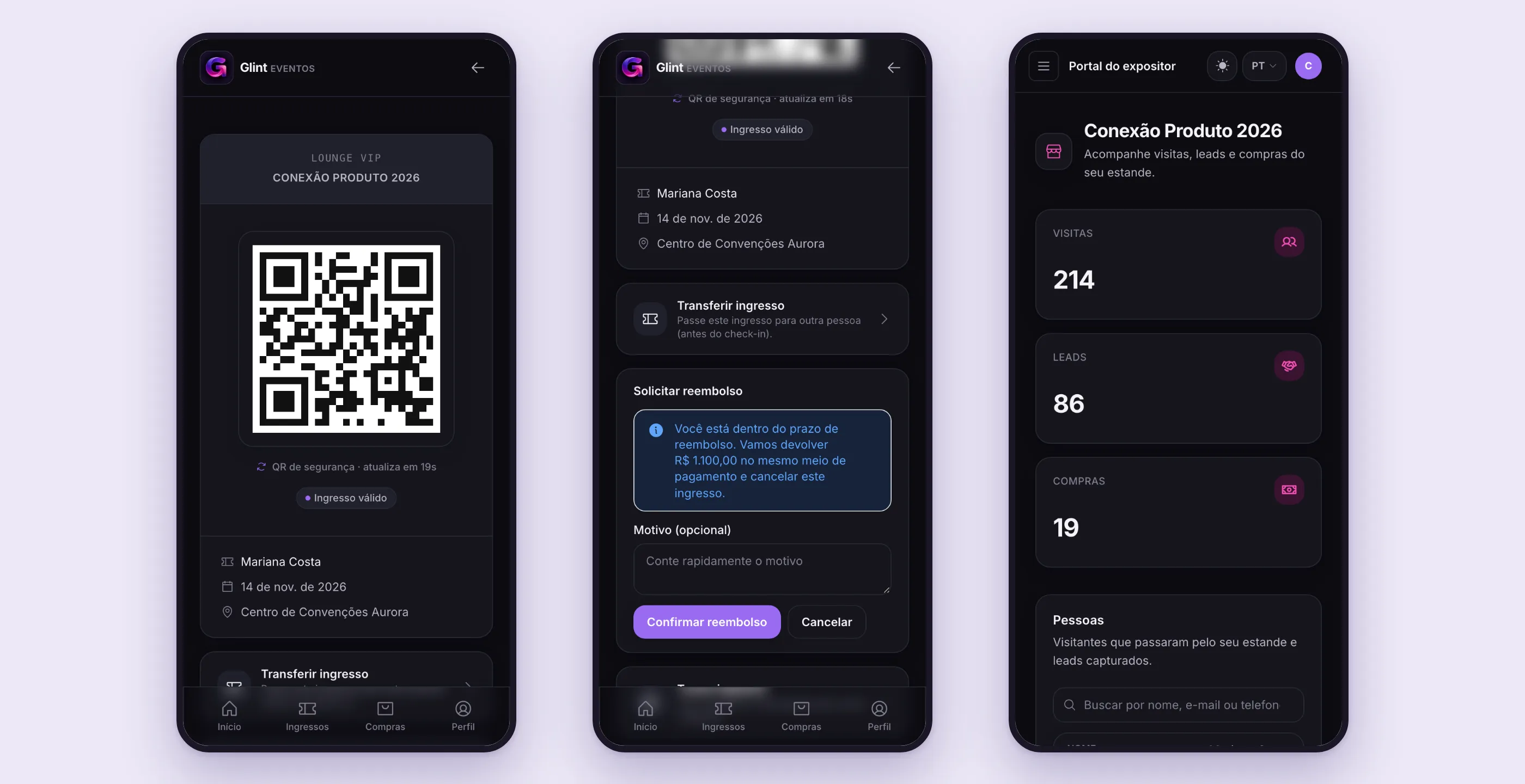
Here the invisible part mattered more than the screen. An adversarial review found a risk of duplicate refunds under simultaneous clicks. The fix was to make sure the item is canceled first, atomically, and only then does the money go back, with an idempotency key on Stripe.
360° CRM and the exhibitor portal
Every attendee has a profile with total spend, events, check-ins, pickups, and a single timeline. Tags are applied automatically based on behavior: “Visited: Lumen Labs” when their badge is scanned at the booth, “Bought at booth” when a purchase comes from a product linked to it. Nobody tags attendees by hand.
There’s also a privacy panel (under LGPD, Brazil’s data protection law) where people can see, export, or anonymize their data, while the financial record is preserved.
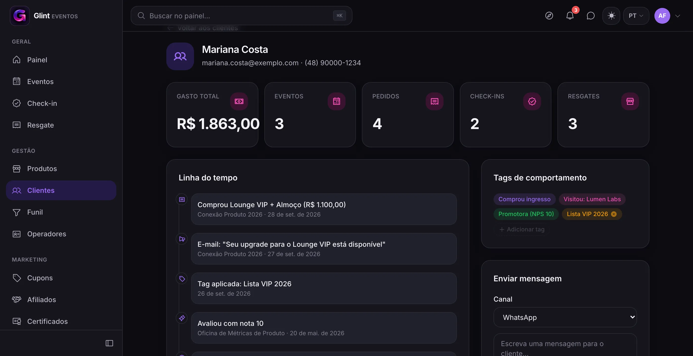
Exhibitors log into their own portal with a code sent by email and capture leads by scanning the QR code on the badge.
Selling outside Glint
Three embeddable widgets take sales to the organizer’s own site: a ticket cart, a product cart, and a floating chat with the sales assistant. The buy button opens the event page with the cart already filled, so the widget reuses the entire checkout instead of duplicating it.
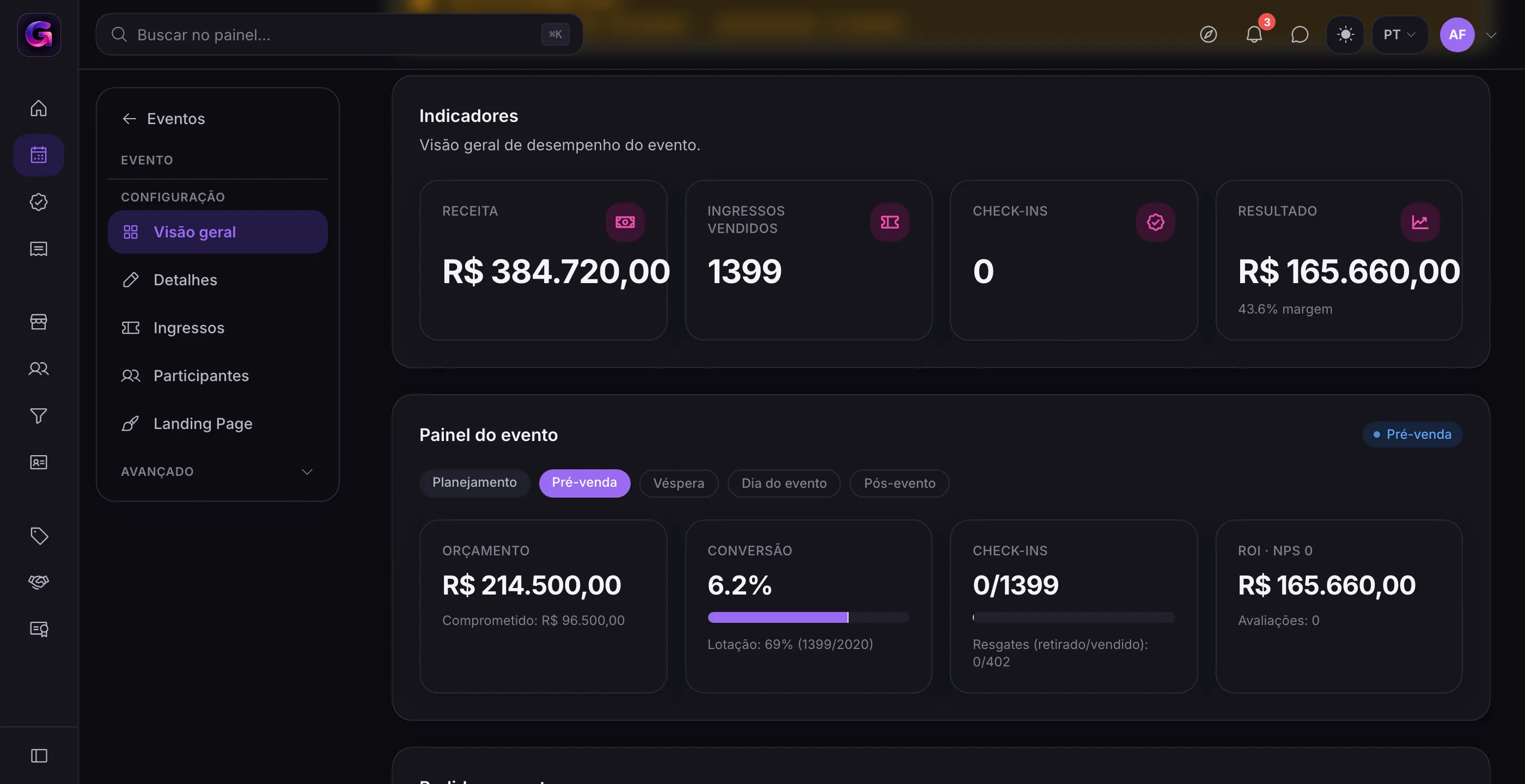
Event overview and plans
The event dashboard adapts to the phase (planning, presale, the day before, event day, post-event) and shows budget, conversion, capacity, check-ins, and results.
The business model has three plans. The basic plan is free and covers the entire core. Paid plans unlock widgets, booths, automations, NPS, an AI bot, and affiliates. The lock lives on the server; the menu only hides what the plan doesn’t include. If the subscription payment fails, the account drops back to basic: the organizer loses the extras, but never the event that’s on sale.
How it was built
It’s a modular monolith: NestJS with domain modules, React with Vite, PostgreSQL, Redis, and Stripe, with the interface in Portuguese, English, and Spanish. I handled product, design, and code with AI. Large deliveries were broken into waves executed by several agents in parallel, with adversarial reviews on the parts that touch money and security.
The dark-by-default design system has about 17 components and was applied to around 50 screens. The automated suite passed a thousand tests, including isolation between organizers.
What changed
For event organizers, the work changes in nature. It stops being checking and replying, and becomes deciding on exceptions.
What was done by hand. Selling tickets by type without tying them to the physical area, dealing with screenshots of shared tickets at the door, piecing attendees together from scattered spreadsheets, and answering refund requests by email.
What became automatic. Capacity locked at configuration, a QR code that rotates and rejects screenshots, refunds within the window straight through Stripe, behavior tags applied when the badge is scanned, and a single timeline for every attendee.
Where a person decides. The organizer turns on rotating QR event by event, with the cost written next to the toggle. They set the refund window, cutoff, and retention. And they approve or decline, in the queue, only the requests that fall outside the rules.
What I took from this project
The decisions that mattered most barely show up in the interface. Moving the capacity lock from checkout to configuration didn’t create a new screen, but it made the dashboard number mean something again. Leaving the rotating QR off by default, with the cost written next to the toggle, is more honest than selling security without mentioning the line at the door.
It also became clear that, in a product that handles money, the happy path is the easy part. The real work is asking what happens with two simultaneous clicks, with a screenshot of a refunded ticket, or with a phone that has no signal at the venue entrance.