Mobile app & AI contentBible Study App2026
Researching, writing, creating artwork, and reviewing every week by hand is a bottleneck. Nine AI stages handle the volume, and a person decides what goes out.
- Client
- Christian content ministry
- Role
- Product builder: front-end redesign and design of the AI content pipeline
- Reading
- 6 min
- Disciplines
- Product design, Mobile UX/UI, Native app (iOS and Android), Agent workflow design
The context
A Christian content ministry has a native Bible study app for phones, published on the App Store and Google Play. It’s built in React Native (Expo), with a single codebase for iPhone and Android. The product is large: a Bible reader with verse-by-verse commentary, a daily devotional with audio, video study tracks, quizzes, guided meditation, search, daily streaks, and achievements. Behind it are a dedicated API, an admin panel, and a development team.
I came in on two fronts. The first was the app’s front end: redesigning core screens without touching the backend. The second came later and lived outside the app: setting up the weekly social media content production on an AI agent platform.
On the second front, the work that belonged to people (researching a topic, writing, creating artwork, reviewing) moved to agents, in nine stages. What stays with a person is the decision to publish. Nothing goes out without that click.
Both fronts answer the same question: what makes someone come back tomorrow?
The pain
In a content product, daily engagement depends on two things that rarely go hand in hand.
- Production volume. Every week someone has to research a topic, write, create artwork, and review. Done by hand, it becomes a bottleneck. Handed to AI without supervision, it becomes a risk: a misquoted verse or a made-up date in a published post weighs more than one fewer post.
- The reading experience. The commentary is what sets the app apart from any free Bible. If it shows up as a block of running text, it feels like a handout, not a study.
The research
I had no access to users or usage metrics. The research was product and code research: the rules documented in the repository, the existing screens, and what the backend actually returned.
Three findings guided the decisions in the app:
- The commentary already came structured. The content arrives with fixed sections: explaining the text, cultural context, a curiosity, the original text, and application for today. It also carries markup for terms and places. The information was there; the interface just wasn’t showing it.
- The reader had too many entry points. Verse of the day, search, devotional, lessons, and AI answers all lead to the same passage. A single screen with two modes (browse and read) simplified everything, as long as the shortcuts landed straight in reading mode.
- The quiz promised something the backend didn’t deliver. The screen expected the answer key back, but the API only returned the score. In practice, the app had no way of knowing which answers were right.
On the content production side, the starting point was different. The agents existed with only a name and an avatar. What was missing was each one’s role and rules, and a decision about where a person steps in.
The solution
The AI production line
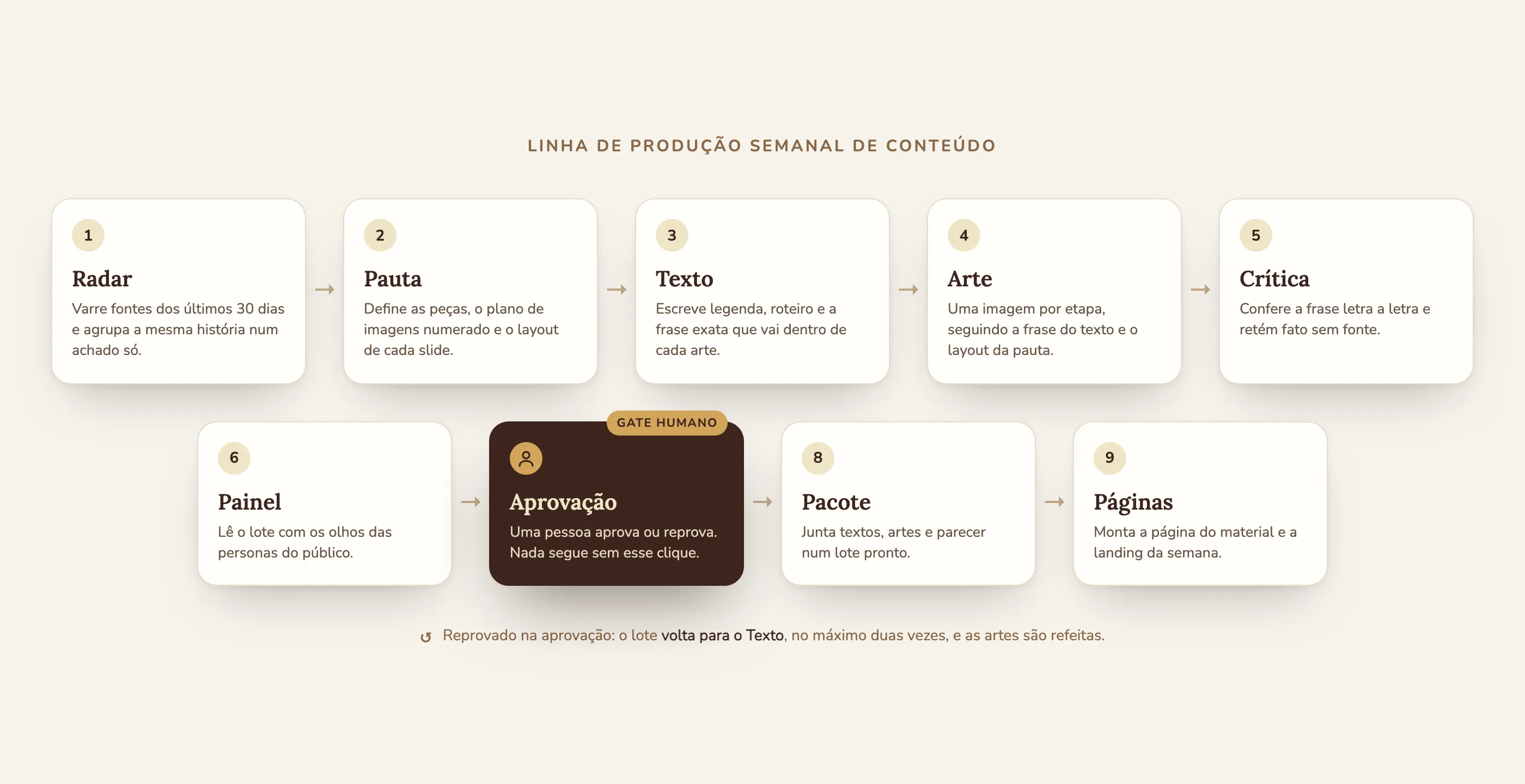
I wrote each agent’s role and rules and designed the sequence: nine stages that run every Monday morning, with a human approval before anything goes out.
Some decisions only surfaced once it was running:
- Visual identity as a shared rule, not a document. The brand guide is injected into every agent. When that guide was wrong, an entire batch came out in the wrong colors. Proof that the guide really is in charge.
- One image per stage. Generating an image takes minutes, and each stage has a time limit. Instead of asking one agent for five pieces of artwork, each piece is its own stage, numbered according to the editorial plan.
- Copy comes before artwork. The main line of text goes inside the image. The critique compares it letter by letter and rejects a wrong accent mark. Rejecting at the gate redoes all the artwork, and the approval notice says so.
- A fact without a source is held back. In one of the first runs, the critique held a topic for lack of a source. I checked it independently, it was correct, and the gate worked as it should: it held, a person confirmed, the batch moved on.
- Compose in one stage, publish in another. The stage that created the page kept timing out because it wrote and published in the same turn. Splitting the two fixed it.
- Forbidding something in text doesn’t hold. Every time the instructions grew, the model found a tool to “get organized” instead of doing the task. What worked was removing the tool from the agent on the platform, not writing “don’t use it.”
Each batch’s landing page starts as a draft. Publishing is still a human click.
The reader and the commentary
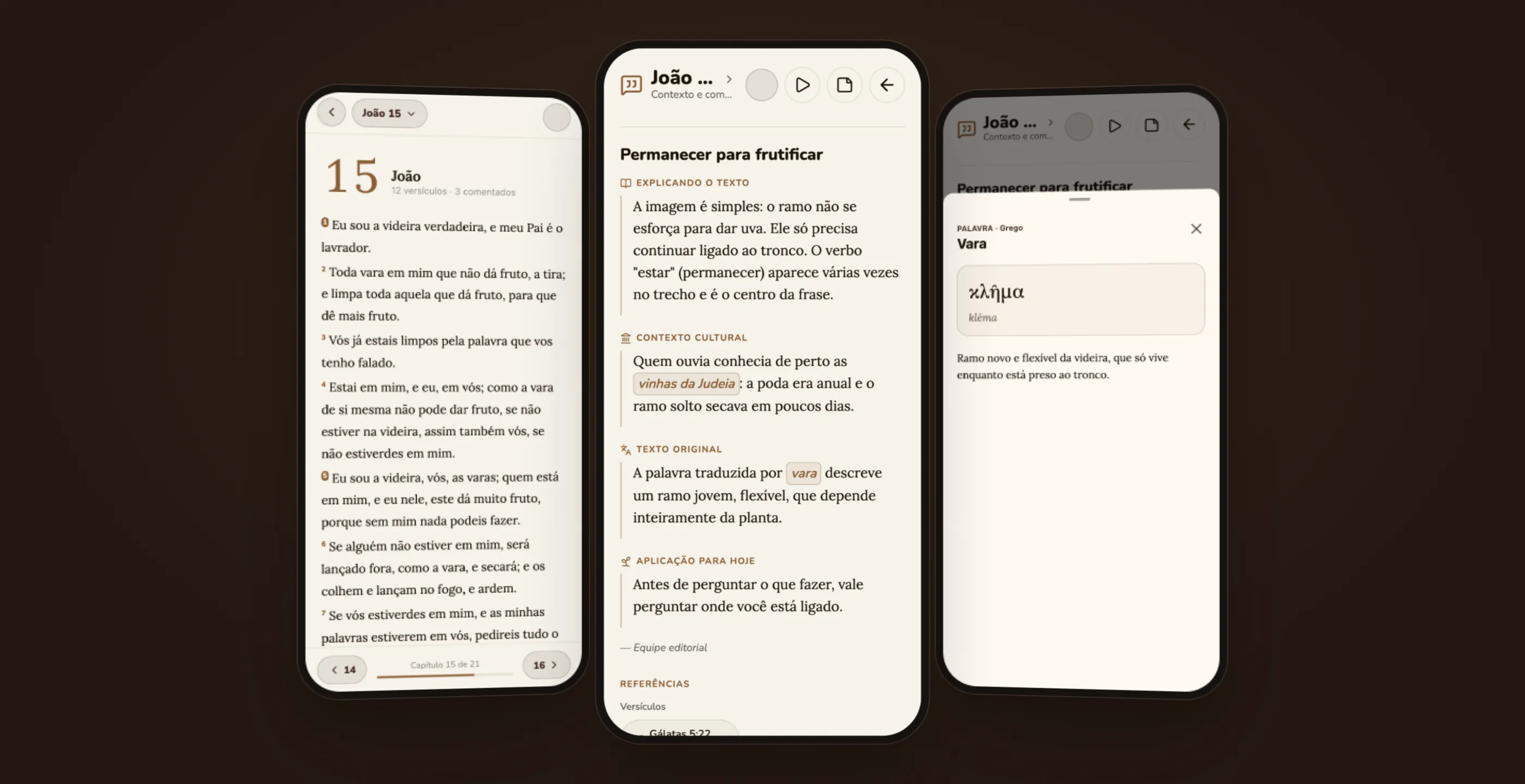
In the app, the chapter opens with a large number, the verse count, and how many verses have commentary. Verses with commentary get a marker. One tap opens the commentary, with each section identified by an icon and a label. Marked terms and places open an entry with the word in the original language and its meaning.
Everything was designed for a phone screen. The commentary is long, so each section opens with a short label and the text is set in a serif typeface that’s comfortable to read. The word entry slides up from the bottom like a sheet and closes without taking the person away from the verse.
The daily ritual
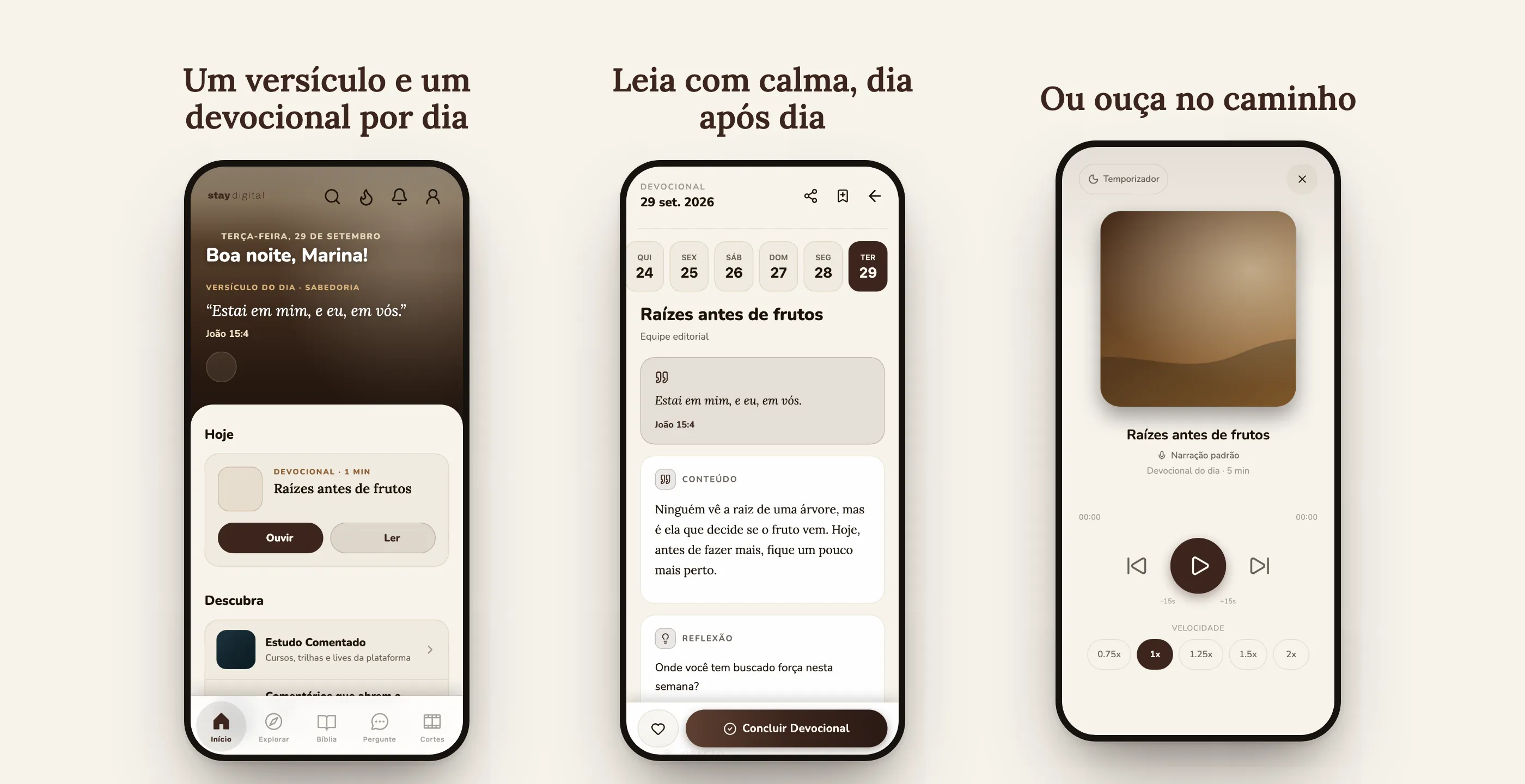
The home screen shows the verse of the day and a single “Today” card, with the devotional and two buttons, Listen and Read. The devotional has date navigation, content sections, a reflection, and a prayer, and ends with “Complete,” which counts toward the streak. The player has a sleep timer and speed control.
Study tracks and quizzes
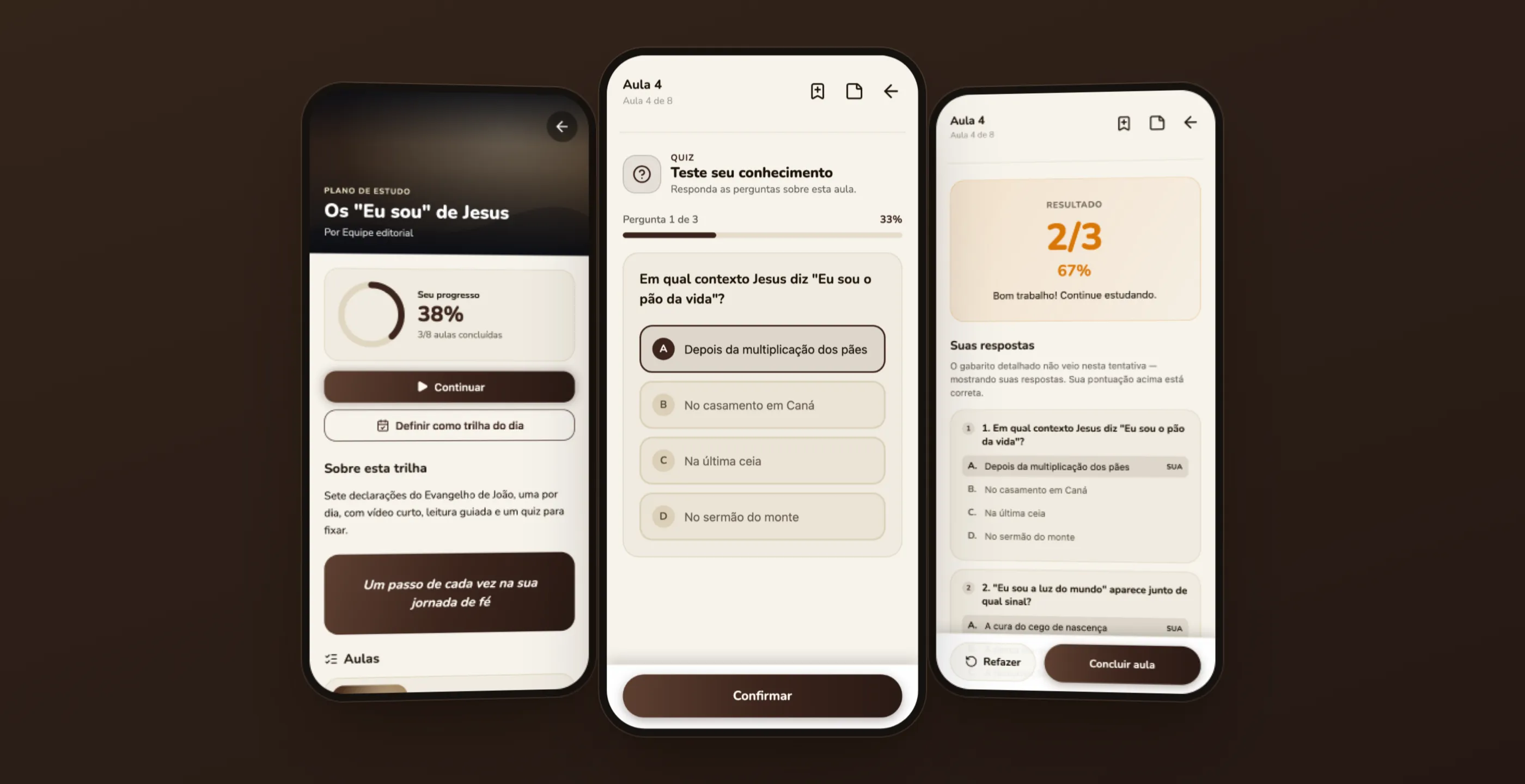
Study tracks work like a study plan: a progress ring, a continue button, an option to set it as the “track of the day,” and lessons in sequence, with the next ones locked. Quizzes appear between lessons.
This is where a product decision came in. With no answer key coming from the backend, the screen could either mark everything wrong or hide the result. I chose to show the score and the person’s answers, with a clear sentence saying that the detailed answer key didn’t come back on this attempt. I left the screen ready to switch on the green and red by itself once the API starts sending the correct answers. The gap was documented for the backend team.
First steps and a tailor-made track
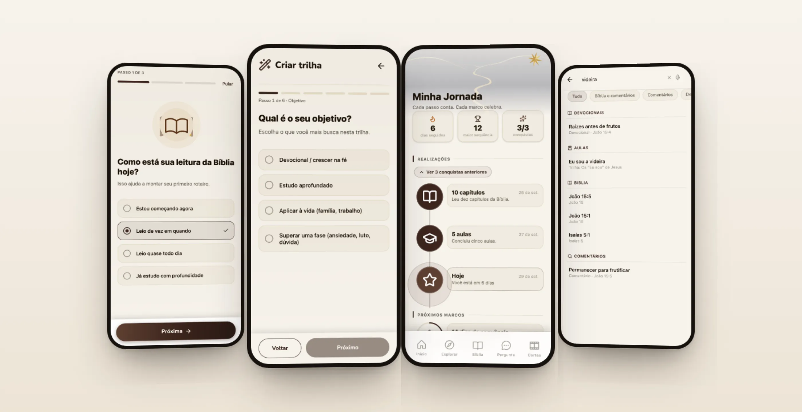
Onboarding asks three short questions (reading level, what the person is looking for, how much time they have each day) to build the first plan. For those who want to go further, a six-step assistant asks for a goal, theme, section of the Bible, depth, and format, and generates a personal track.
“My Journey” turns the daily streak into a timeline, with achievements already earned and upcoming milestones. Search brings devotionals, lessons, verses, and commentary together in one place, with popular searches as a starting point.
What changed
In the app, the commentary became layers, the reader got a single screen, and the quiz started telling the truth about the missing data. In content production, the work moved to a different place.
What was done by hand. Researching the week’s topic, writing, creating the artwork, and reviewing, every single week.
What became automatic. The nine stages every Monday: radar, editorial plan, copy, artwork (one per stage), letter-by-letter critique, panel, package, and pages, with the brand guide injected into every agent.
Where a person decides. At the approval gate, before anything goes out. On any fact without a source, which the critique holds until someone confirms it. And on the publish click, which is still human: each batch’s landing page starts as a draft.
What I took from this project
In a content product, the interface and the production are the same problem. A beautiful reader is no use if the commentary doesn’t arrive, and producing a lot is no use if nothing brings the person back the next day.
With AI, the lesson was more about design than about the model. What holds quality up isn’t the longest prompt. It’s the structure: one stage for each thing, data passing from one stage to the next, tools taken away from those who shouldn’t use them, and a person at the point where a mistake is expensive.