Mobile appConker2018
Waze is for traffic, Strava for training, Google Maps for addresses. And for finding the waterfall closest to you?
- Client
- Conker
- Role
- UX/UI designer
- Timeline
- 1 week
- Disciplines
- Discovery, UX/UI, Logo, Benchmarking
The context
Anyone who’s into hiking, waterfalls, climbing, or biking knows the routine: ask in a WhatsApp group, dig through Instagram photos, trust a tip from someone who “went last year.” The information exists, but it’s scattered and rarely tells you what matters in the moment: how to get there, who’s there right now, whether it’s safe.
Conker came out of that gap, as an app to discover and navigate to outdoor activity spots.
The pain
For people who get out there, the question is simple: where can I go, near me, and is it safe? They already had three great map and movement apps in their pocket, and none of them answered that question.
The research
Benchmarking made the opportunity explicit. Each competitor solved one piece, and nobody solved the whole thing:
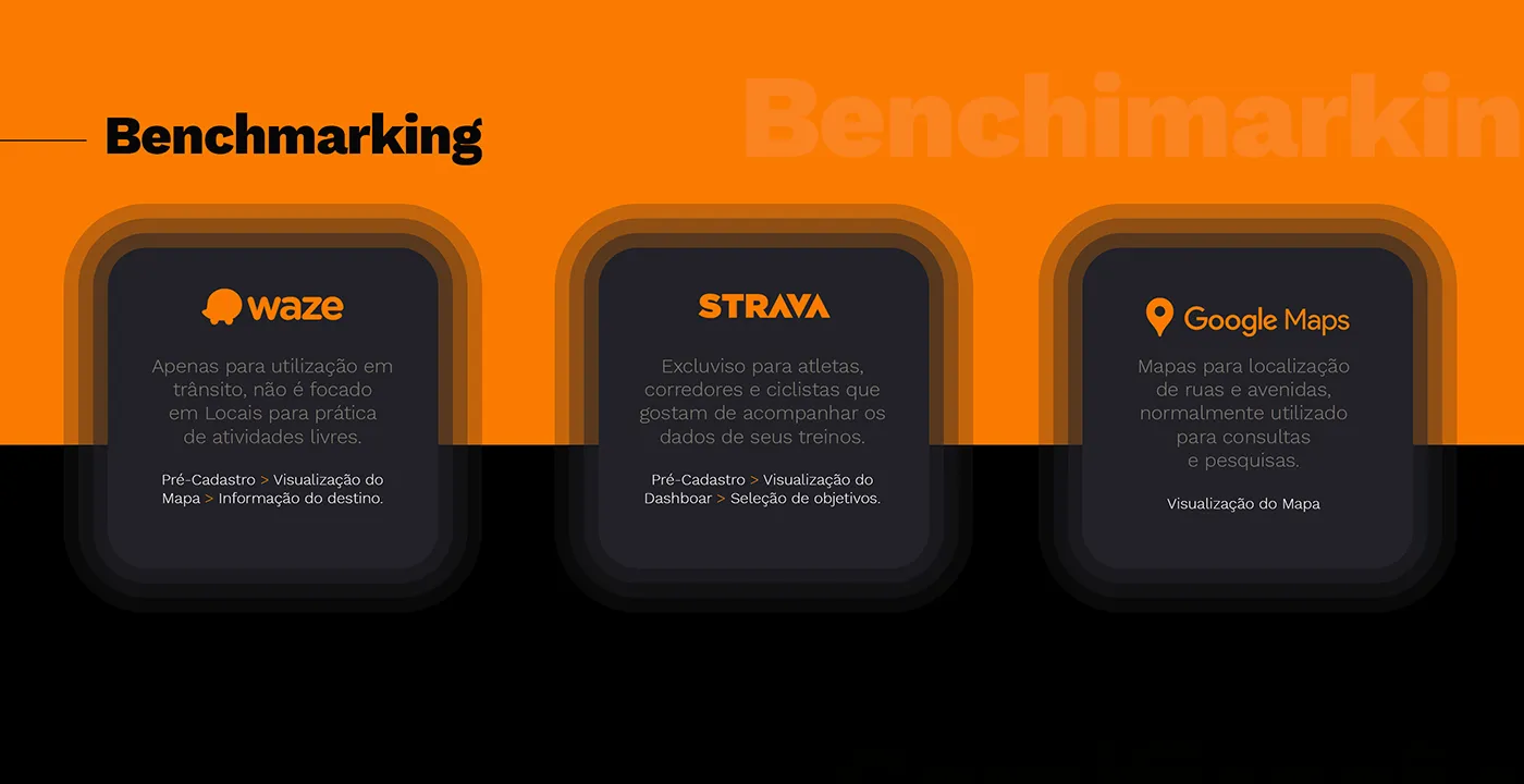
- Waze: built for traffic, not for leisure destinations.
- Strava: excellent for athletes tracking training data, but it doesn’t help you find where to go.
- Google Maps: shows streets and avenues; the trail and the waterfall are, at best, a pin with no context.
The empty space was the combination of location-based discovery with community: knowing what’s nearby, how to get there, and swapping information with the people who are there.
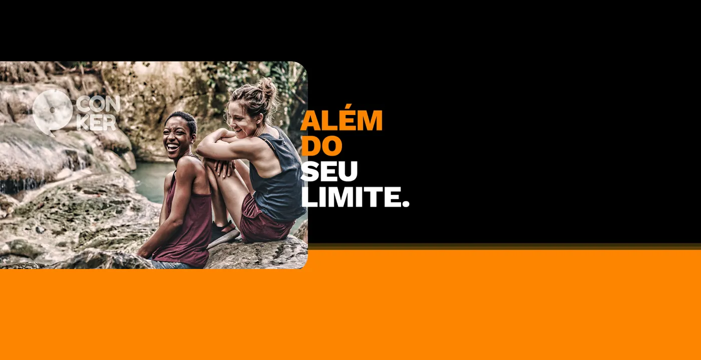
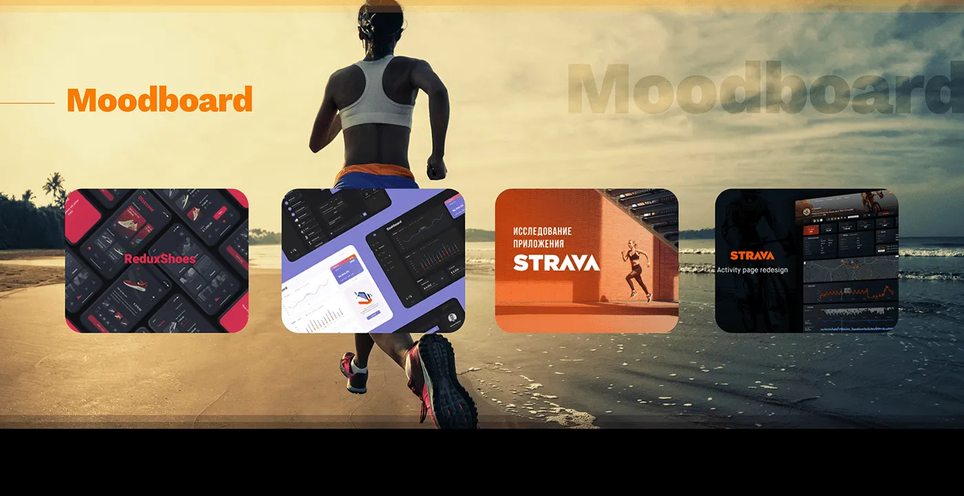
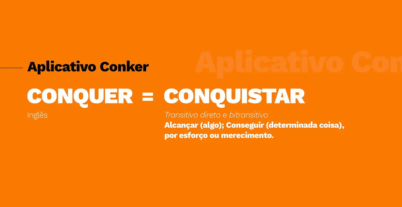
The moodboard and the brand came along with it. The name plays on conquer: achieving something through effort or merit. The tagline “Além do seu limite” (Beyond your limit) ties the promise together.
The solution
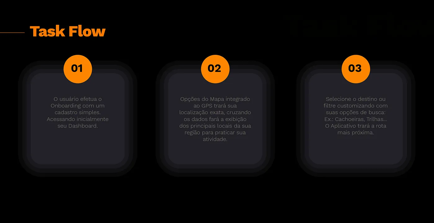
The main flow was designed in six steps, from sign-up to community:
- Onboarding with a simple sign-up that goes straight to the dashboard.
- GPS-integrated map showing the main spots in the area for the person’s activity.
- Search and filters by destination type (waterfalls, trails…), with the nearest route.
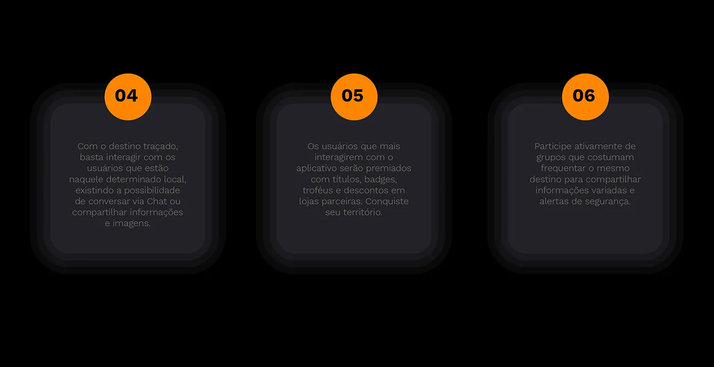
- On-site interaction: chat with people at the same destination and share information and photos.
- Gamification: the most active users earn titles, badges, trophies, and discounts at partner stores. “Conquer your territory.”
- Groups of people who frequent the same destination, to swap information and safety alerts.
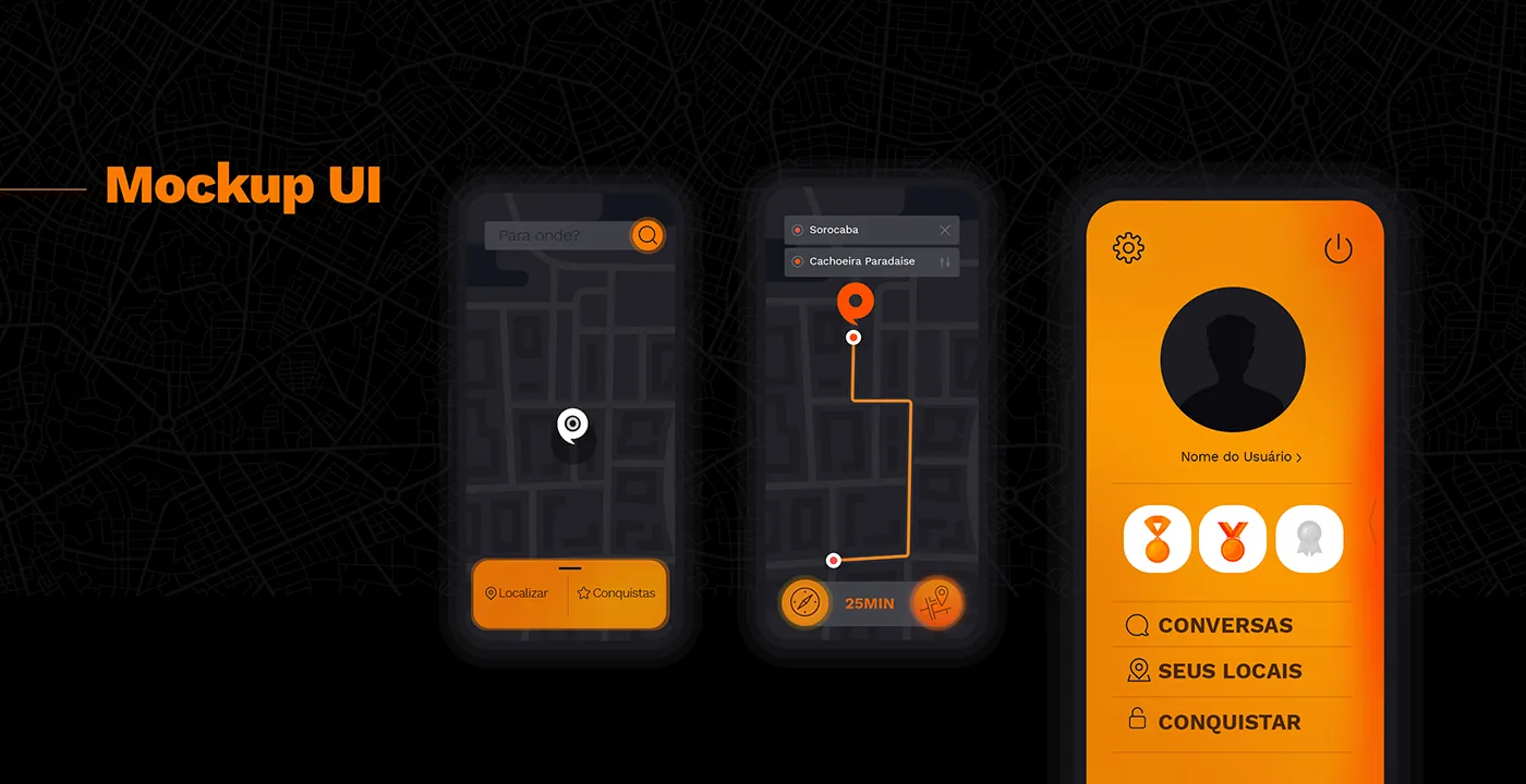
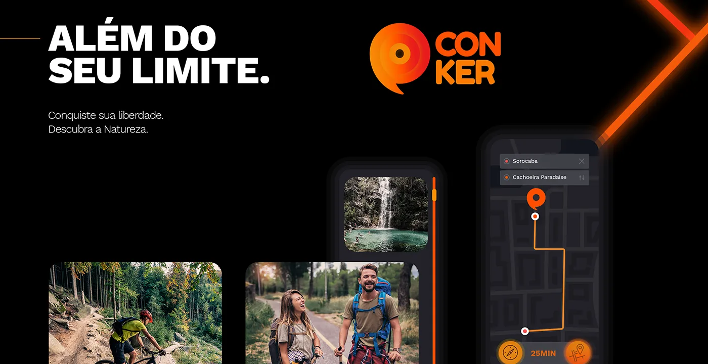
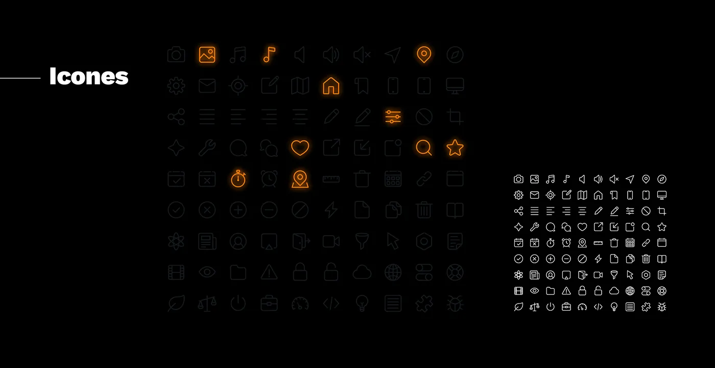
The identity uses black and orange with Work Sans, plus a custom icon family for the activity types.
What I took from this project
A week isn’t enough to validate a product, but it’s enough to find the opportunity. The benchmarking here wasn’t a list of visual references: it was the product’s argument. When you can say in one sentence what nobody is solving, the rest of the project becomes much easier to defend.